Circular
Connecting Dietitians and Patients through a Mobile Health Platform
Circular is a platform that helps registered dietitians monitor their patients in order to maintain their health through nutrition management. Patients use the Circular app to log their meals, and dietitians can receive information about their progress through the provider-side app.
Year
2026
Client
UXD 3400: Introduction to Prototyping Methods & Evaluation for UX Design
Role
Research, Design, and Testing
Tools
Figma, Figma Make
The Problem
- It is difficult for dietitians to verify patient-reported dietary habits and monitor symptoms and progress remotely.
- Dietitians have large caseloads, with a diverse range dietary needs and health conditions.
- Analyzing nutritional information takes too much time, and distracts from patient care.
Objective
To design a digital portal that:
- improves patient-provider communication
- assists dietitians in delivering personalized care
- maintains privacy and security of health info
Target User
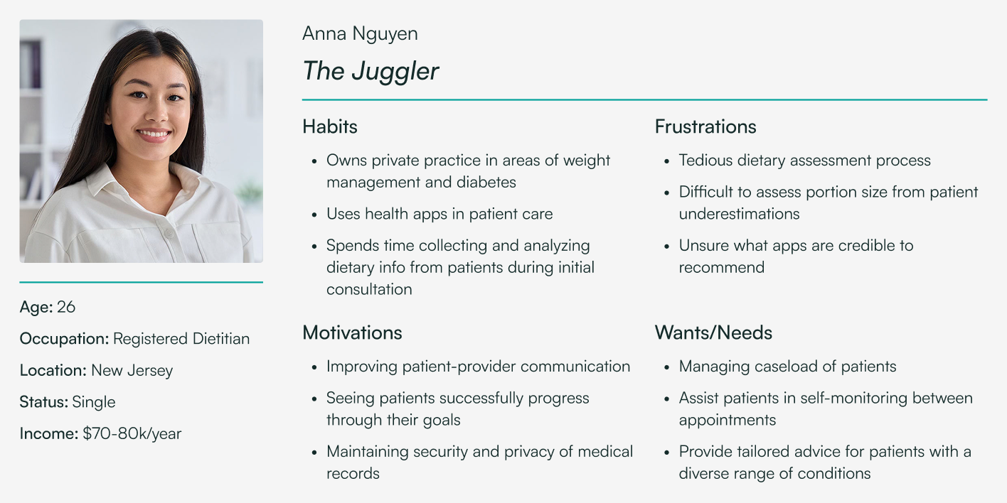
For this project, I focused on a specific user persona.
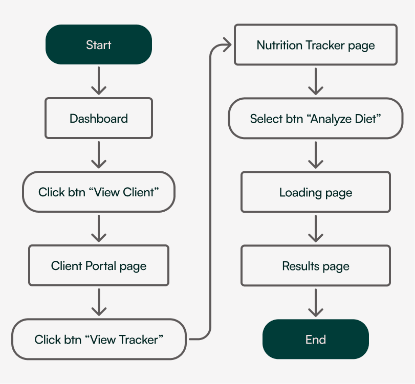
Key Tasks and User Flows
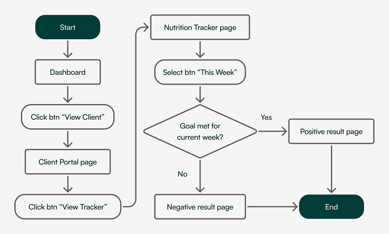
Set & Track Patient Goals
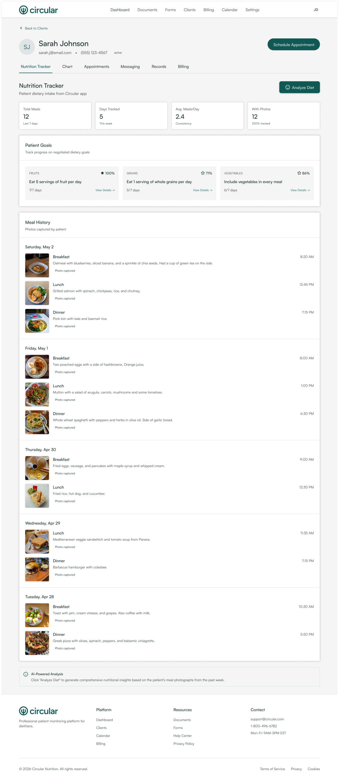
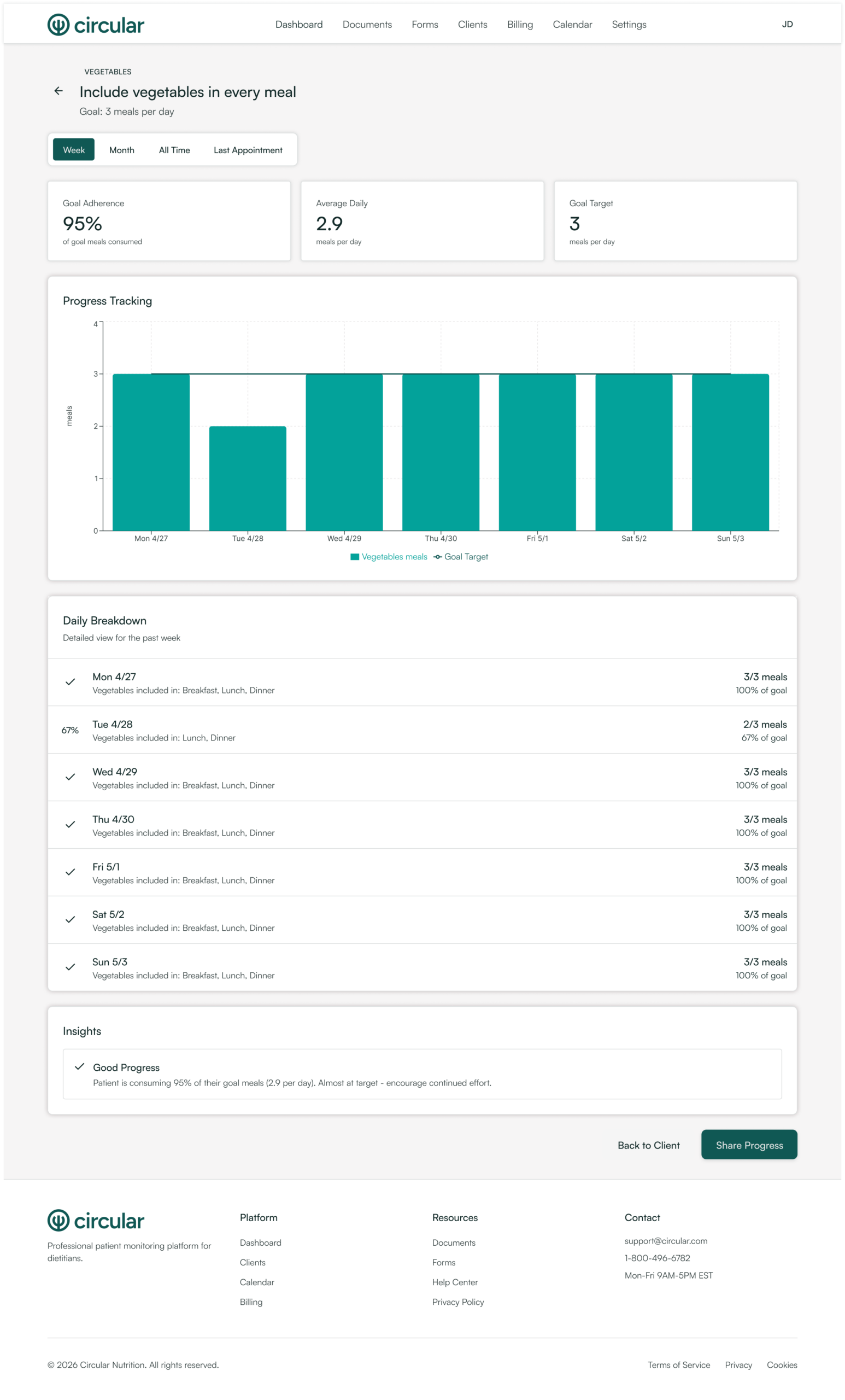
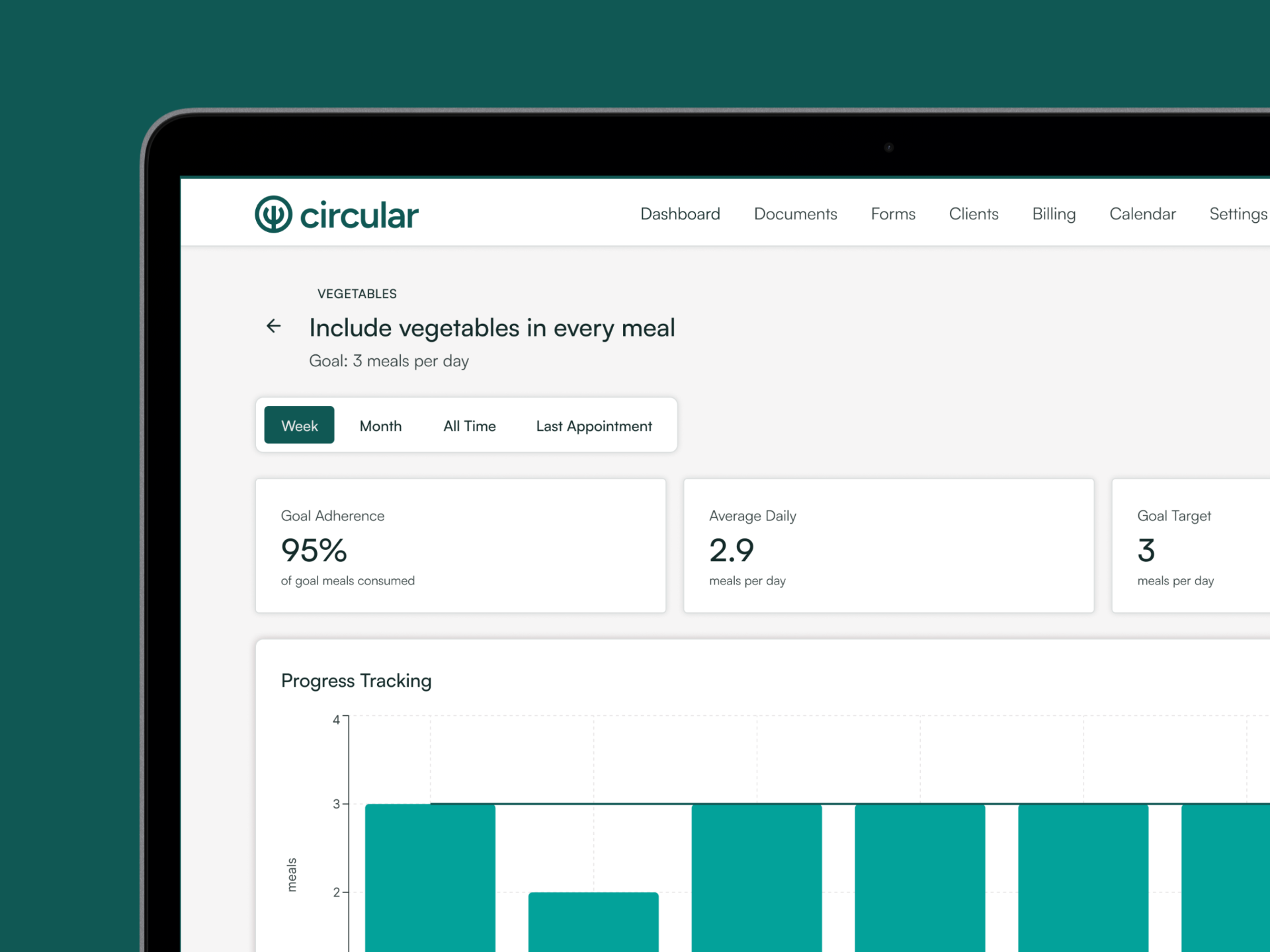
Task: Check a client’s meal history to assess whether they are meeting their goal of adding vegetables to all meals.
Nutrition Monitoring
Task: View nutritional analysis of patient dietary intake.
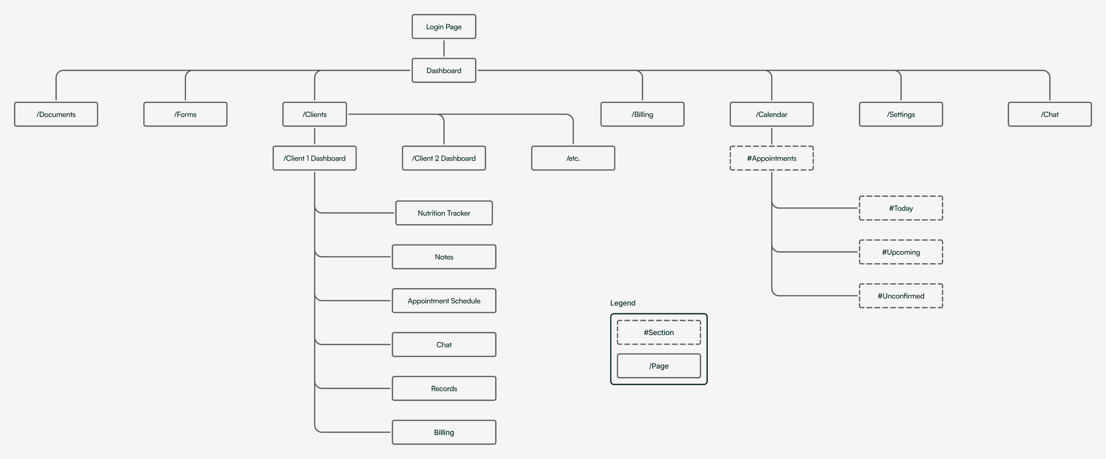
Site Map
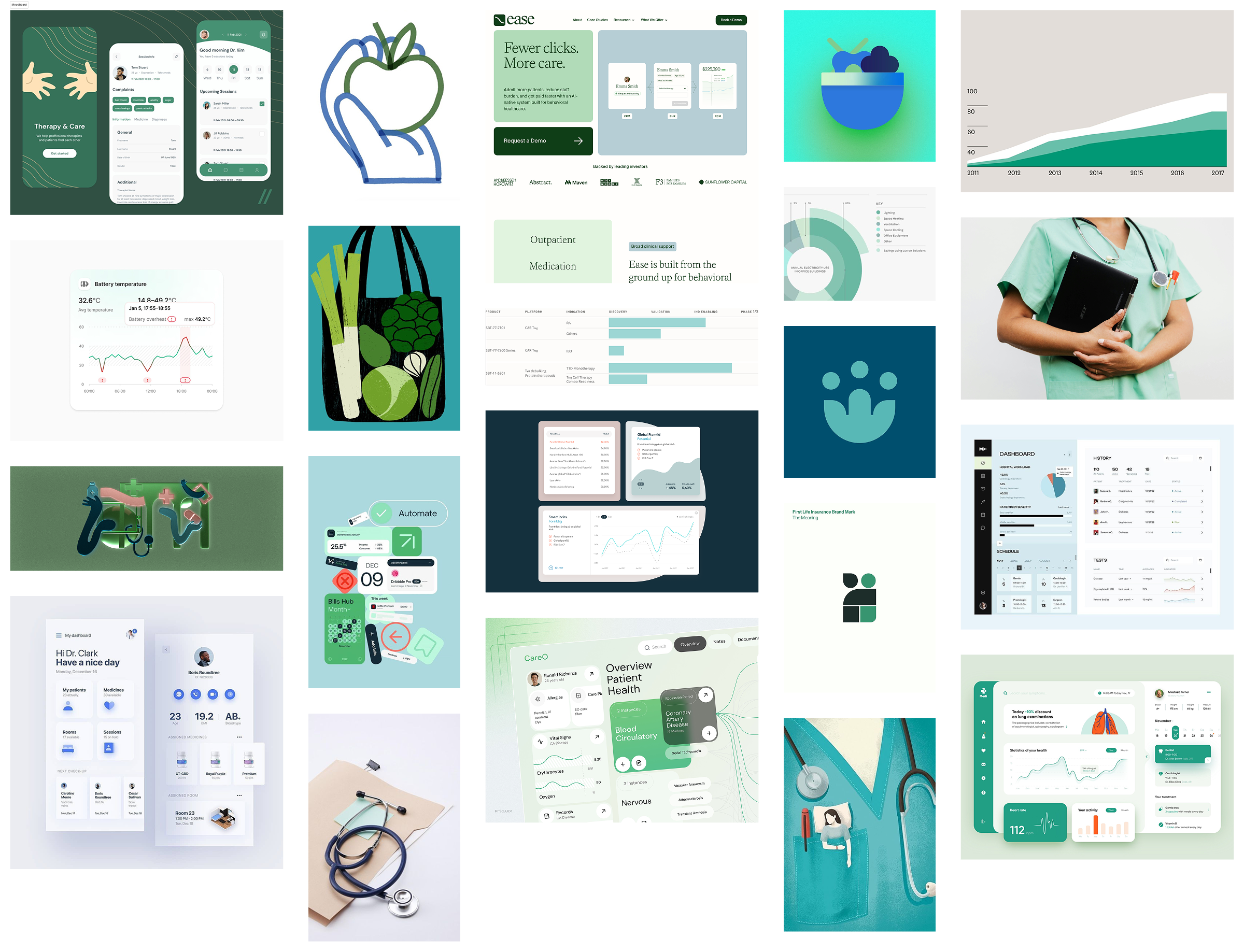
Ideation
To assist in brainstorming, I created a moodboard establishing the look and feel of the provider-side app.
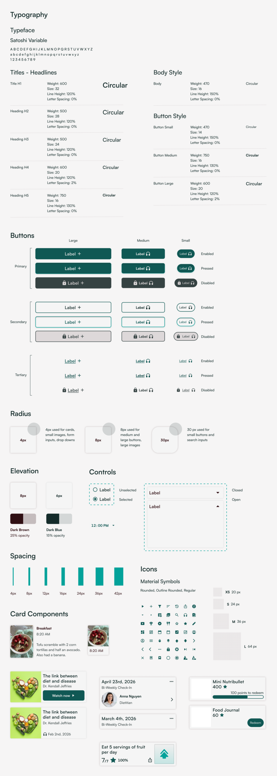
Design System
I based the design off of the design system created for the patient-side Circular app.
Select Hi-Fidelity Designs
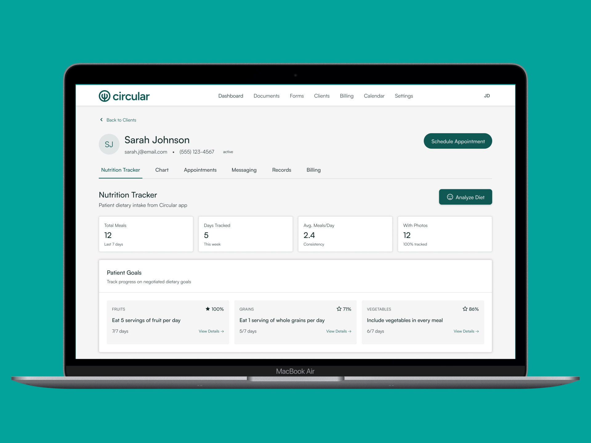
Client Overview
Client Goals
Dietary Analysis

Nutrition Self-Monitoring
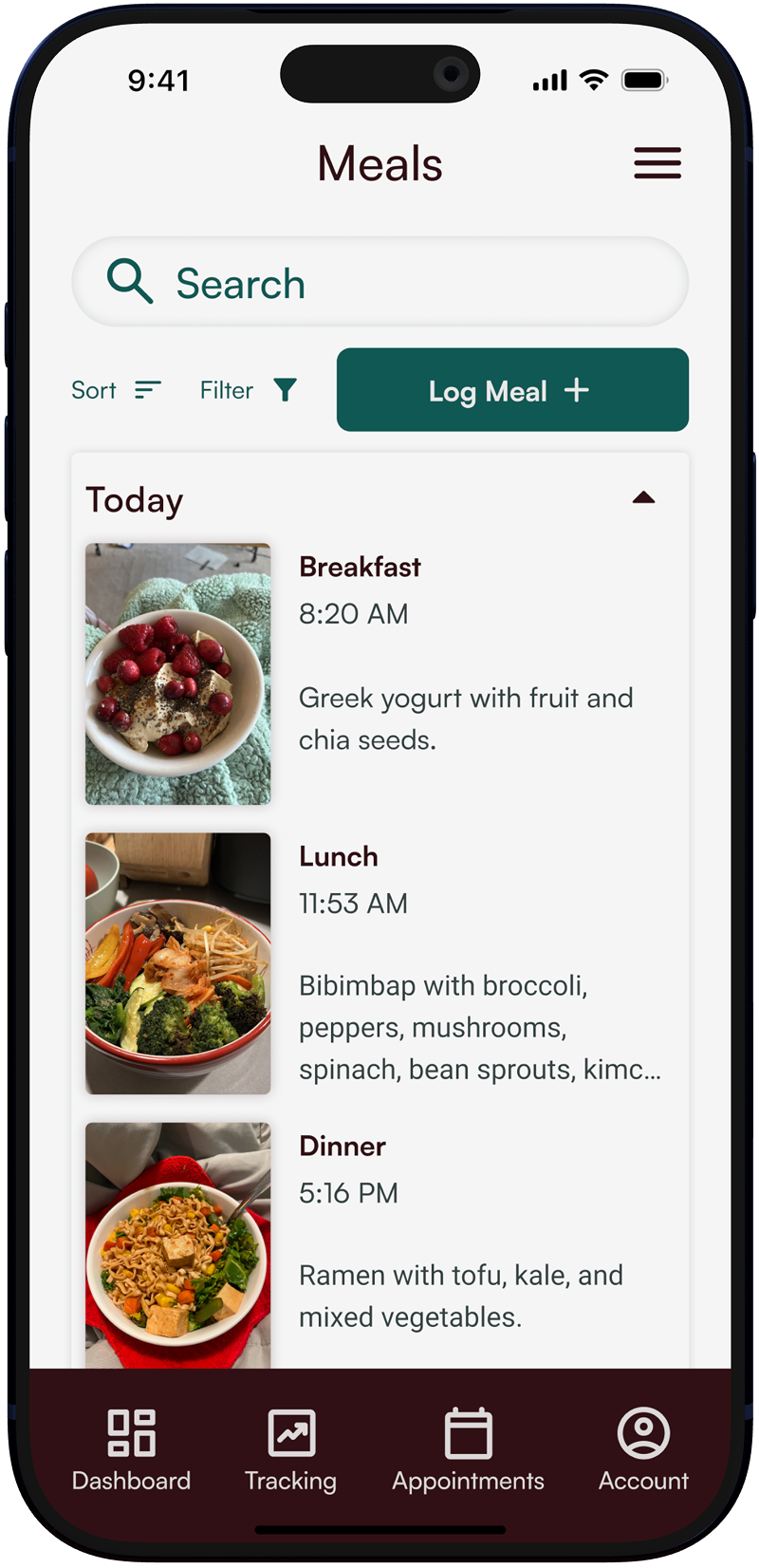
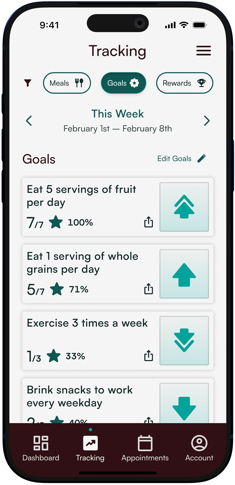
Using the Circular App, patients can log their meals and goals with simple, photo-based tracking.
Simplified Nutrition Analysis
The Circular portal analyzes patient data in real time, streamlining the dietary assessment process so providers can focus on patient care.
User Testing: Qualitative Results
Issues found in testing
Across the board, users struggled to find specific information. Users expected the back button on client profile page to return to the dashboard. The location of patient goals was not intuitive, as some users searched for them in the chart or dietary analysis pages.
User’s comments for the design
Users did like that information was readily available and the data was consistently labelled. Some labels were not clear, however, and some users found it difficult to navigate and understand the purpose of each page. Users mentioned that the minimal design seemed appropriate for the healthcare sector, and liked the ability to see the analytics of each goal.
Other user feedback
On the dashboard, users suggested making the view all clients button more prominent, as it was difficult to see at first glance.
Users also proposed adjusting the hierarchy of nutritional analysis results page, as health conditions, recommendations and insights are more important items.
Other recommendations included adding quick access buttons for editing patient appointments and creating a traditional calendar layout for the calendar page.
User Testing: Quantative Results
Average SEQ score
"On a scale from 1 to 7, where 1 is very easy and 7 is very difficult, how would you rate the difficulty of this task?"
Task 1: Check a client’s meal history to assess whether they are meeting their goal of adding vegetables to all meals.
Average score: 4
Task 2: View nutritional analysis of patient dietary intake.
Average score: 4.2
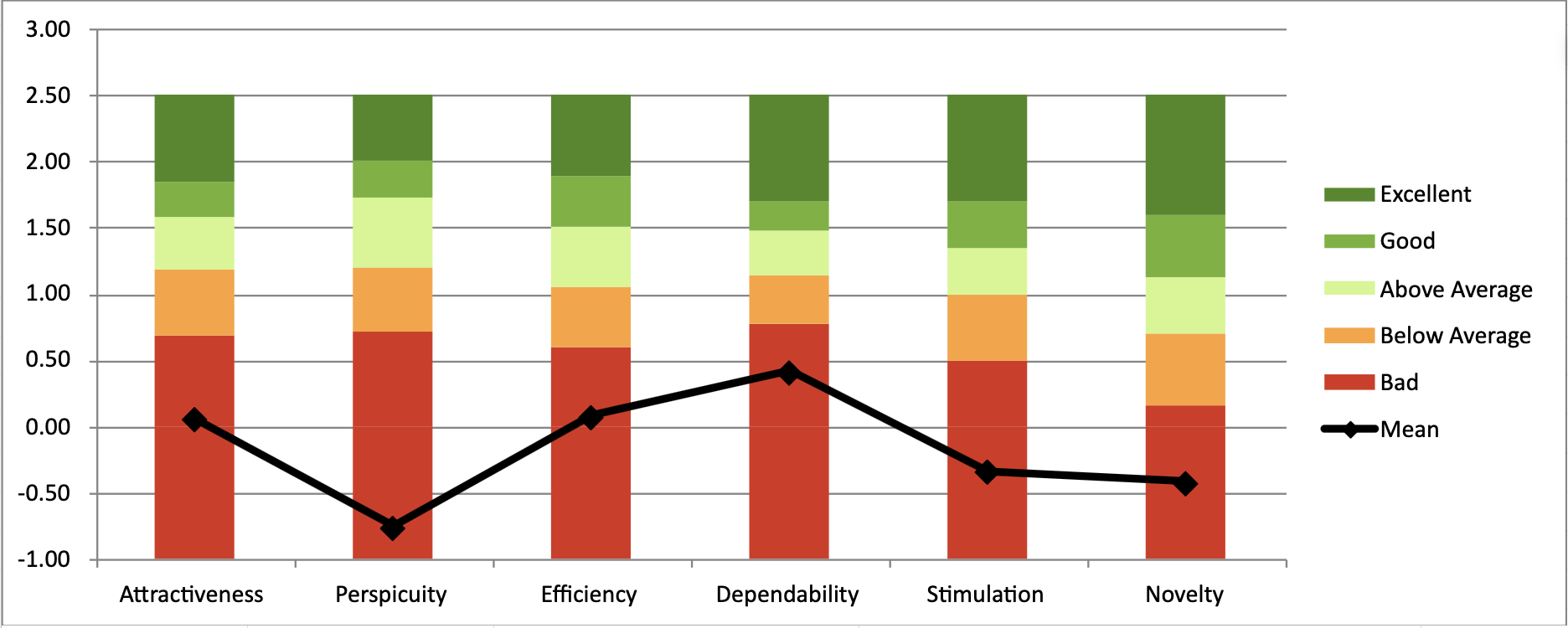
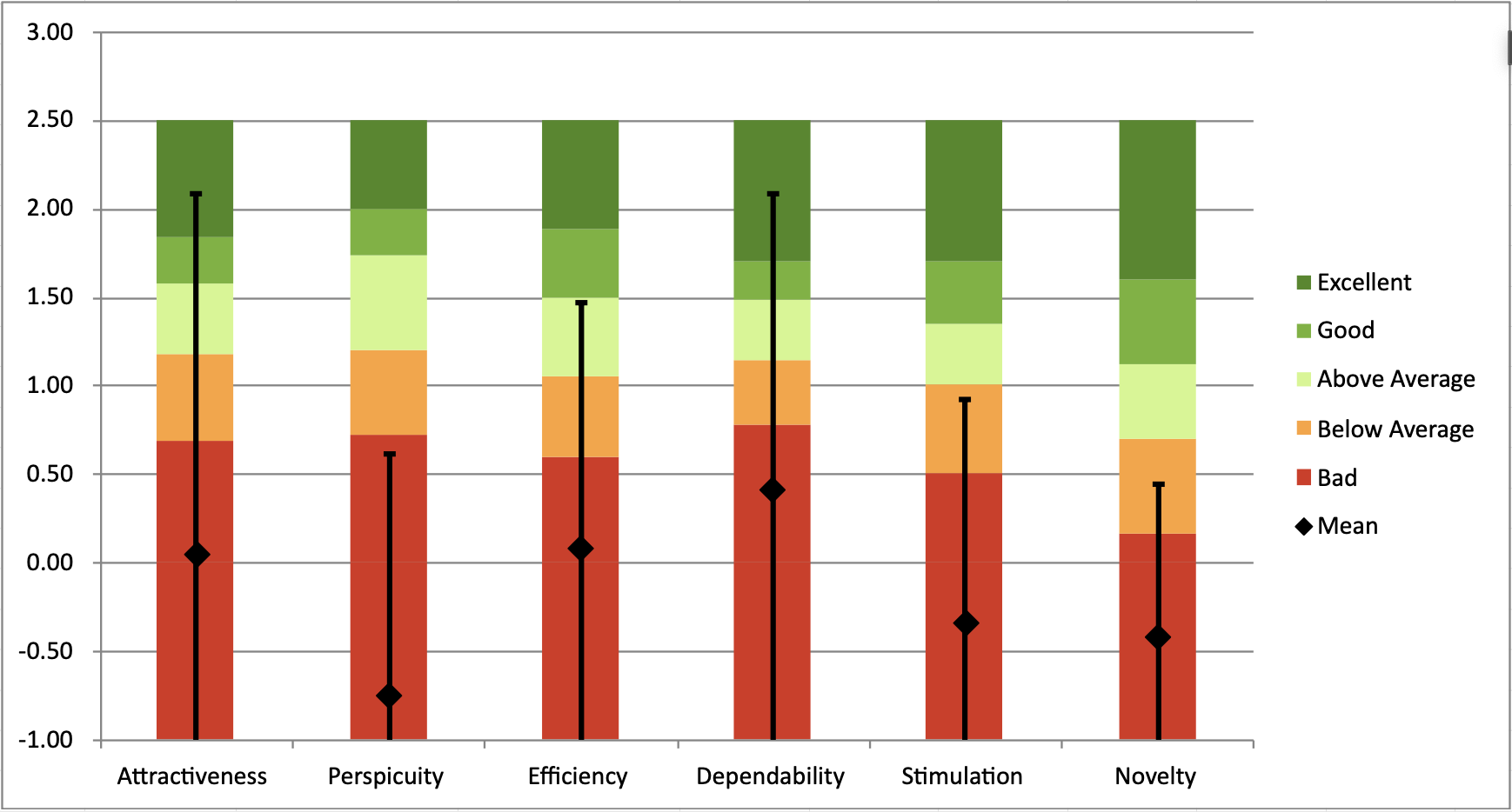
User Experience Questionnaire Results
The user experience questionnaires had a wide range of data, with the highest score in dependability and the lowest in perspicuity.
Next Steps
- Reassess overall information architecture
- Adjust hierarchy of information on nutritonal analysis page
- Make tabs and nutritional analysis buttons more prominent
- Additional Testing
Check out the site here.
Selected Works