SF 2435 is an Iowa law enacted in May of 2024 that bans DEI in higher education, part of a wider movement against DEI nationwide. The repercussions of SF 2435 have hit close to home to many students, as the community spaces of minority students have turned into a legislative and cultural battleground.
Controversy and misunderstanding surrounding the bill reverberated on campuses throughout the state, culminating in clashes between student protestors and counter-protestors as students at Iowa State called for the Board of Regents to prevent restrictions against campus resources for marginalized students.
In order to help quell misinformation, I chose to explore the subject through a poster in the International Typographic Style in order to simply and effectively communicate the facts around the issue to students.
I started my research by reading over the law in full, specifically the parts that impact DEI in public universities. This helped me understand the issue without any outside bias. Then, I investigated reporting on recent student protests, reactions of other Iowa universities, and statements from Iowa State and the Board of Regents. Through this process, I crafted a clear and concise message illustrating the most essential information relevant to ISU students.
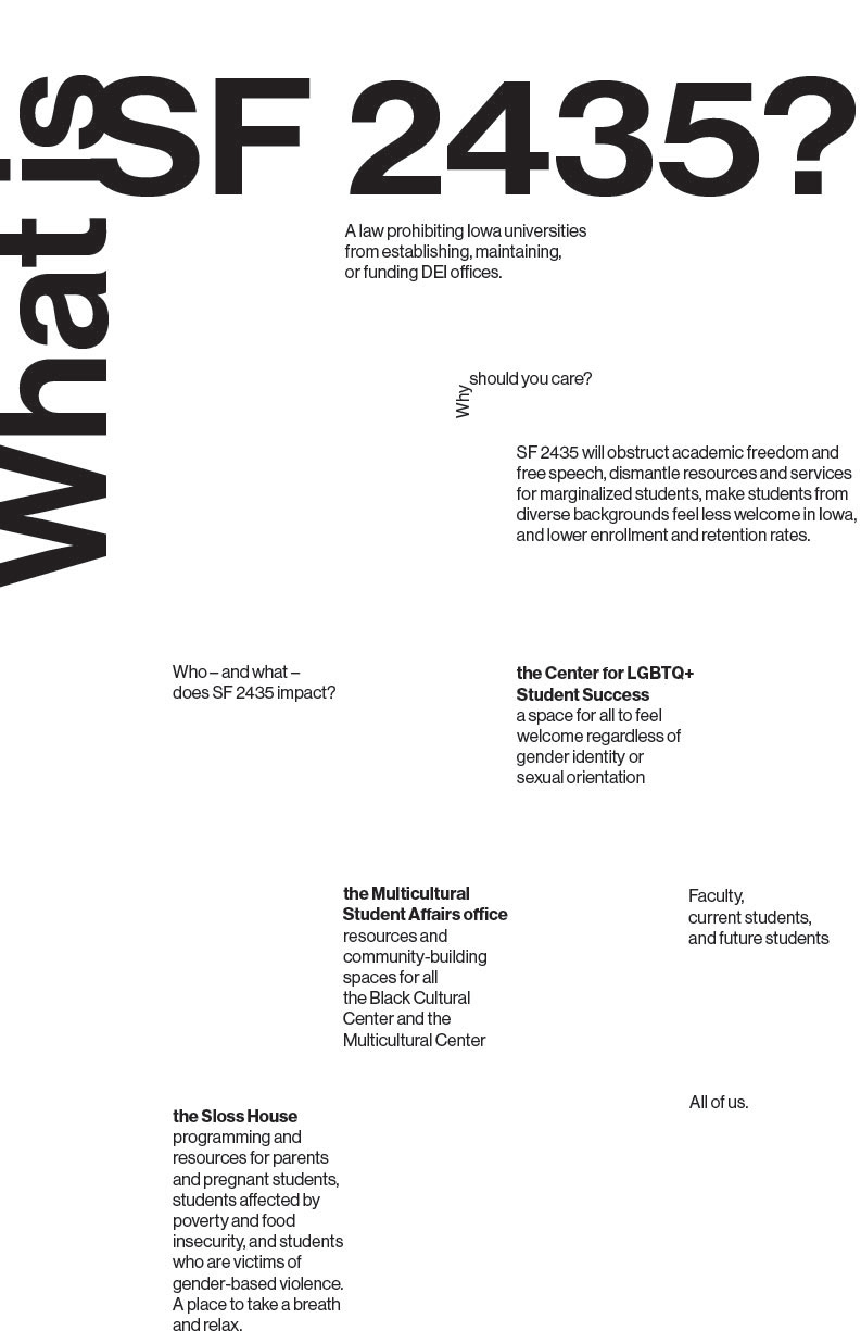
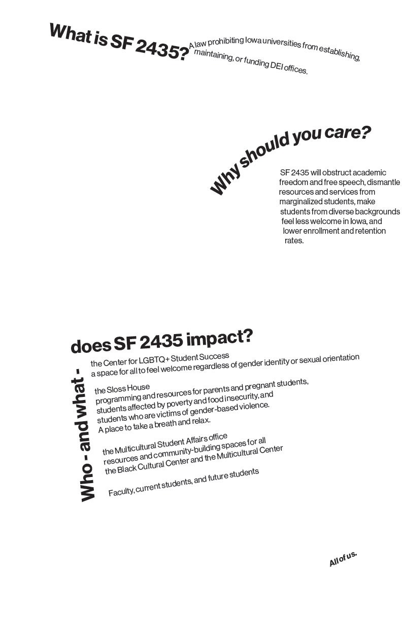
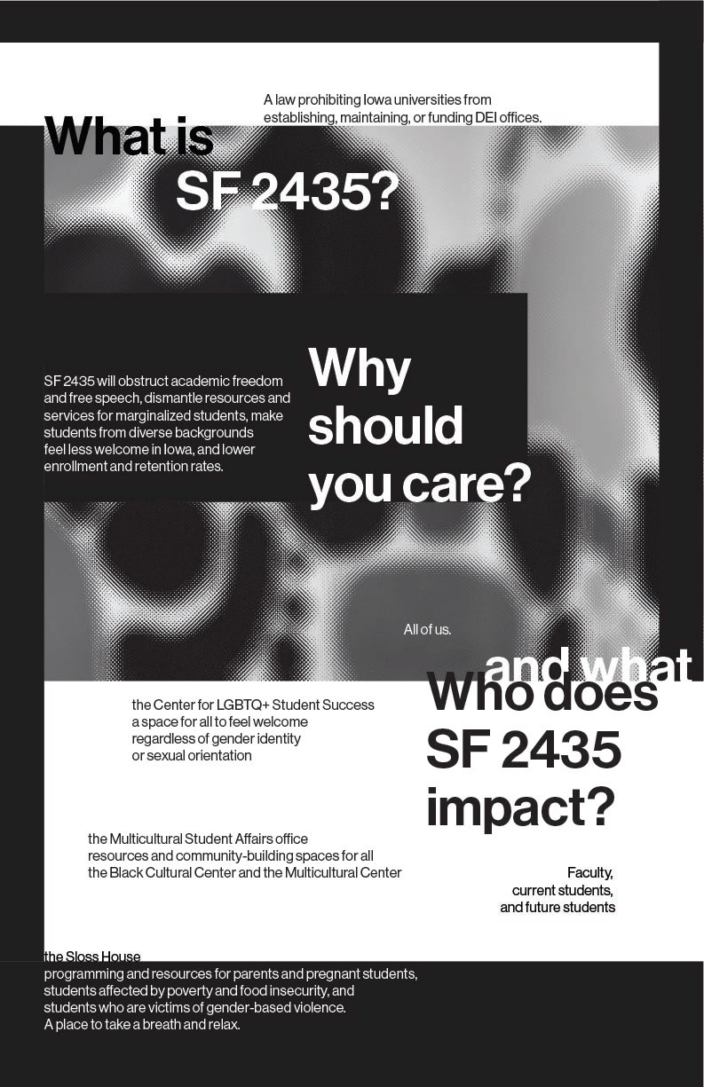
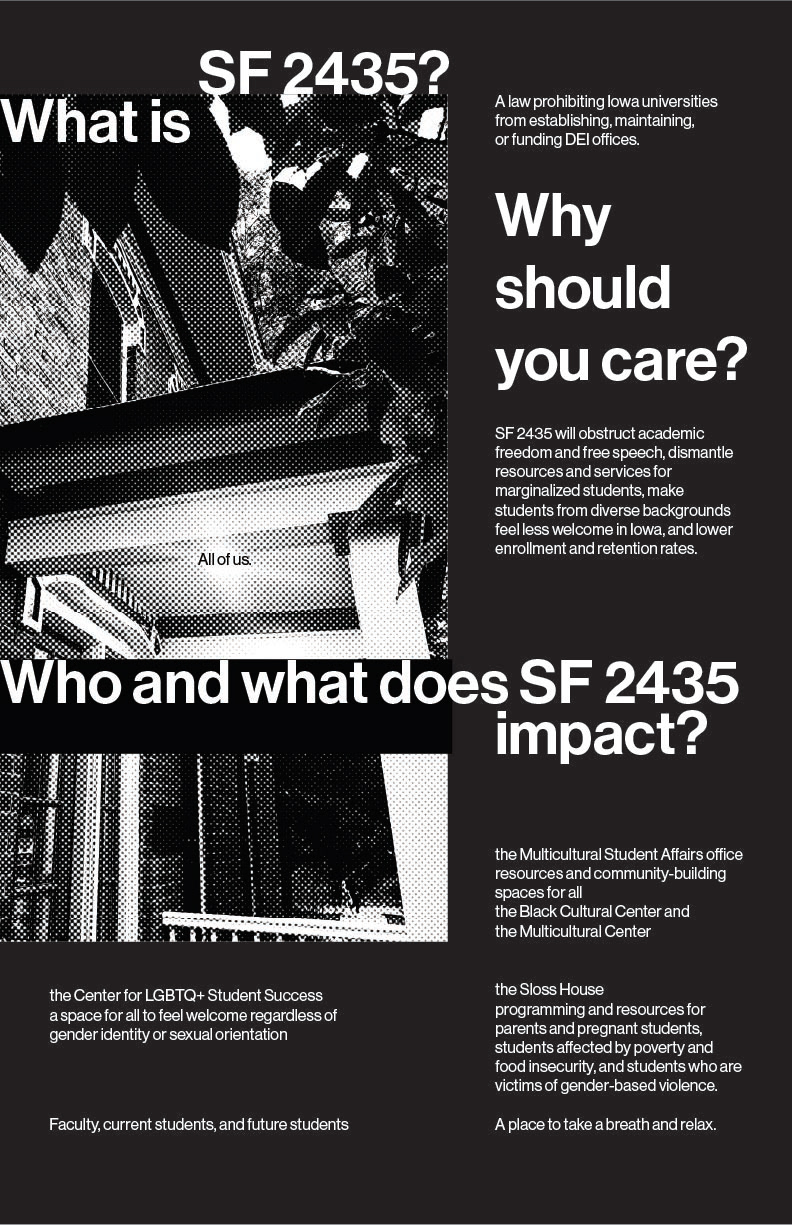
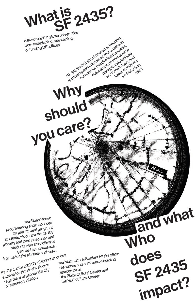
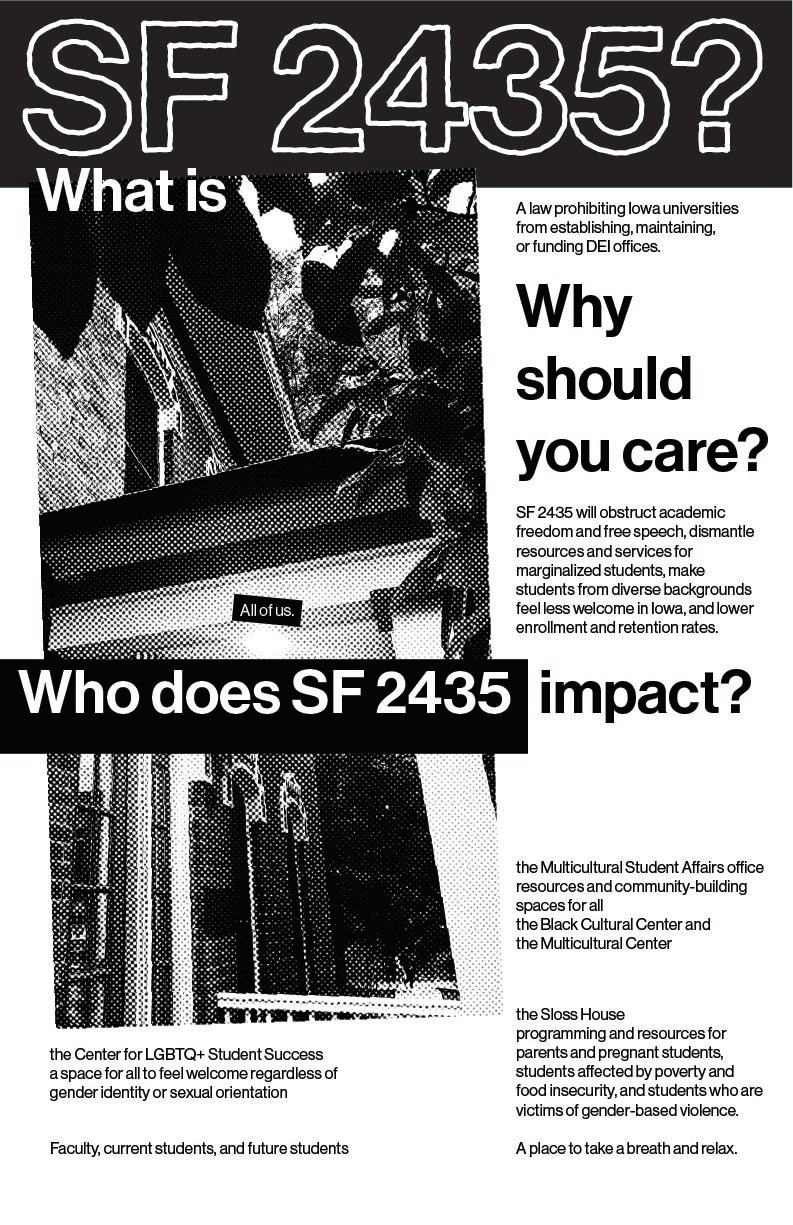
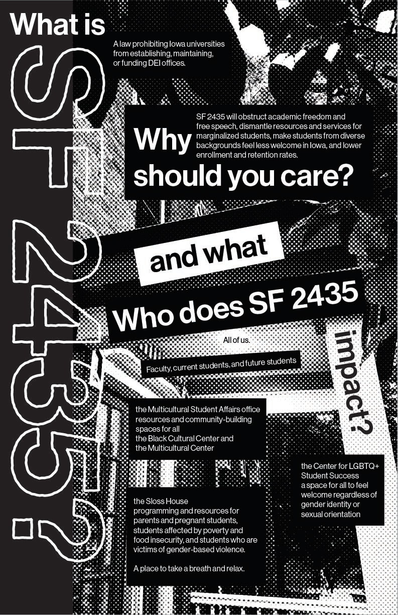
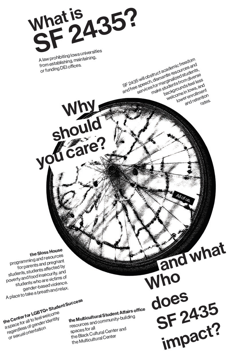
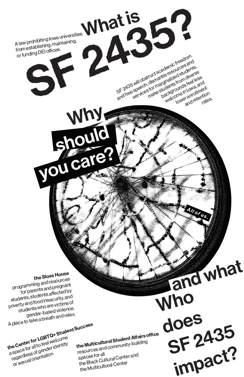
My project underwent significant visual, textual, and conceptual evolution throughout the various iterations of the design.
In my explorations, I used several different images related to Sloss House, a key location in the initial poster concept, for photographic grids and utilization within my design. I landed on an abstraction of a bicycle wheel, a collaborative art piece hanging in Sloss, as a focal point of the poster, in order to center the ideals of community and diversity at risk due to SF 2435.
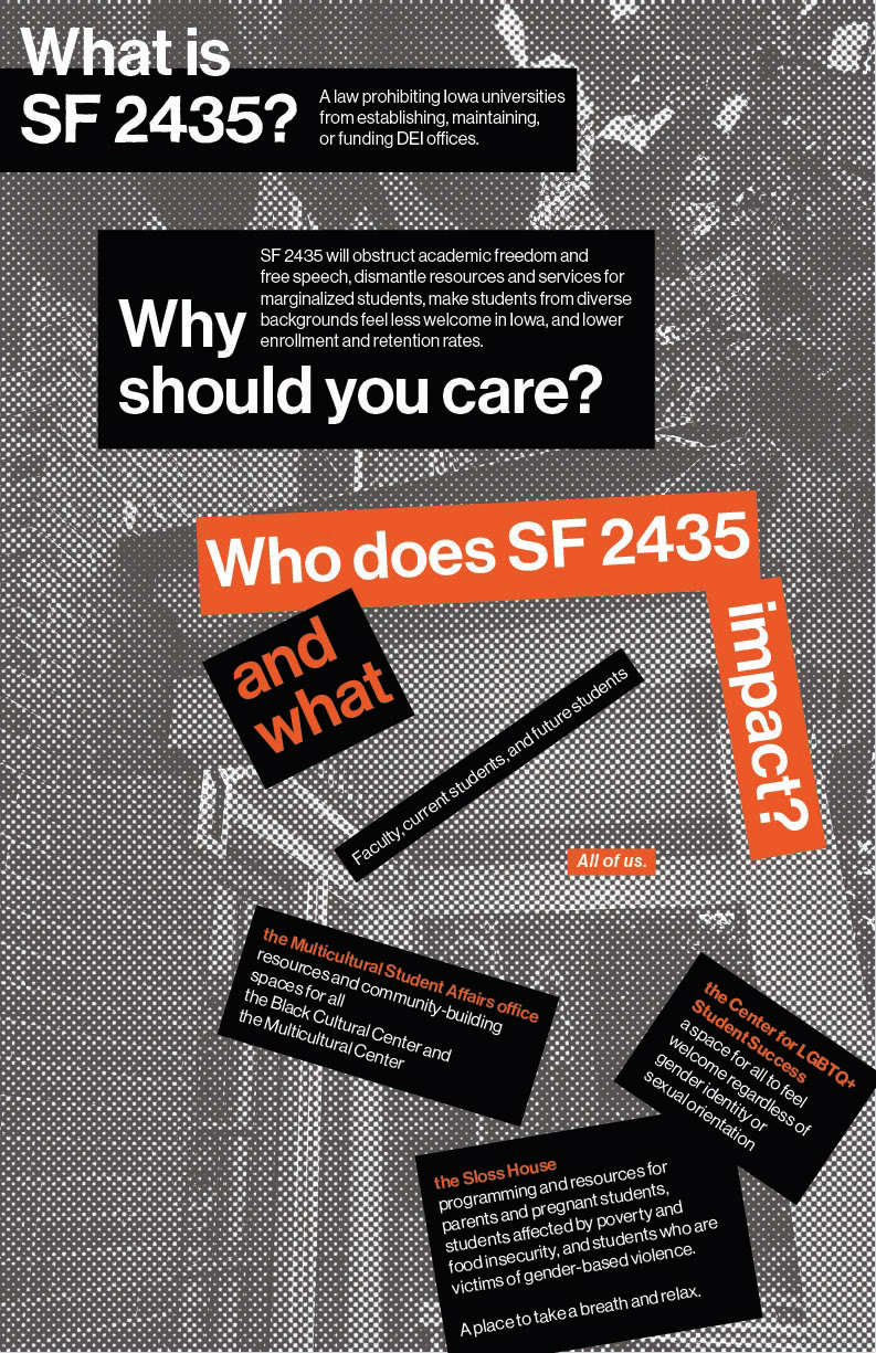
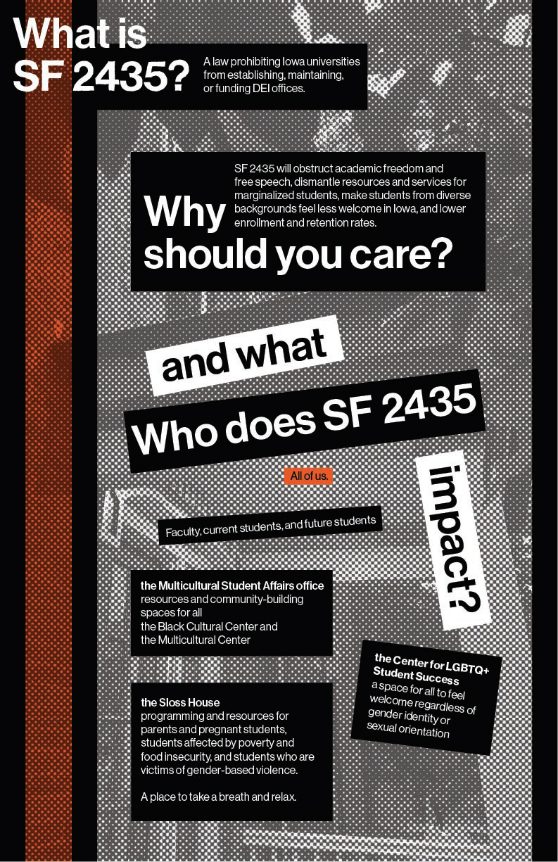
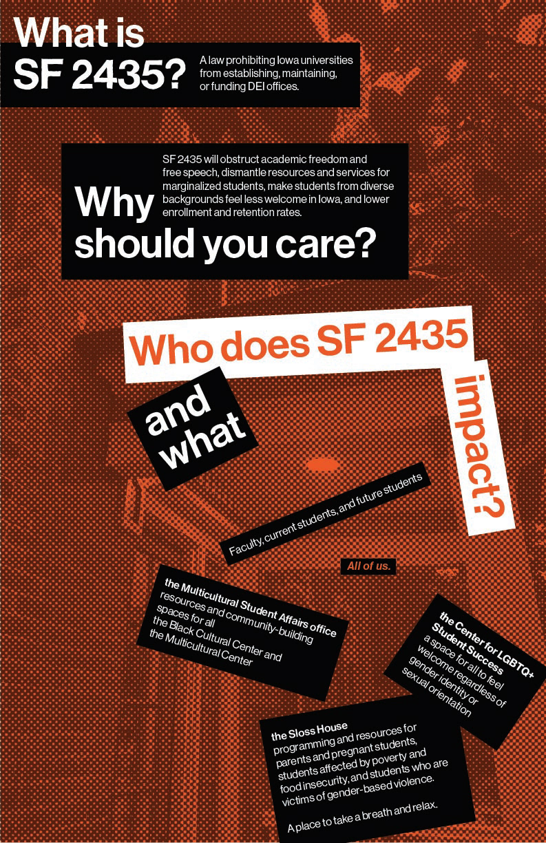
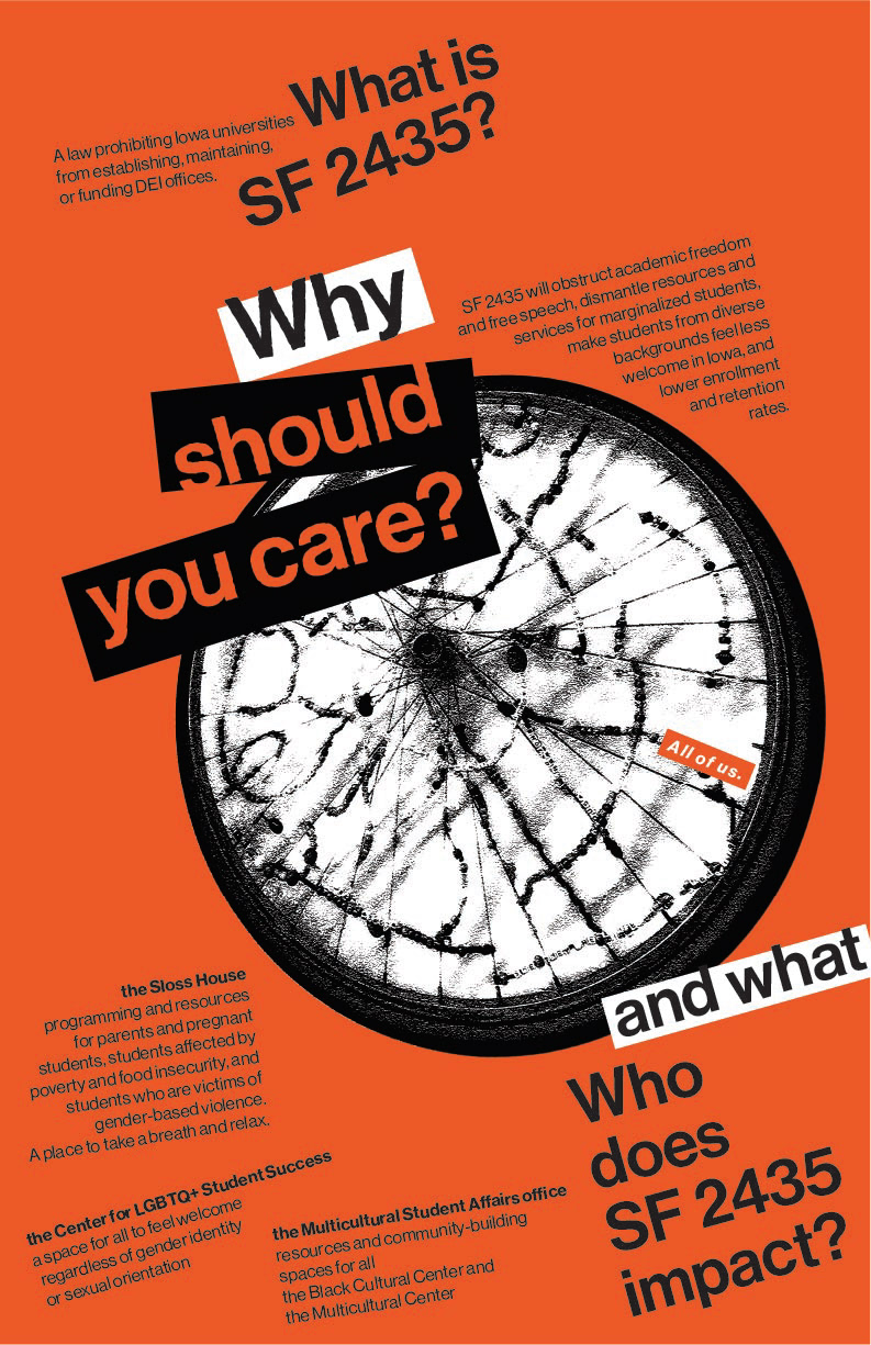
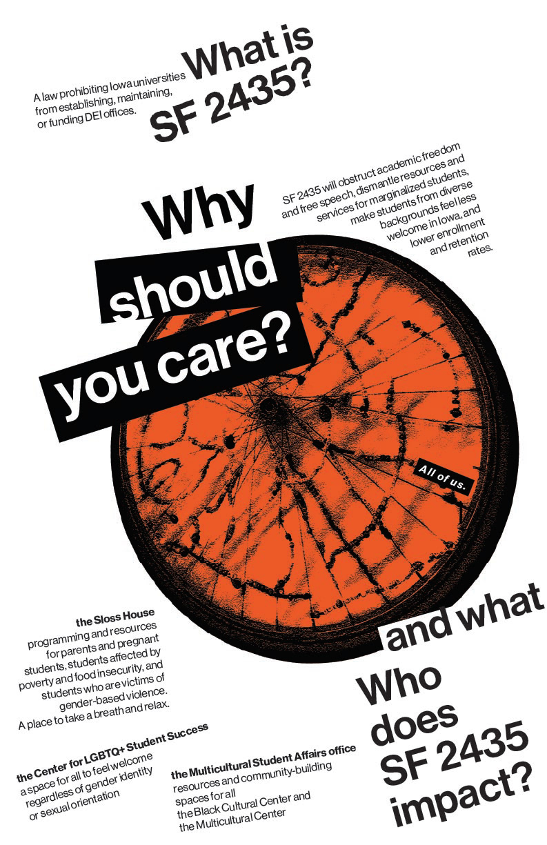
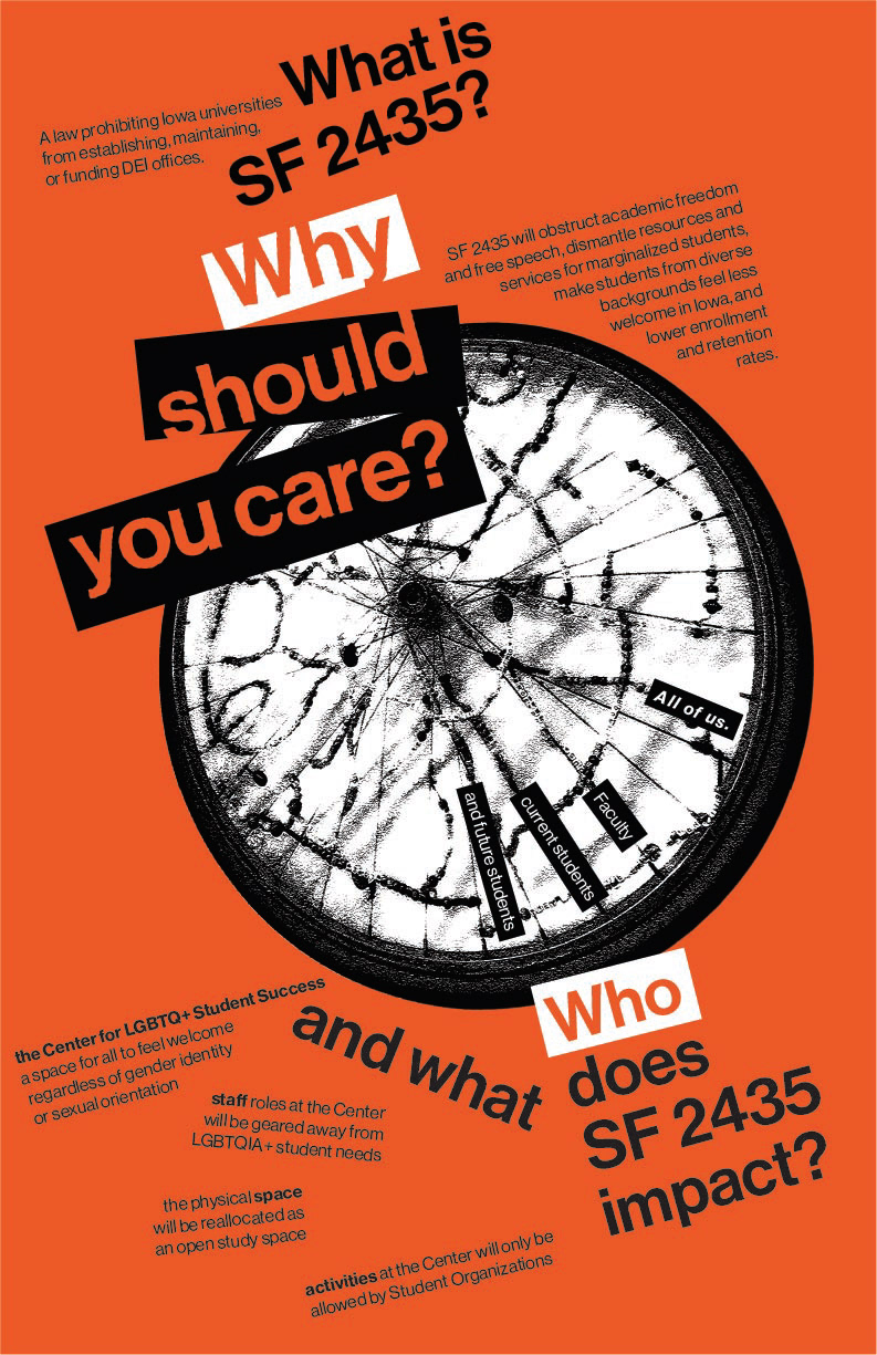
The selective use of white highlights on orange text as well as variations in proportion generated further levels of hierarchy indicating key textual information. The use of these black and white blocky highlights is inspired by stensils and graffiti art, connecting back to the grassroots efforts of student activists protesting this issue. Additional visual inspiration includes the rough cutout style and selective color displayed in the work of Saul Bass.
The elements of Swiss design and the International Typographic Style served as guiding principles throughout my design process. The use of a photographic grid based on the bicycle wheel helped to unify and ground my design, creating cohesion between the visual and textual elements in the poster.
The grid also established a context of balance and alignment which I could consciously break from in order to create feelings of tension, instability, and disjointedness.
The grainy textured black and white image, stark against the bright orange background, leaves the viewer unsure yet intrigued. The radial spokes and off-centered placement simultaneously create rhythm and tension. The use of bright orange helps to bring attention to the critical nature of the issue, and illustrate the harm eliminating DEI at Iowa State has on us all.