This series centers around the idea of extracting and abstracting letterforms to create compositions. In these explorations, I developed a foundational understanding of typography down to its most basic structure.
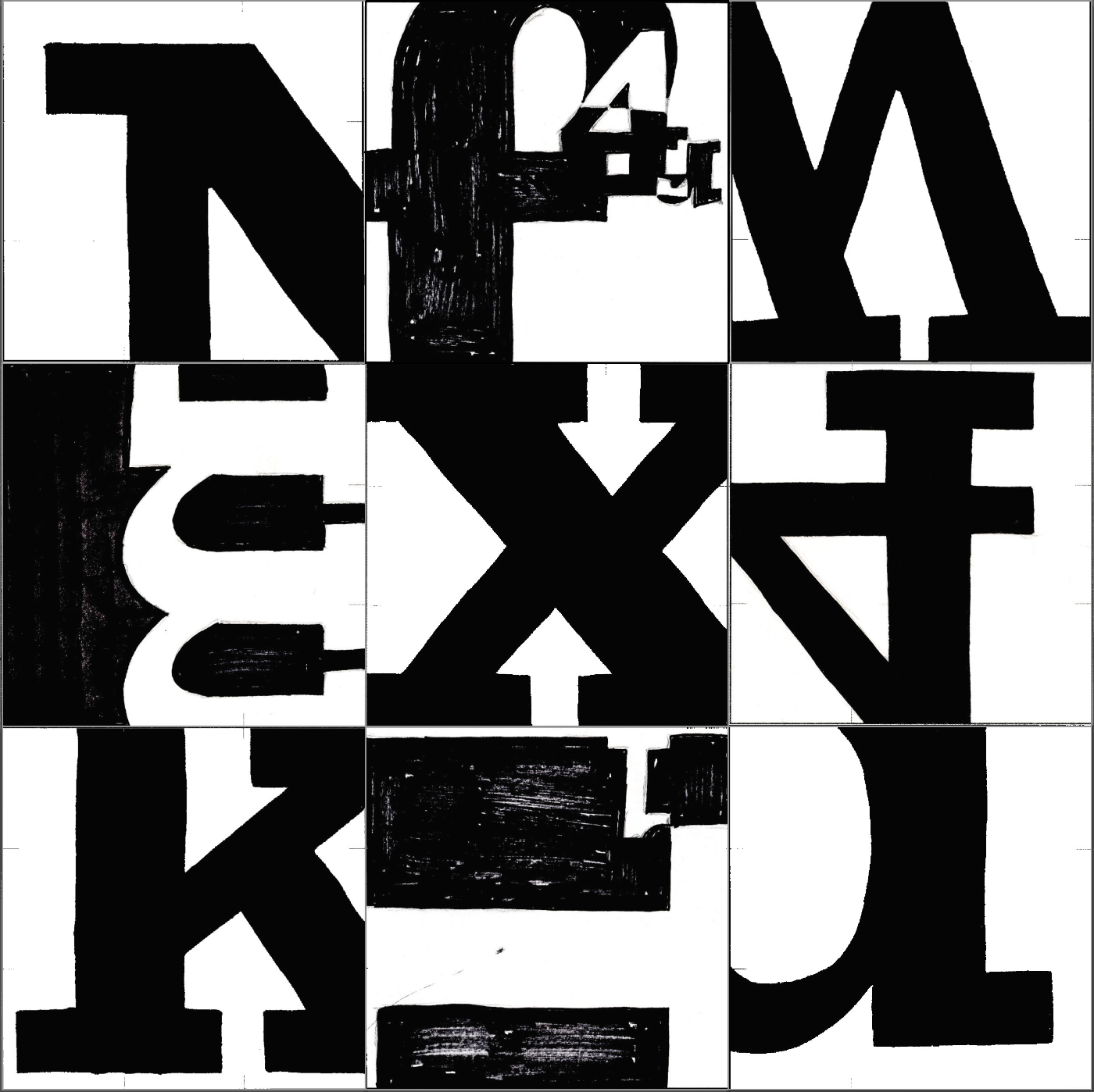
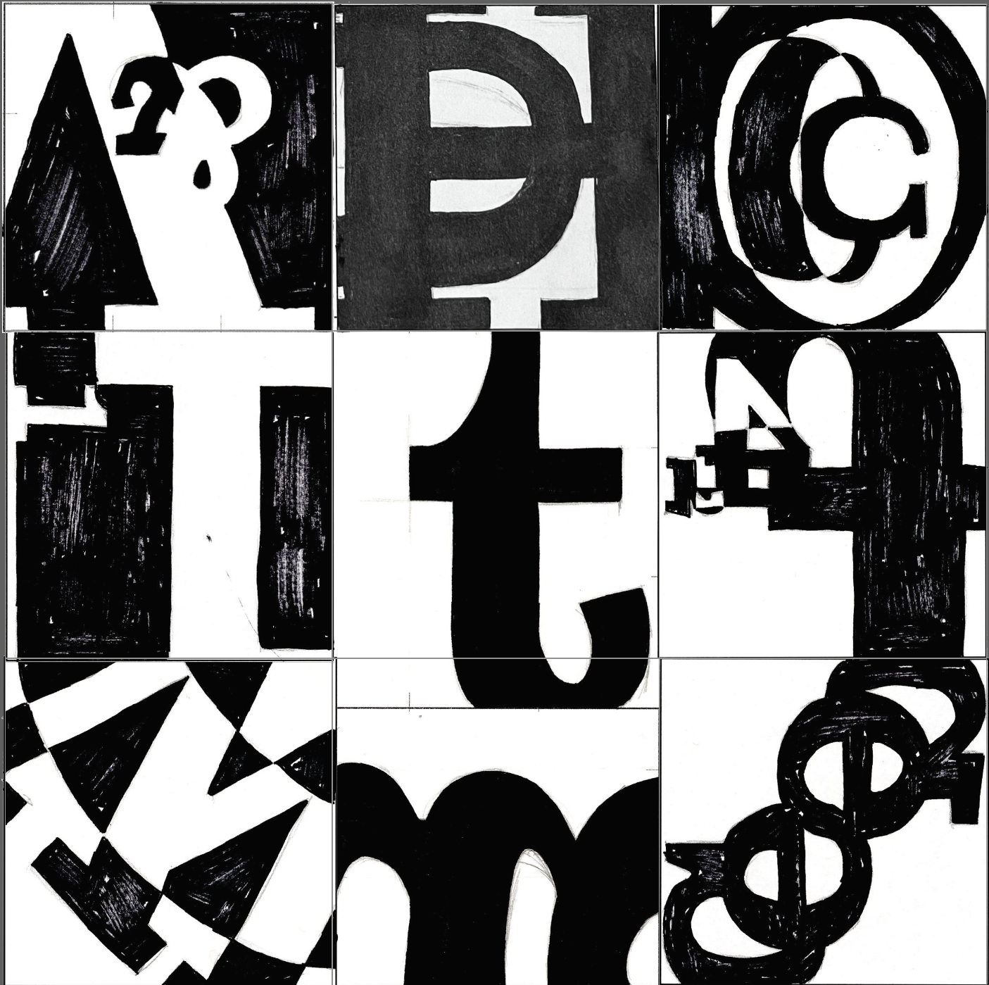
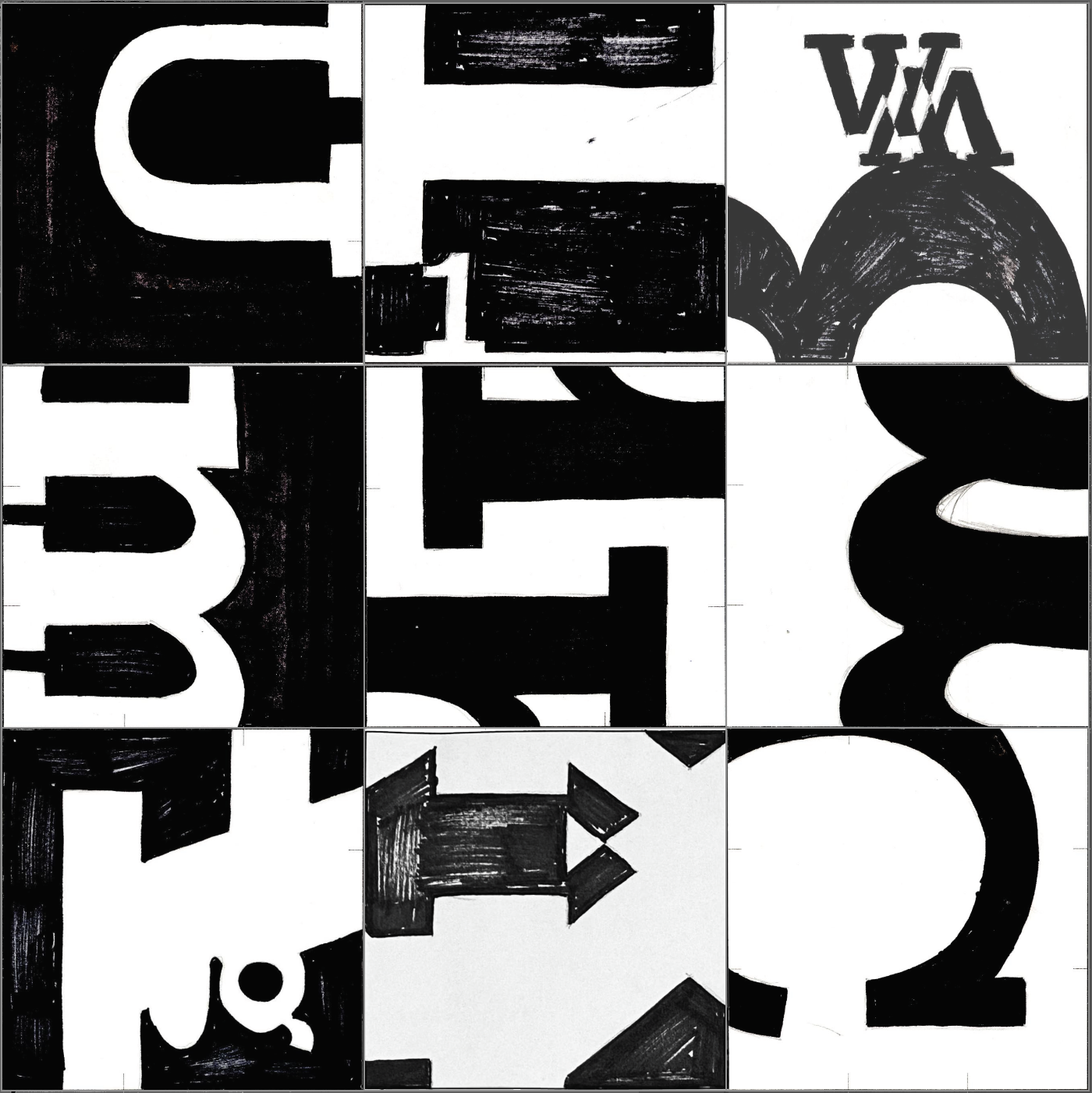
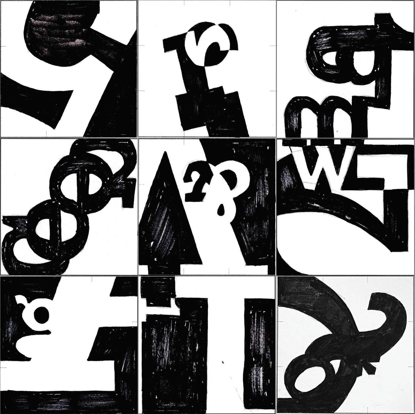
I began with singular squares based on a single letter, zooming into a single letterform to build the foundational skills of sketching typography. I then expanded the scope to combining different squares to create overlapping relationships between letterforms, exploring the ways in which they can interact. I then arranged the best of these typographic squares into four unified compositions, focusing on leading the eye around the page.
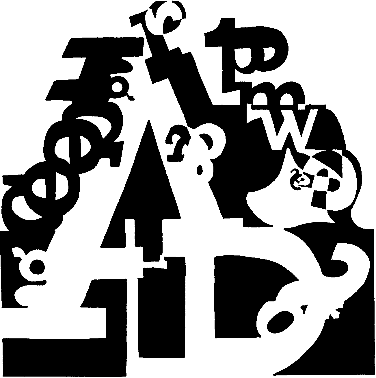
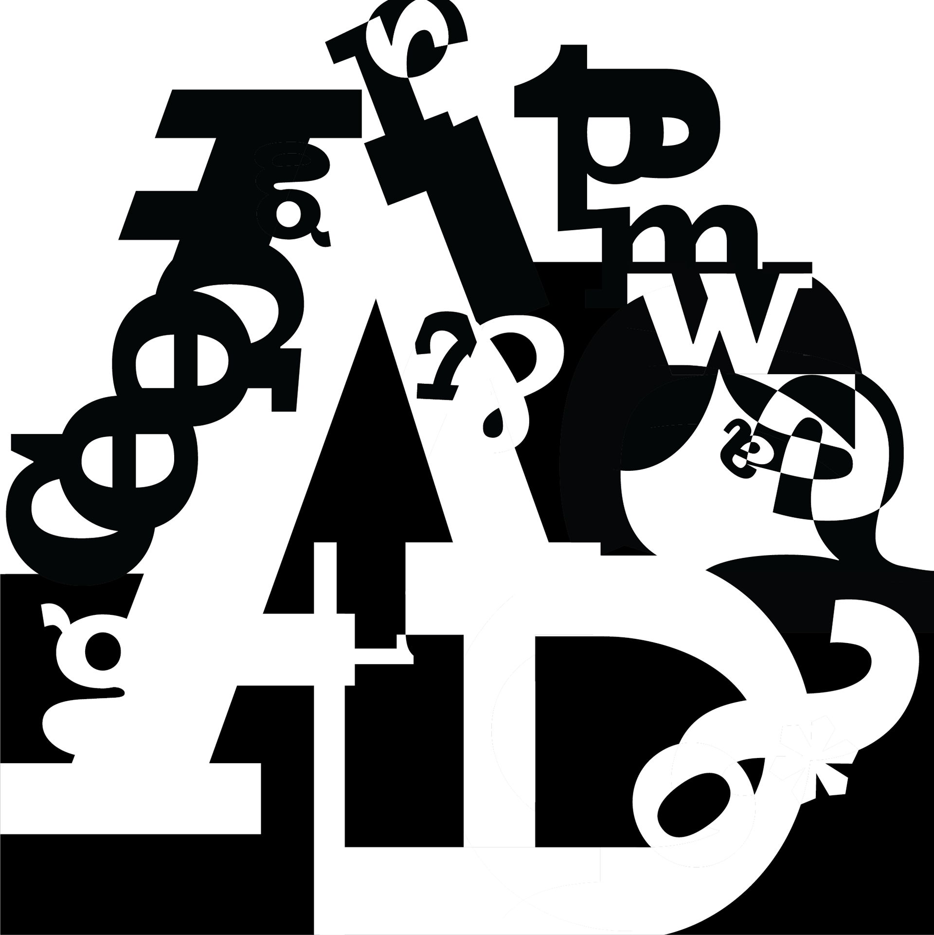
Selecting one composition for further exploration, I broke the borders of the square and combined each of the elements to create a cohesive plate. Additionally, I focused on creating movement and direction in order to direct the viewer towards a focal point. This design became the foundation for a type specimen poster advertising the typeface I selected.
First working on paper, I focused in on select areas of my plate, exploring various compositions for the poster. Originally, I considered several different layout options, including a radial grid, and a few other options I explored later in Illustrator. I’ve also included notes on the typeface history.
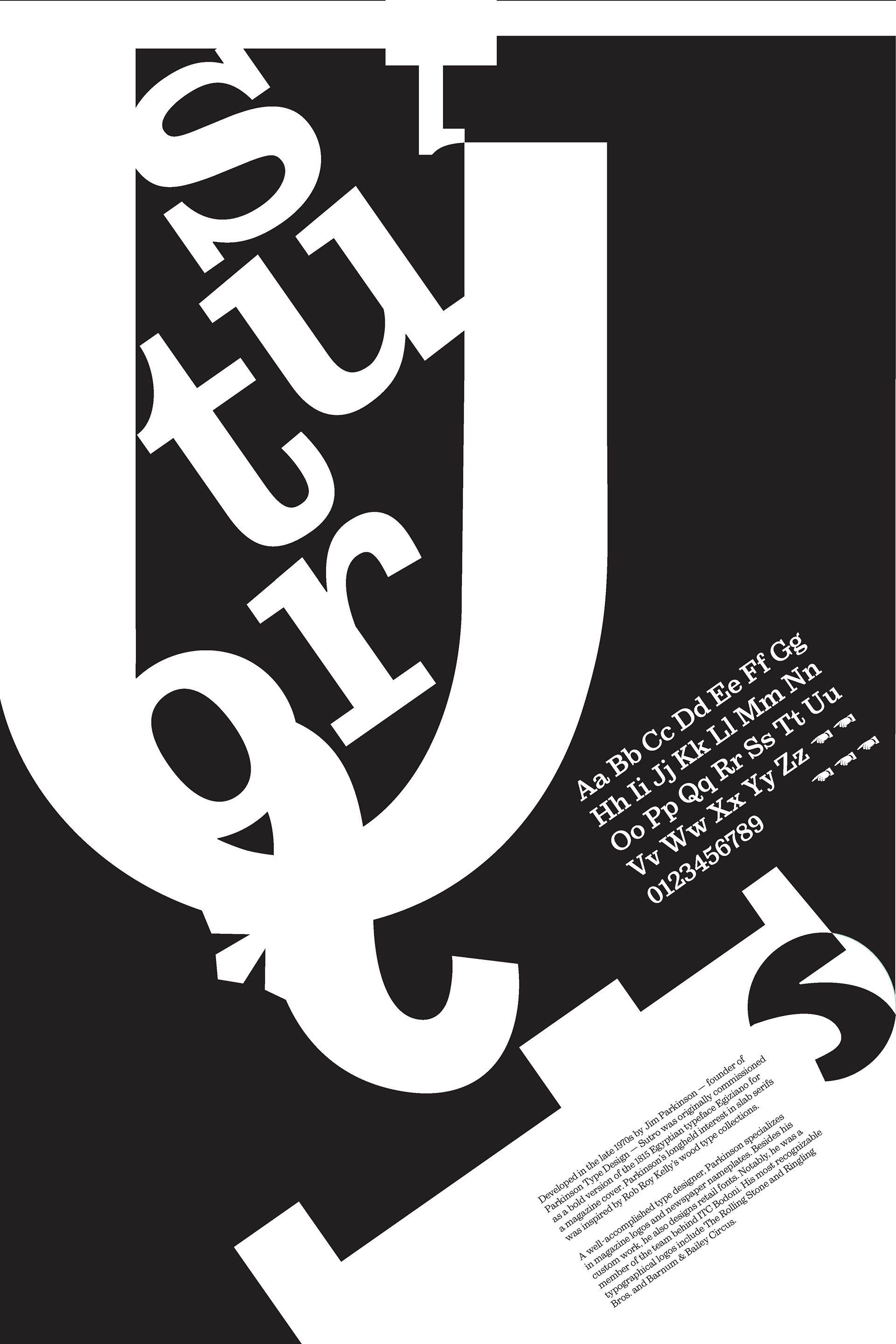
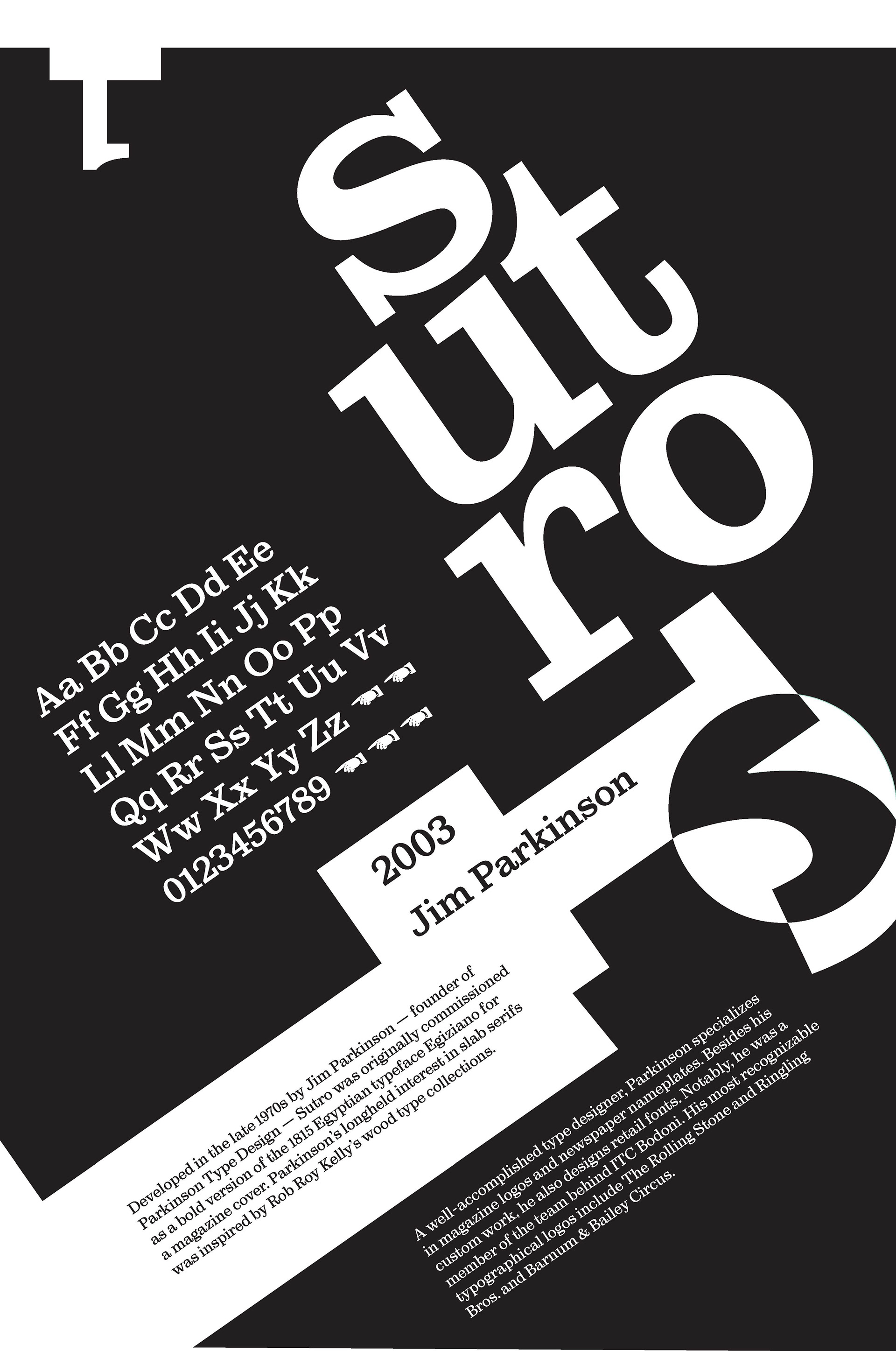
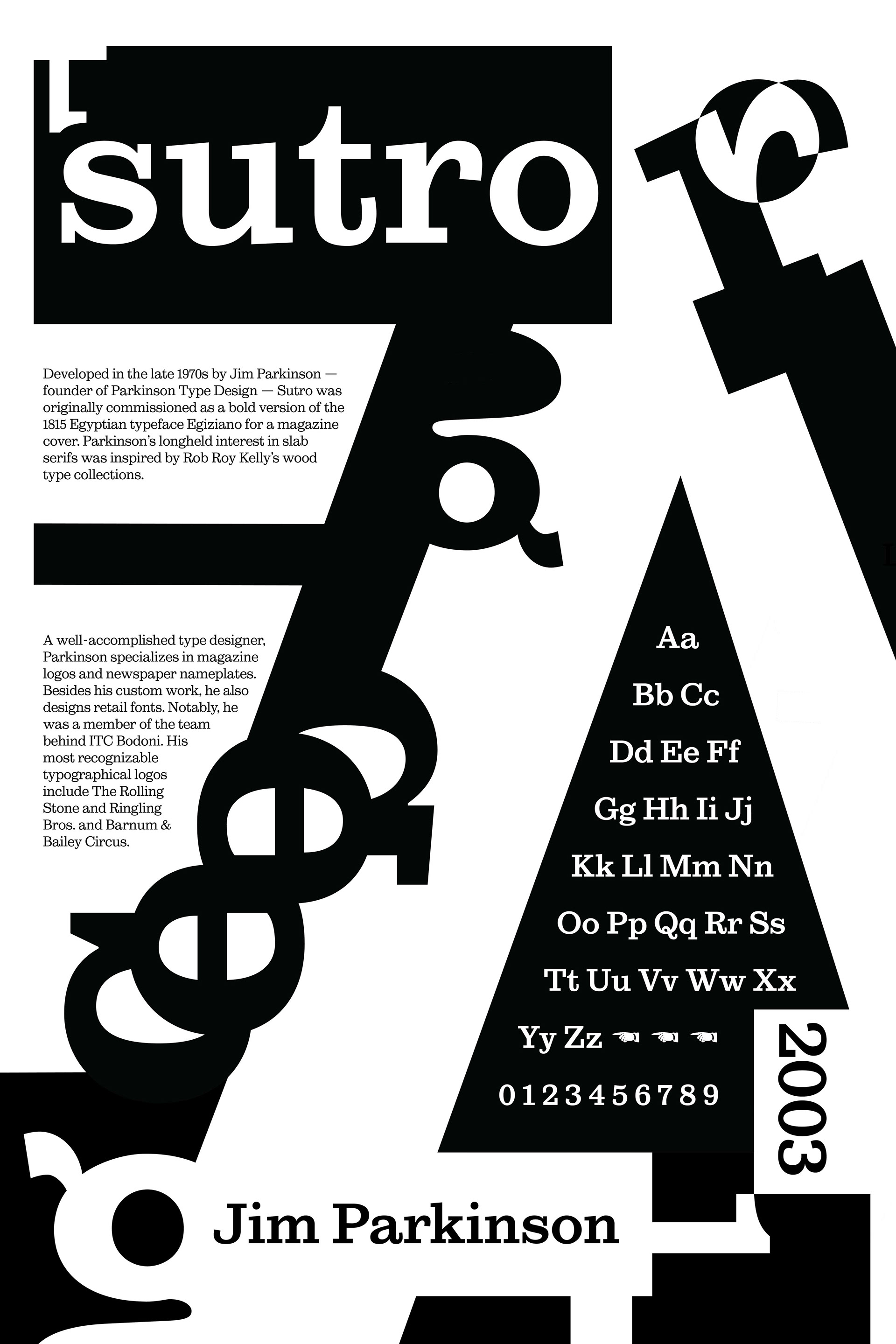
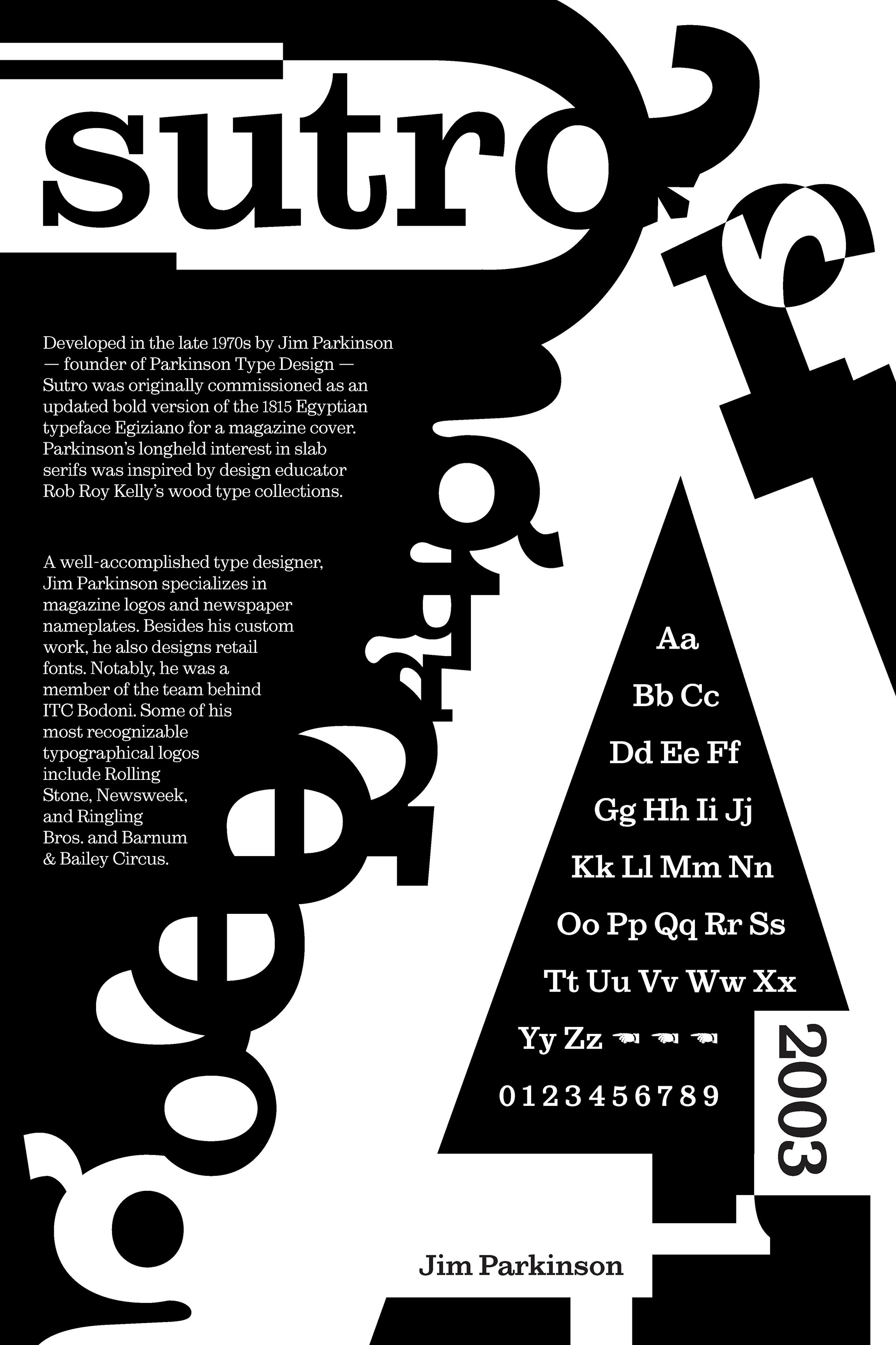
These selections show the progression of the design from the first to the final draft. In my process, I made iterations that focused on improving the legibility of the title, establishing hierarchy, and abstracting letterforms to create organic shapes.
I ultimately went with a cropped version of the ‘A’ shape from exercise 2, creating a hierarchy that centers the alphabet and directs the viewer toward the title of the typeface.
In the final design, I made additional changes related to alignment, eliminating unnecessary elements, balancing white space, and clarifying the hierarchy.