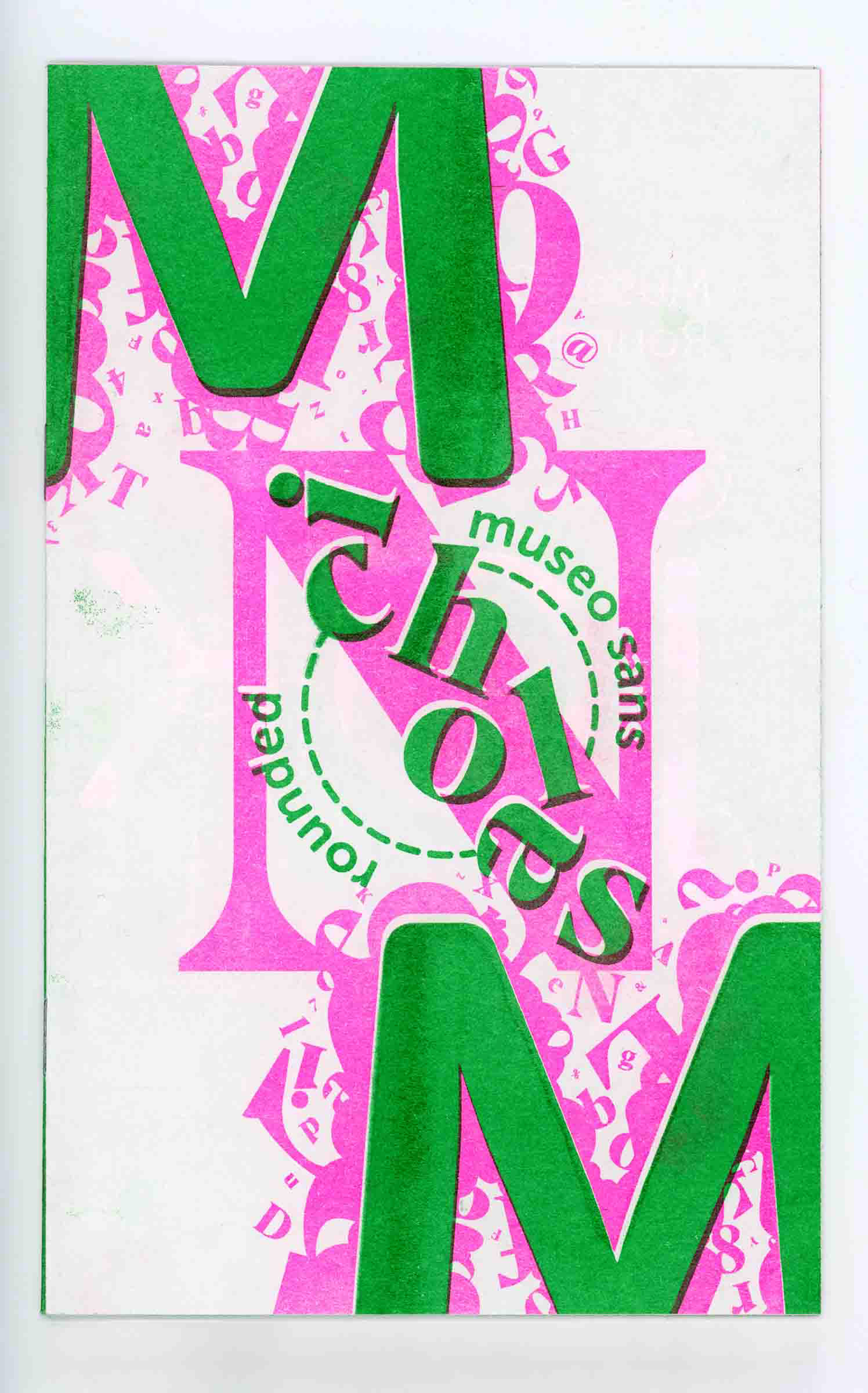
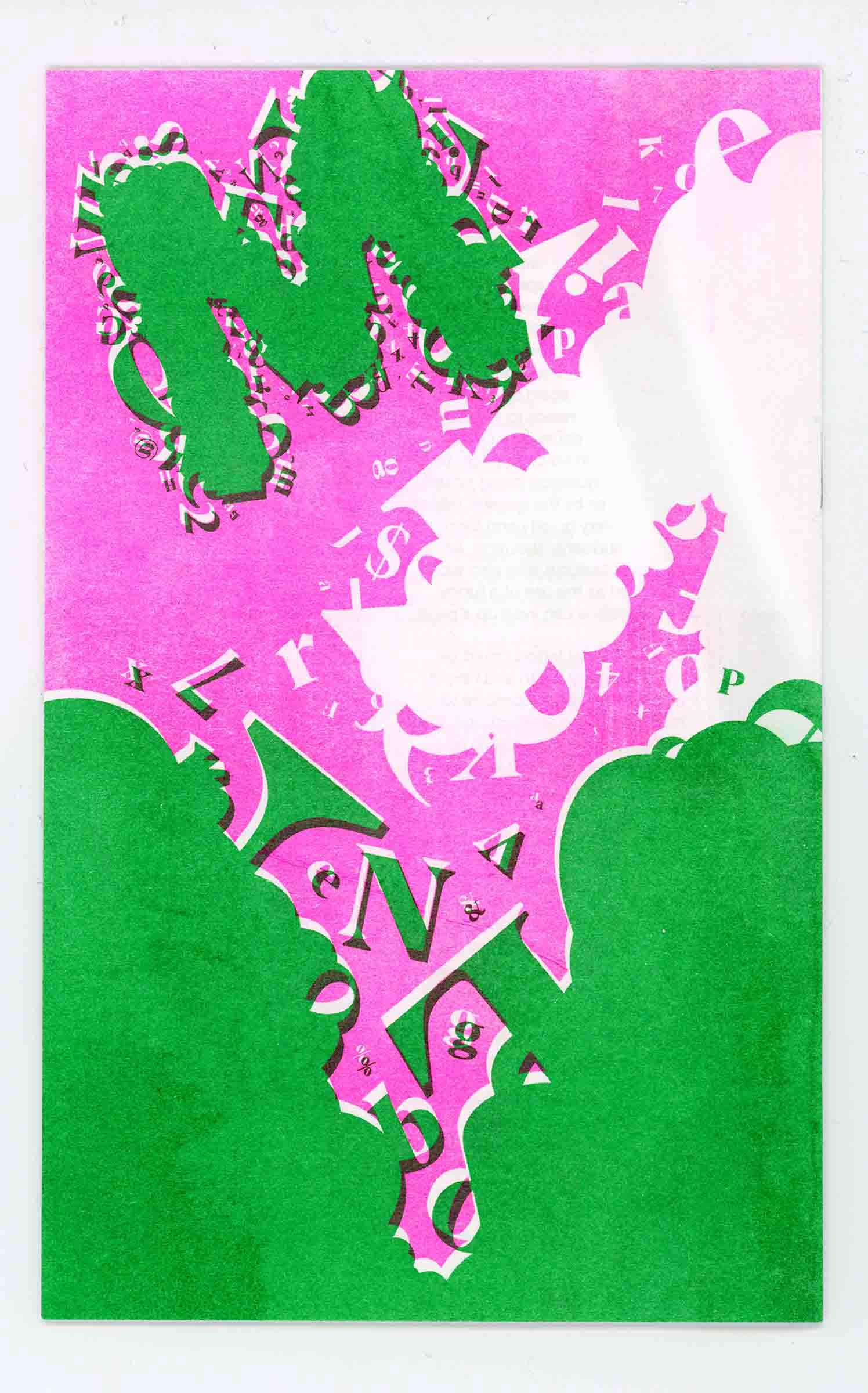
This project is a concept for a booklet showcasing the pairing of two typefaces, as commissioned by Adobe Fonts. The goal was to market the typefaces to designers and printers by highlighting their applications, capabilities, and typographic features.
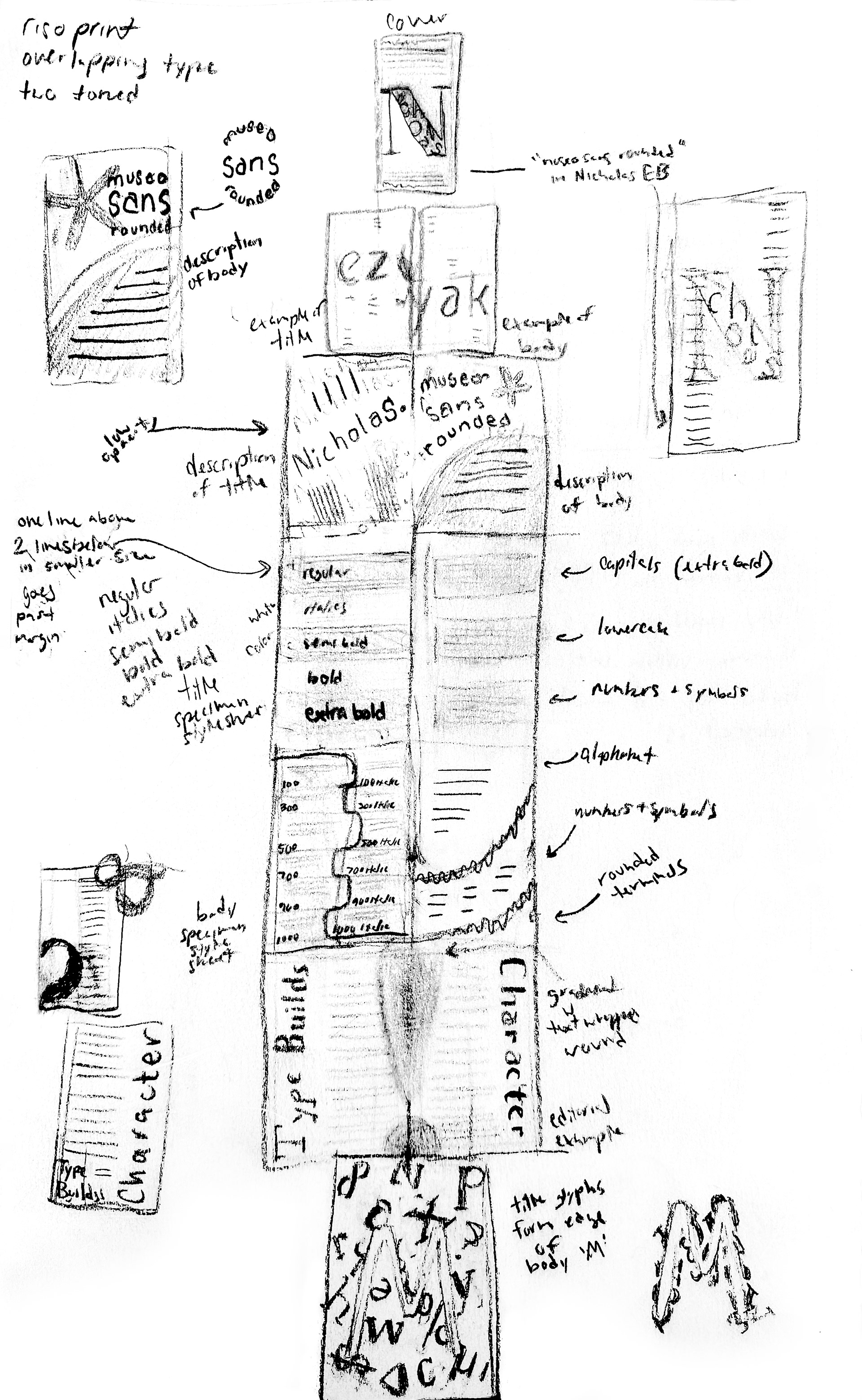
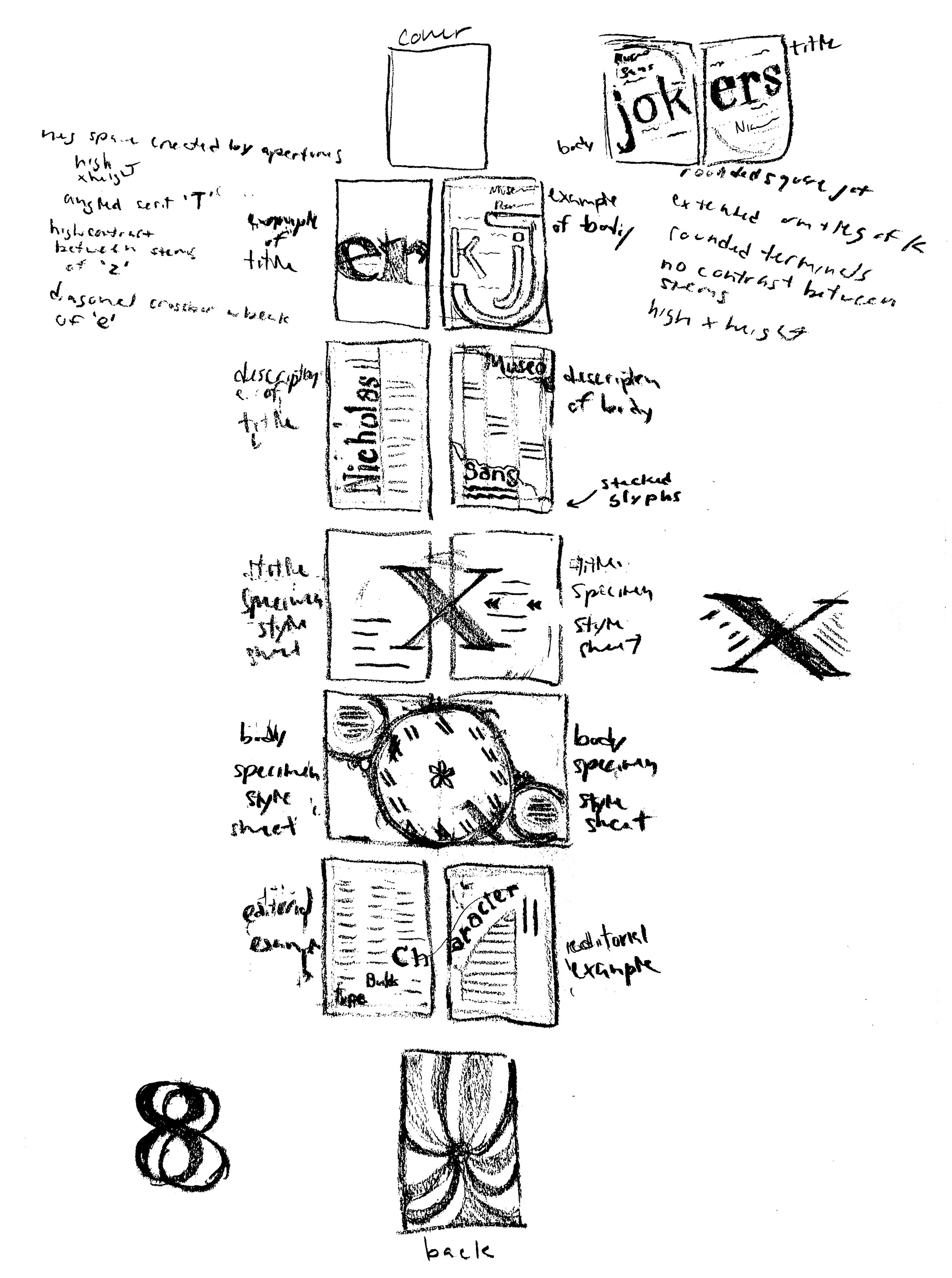
I completed two page maps for the booklet, ultimately deciding to merge elements from both into the design once I moved digitally.
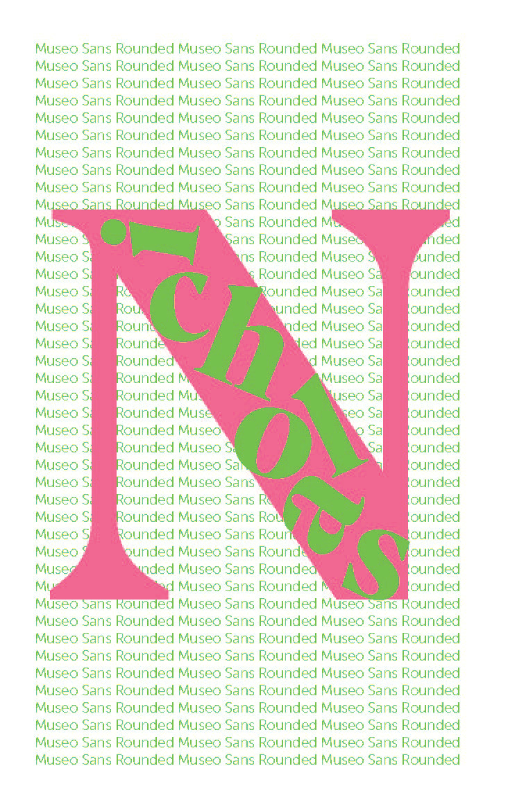
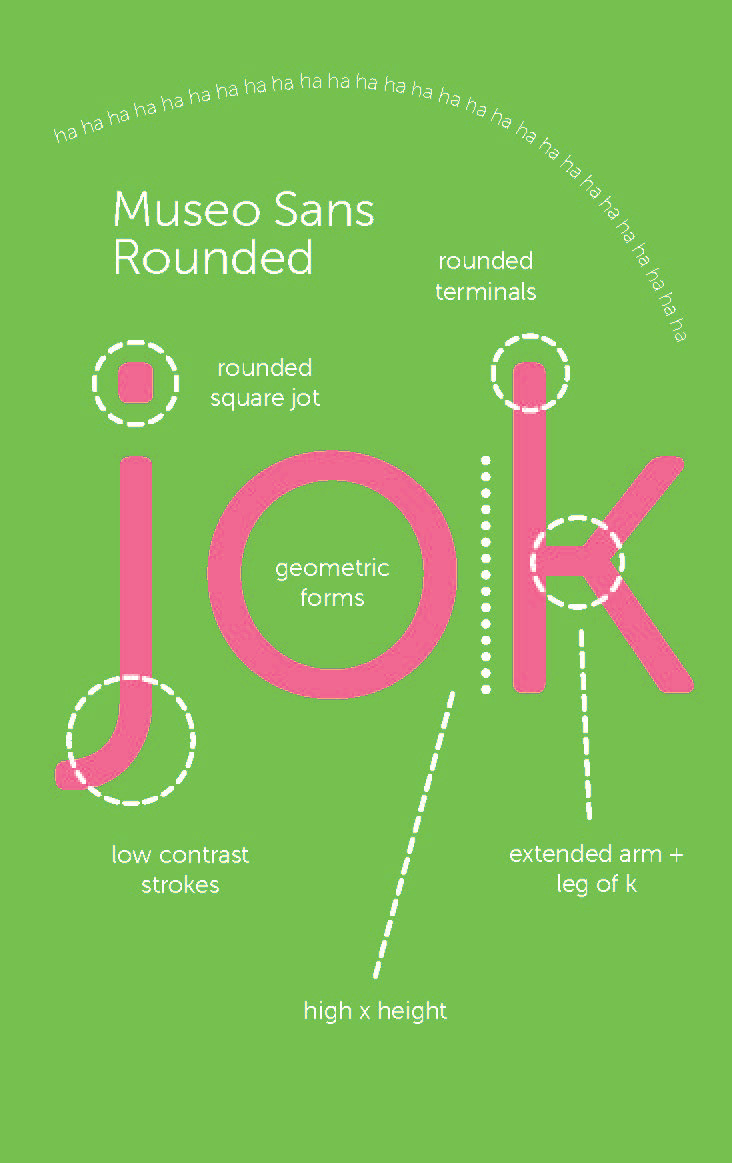
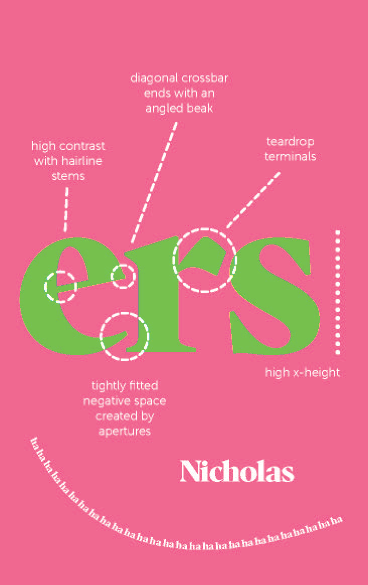
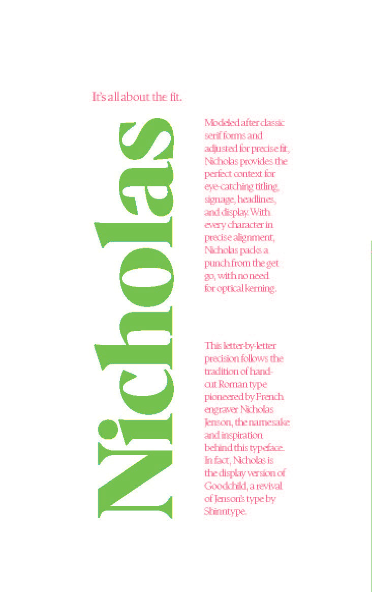
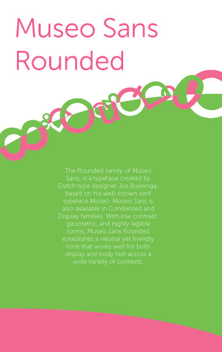
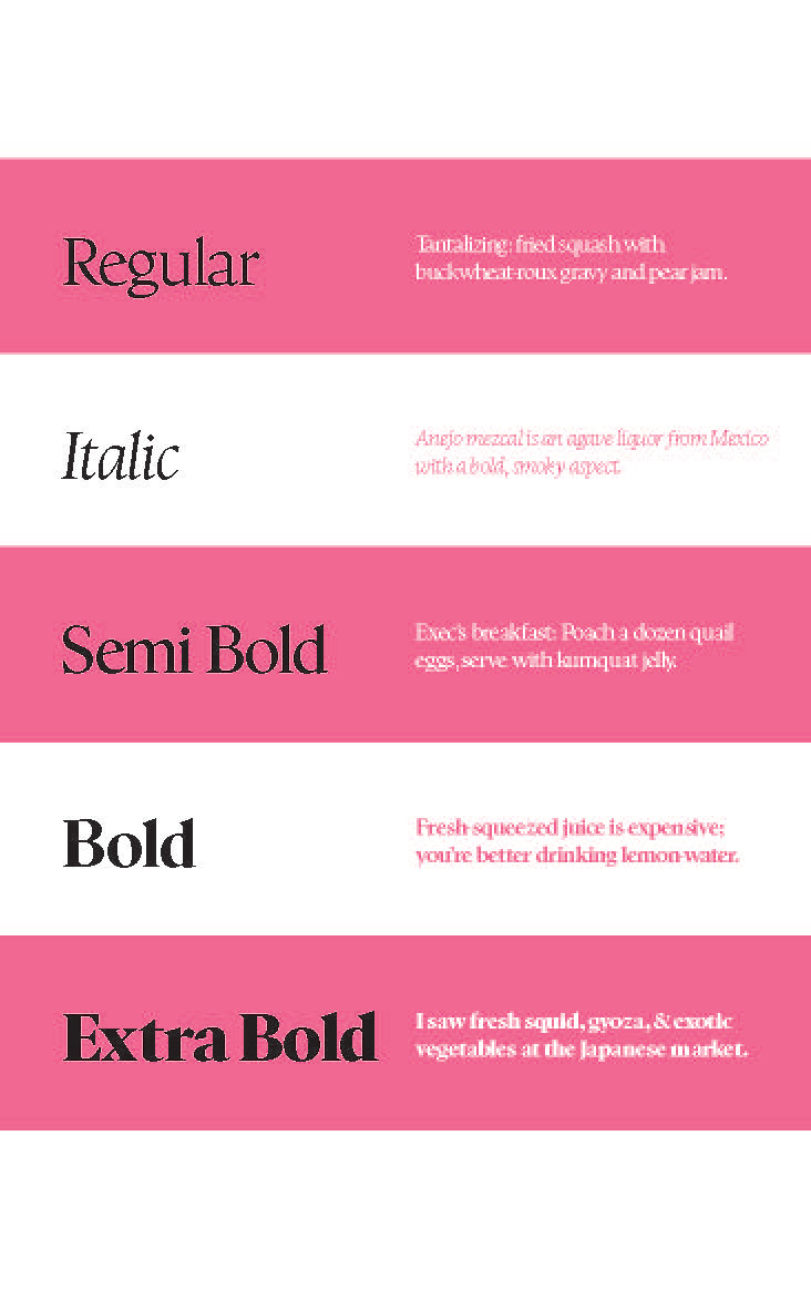
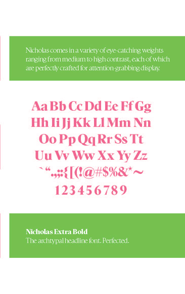
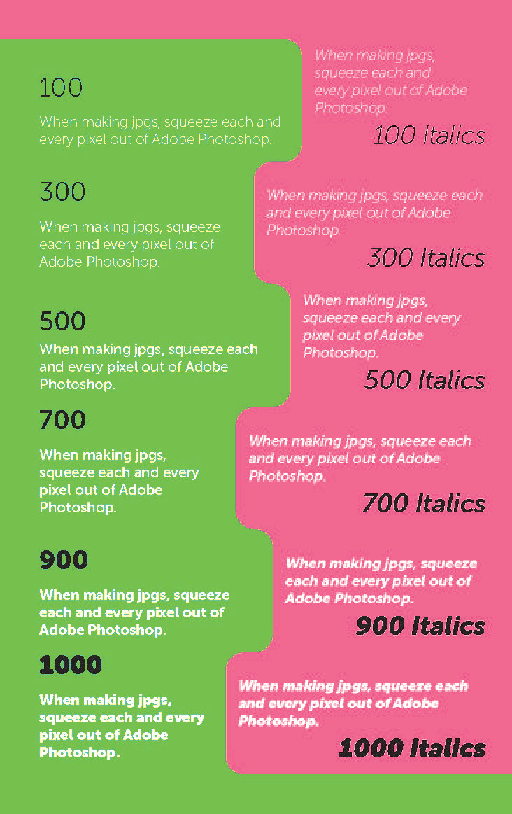
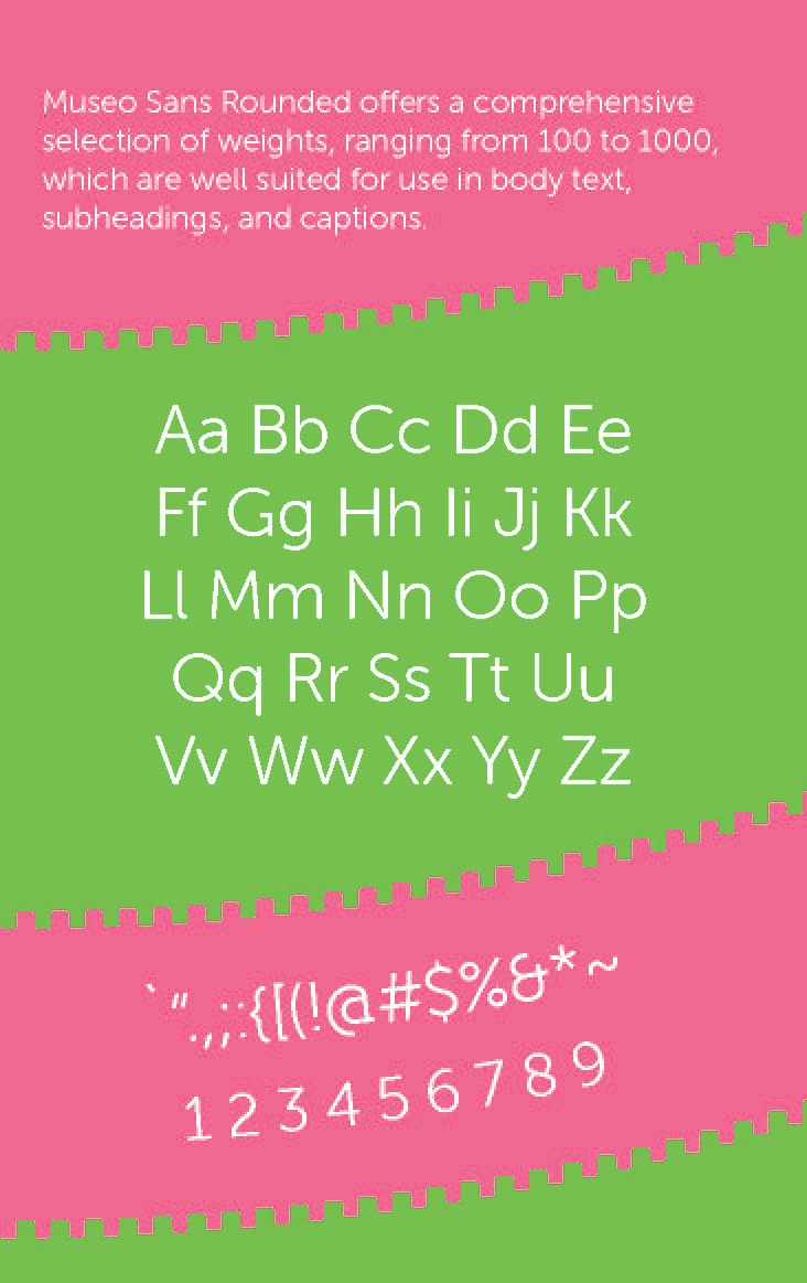
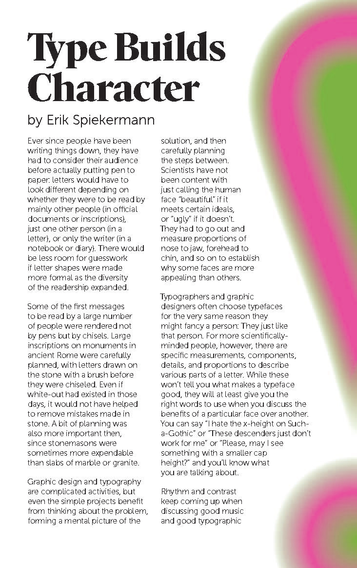
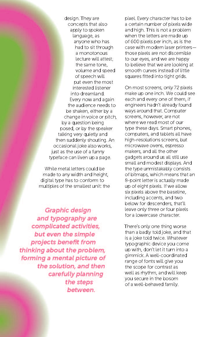
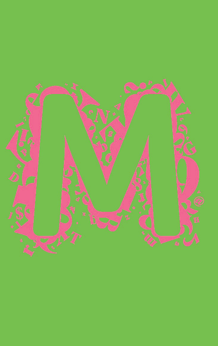
My original design featured a neon pink and green color palette. However, this proved to be problematic as I received feedback that the vibrating colors tended to make some viewers uncomfortable. Additionally, the composition of my front and back covers needed to be reworked, as they felt disjointed from each other.
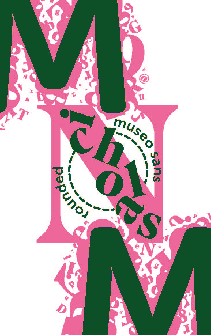
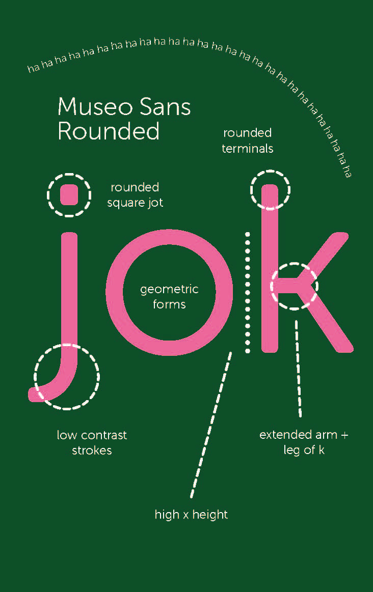
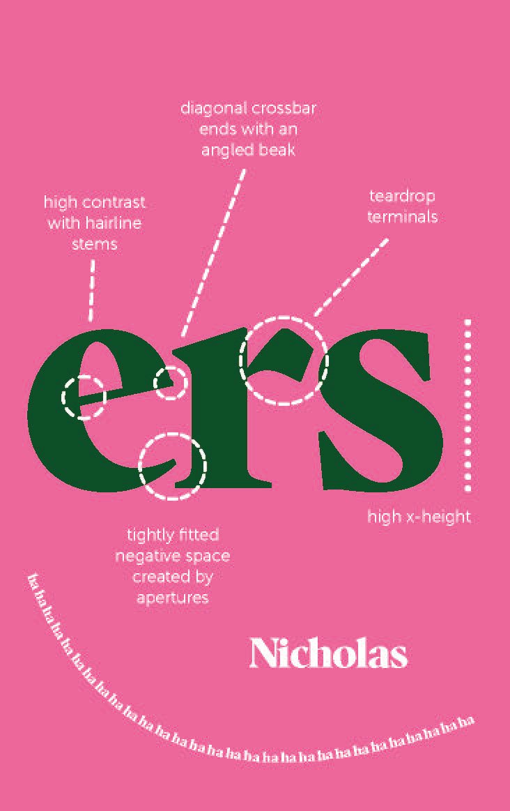
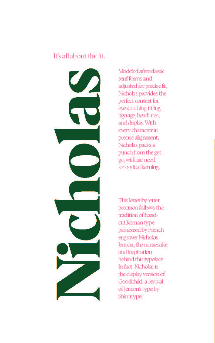
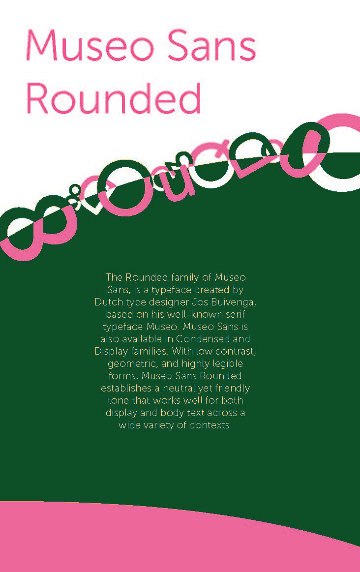
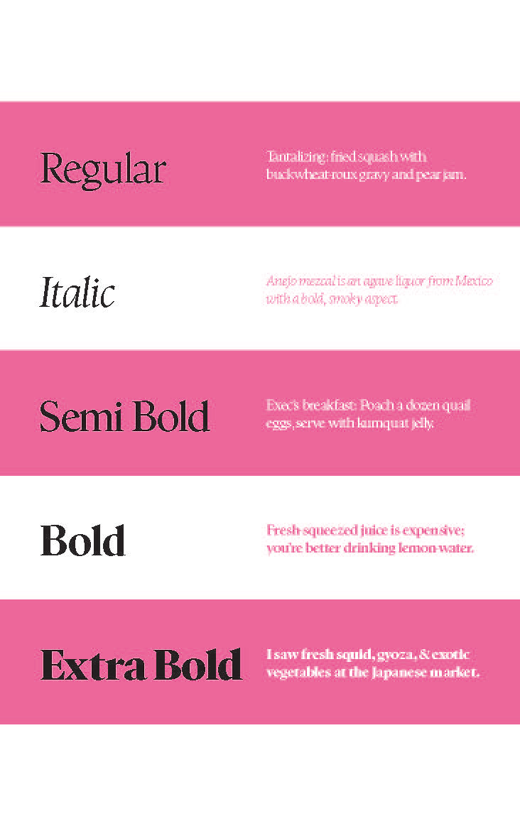
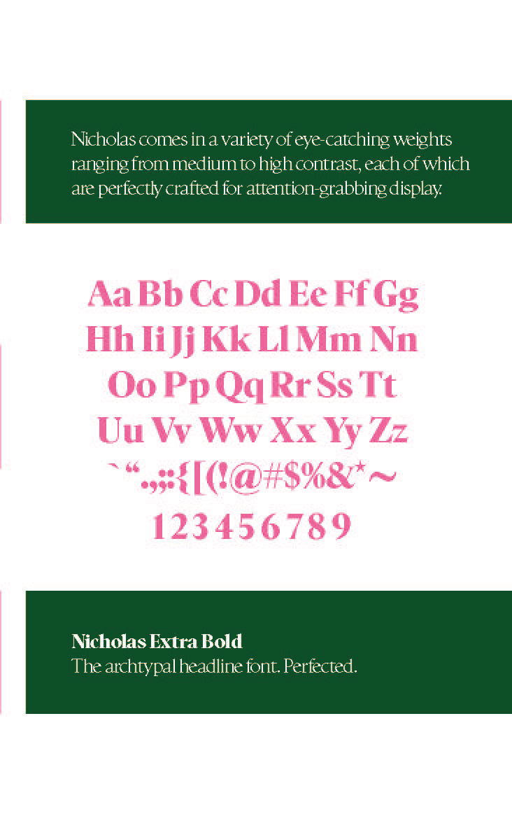
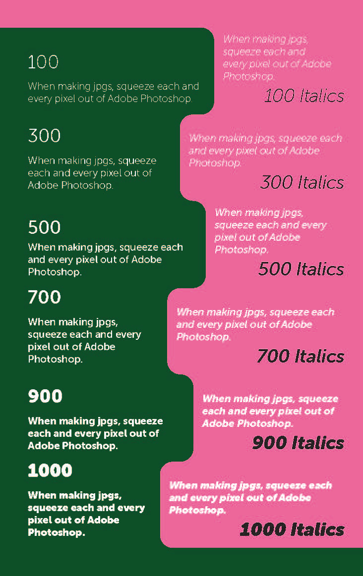
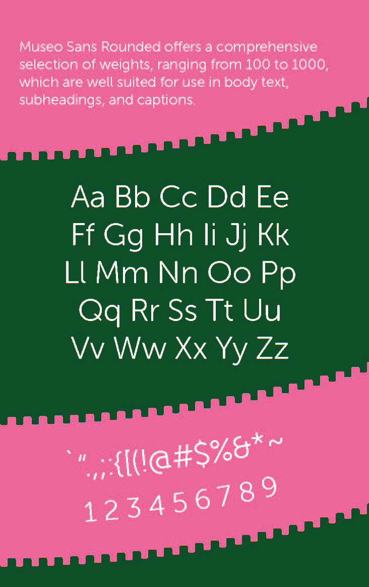
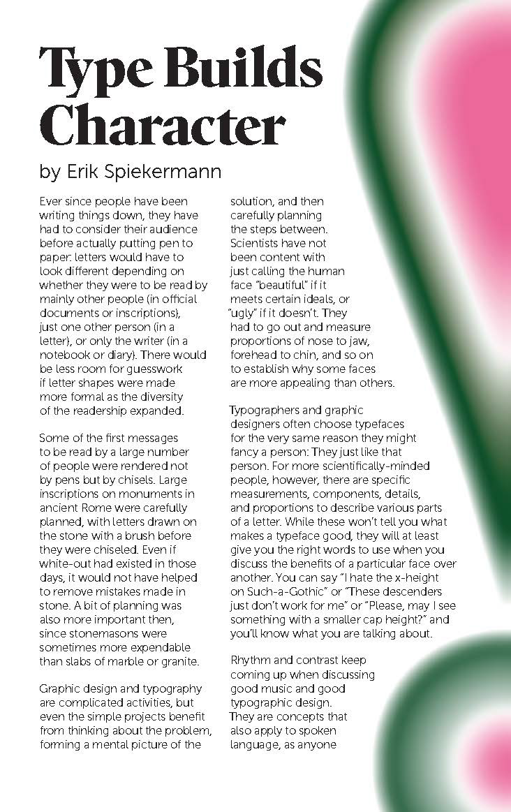
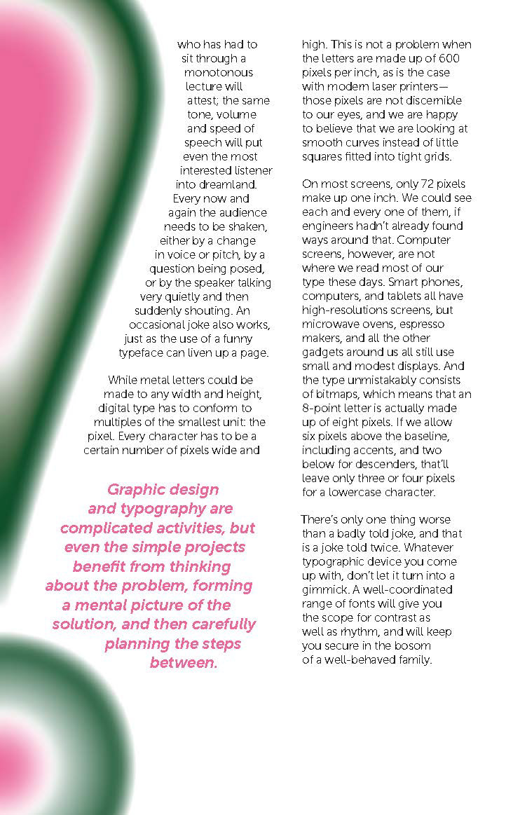
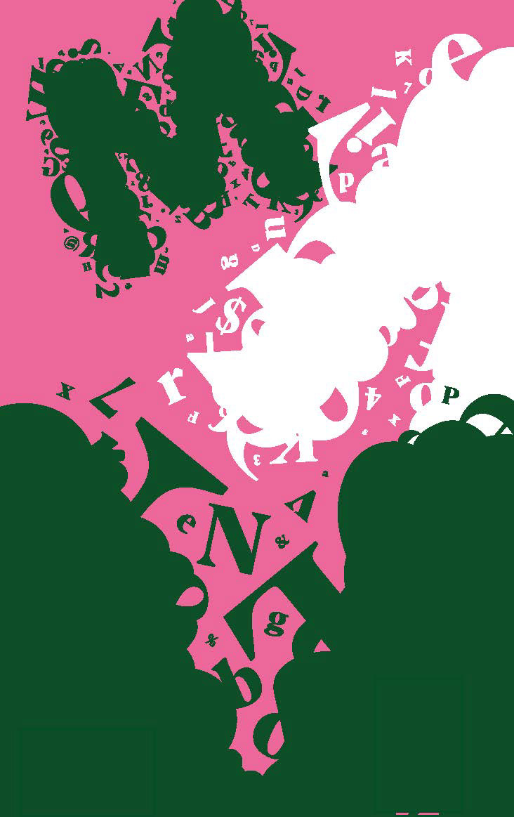
For the second print, I adjusted my color palette to reduce the vibration effect, which was much more accessible. Additionally, I tweaked the front and back covers to match each other while incorporating elements from within the booklet, leading to a much more cohesive layout overall.
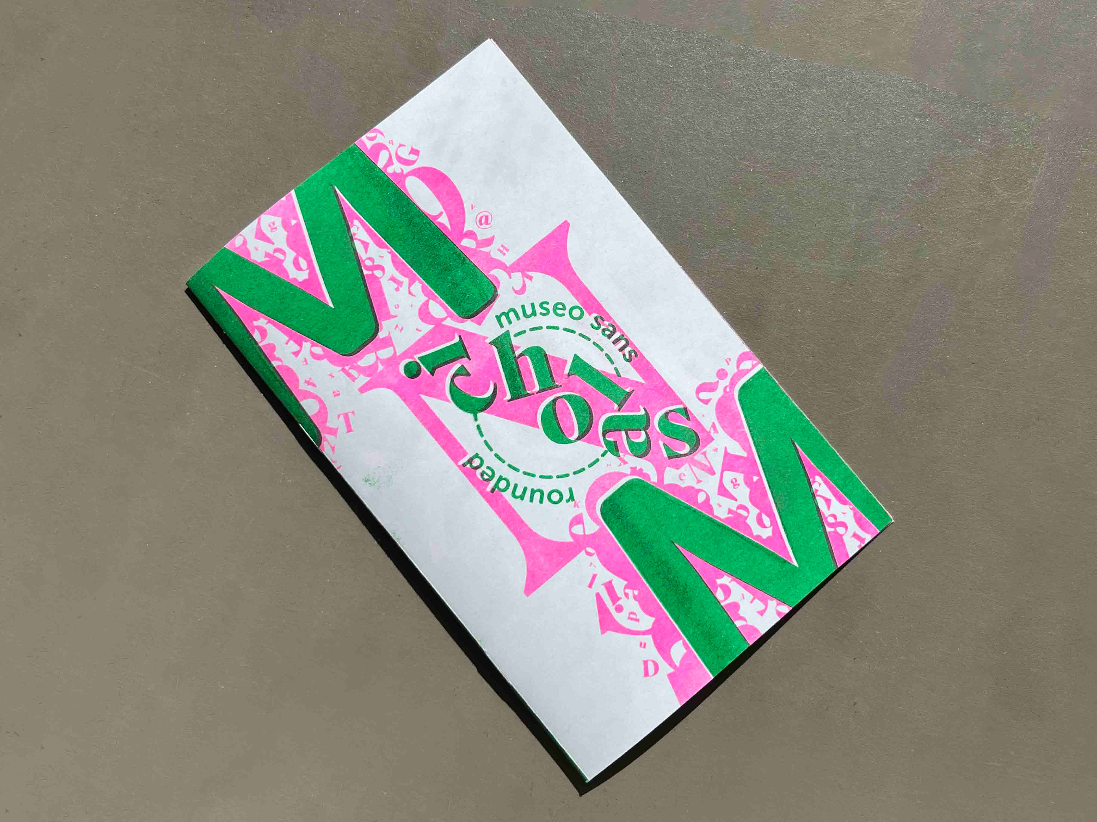
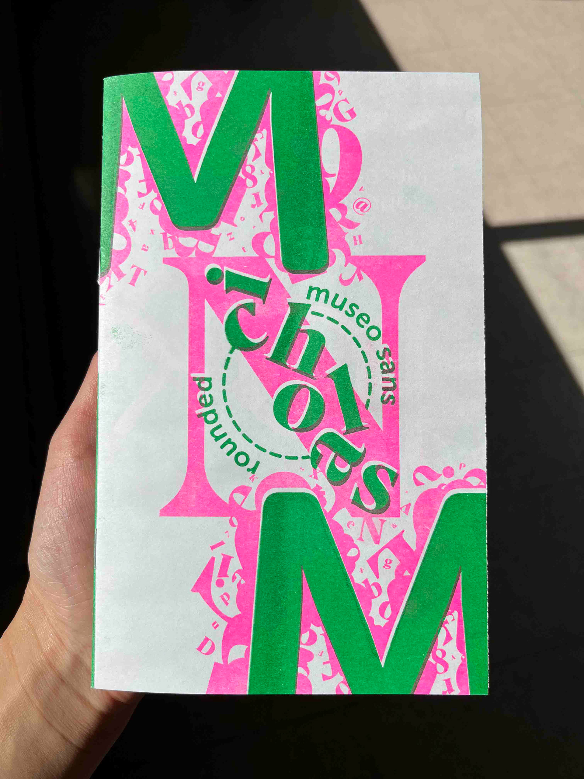
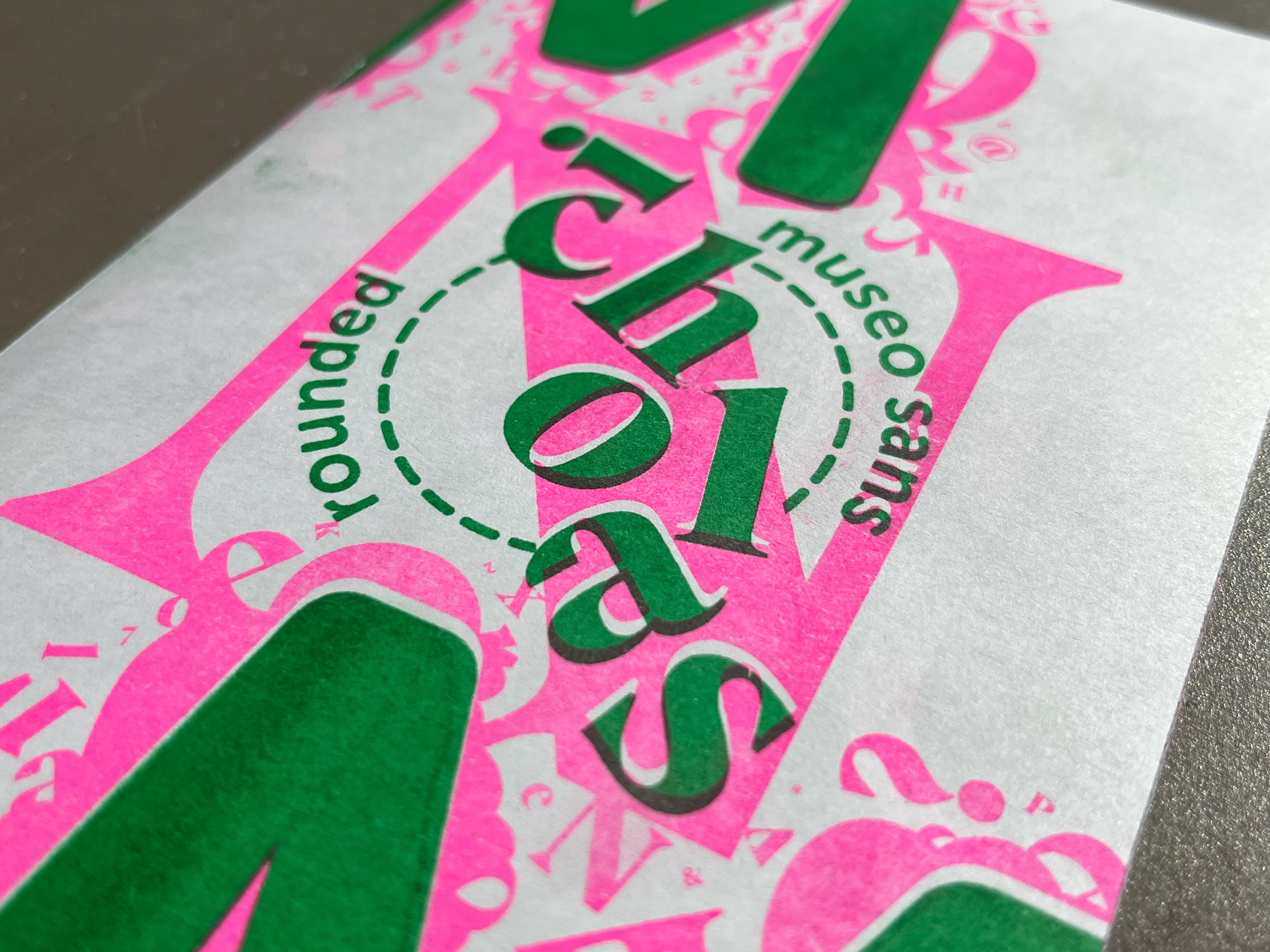
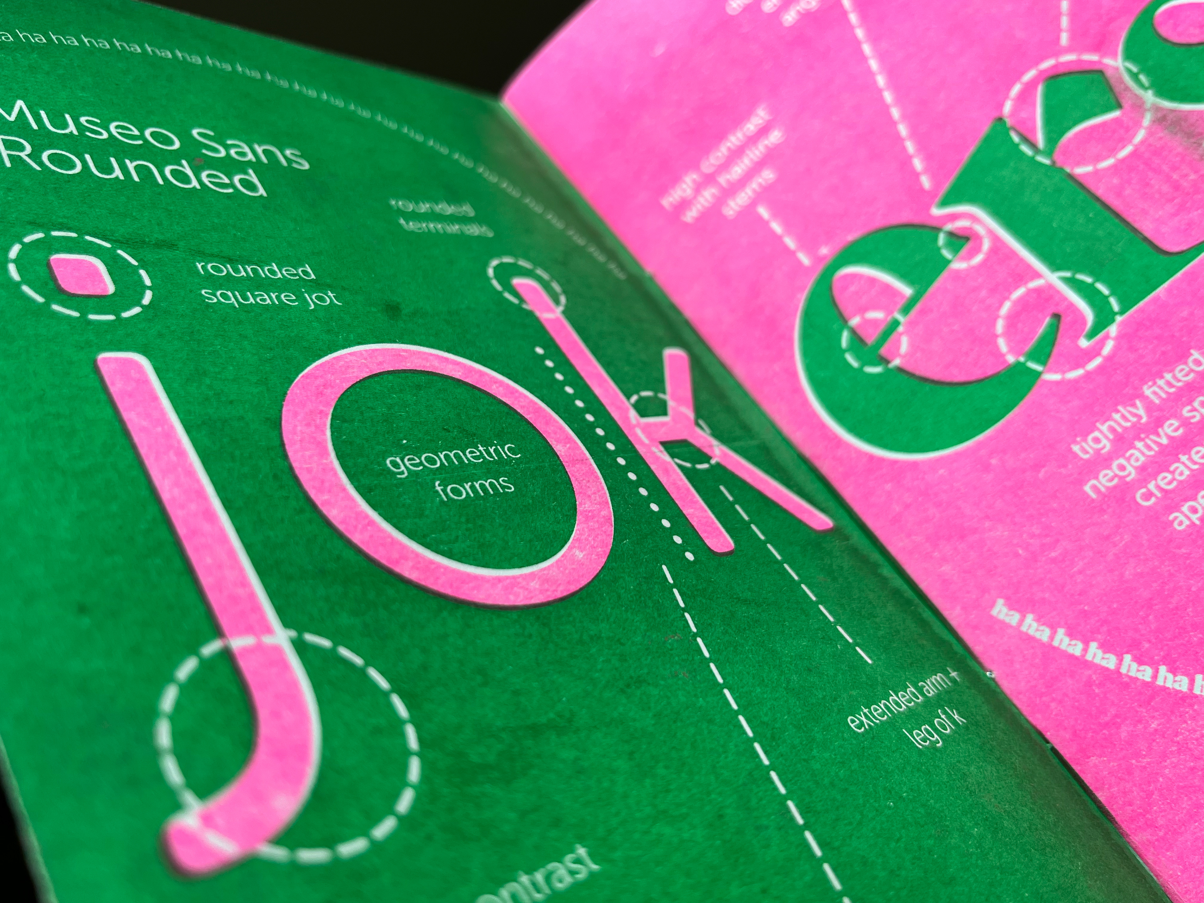
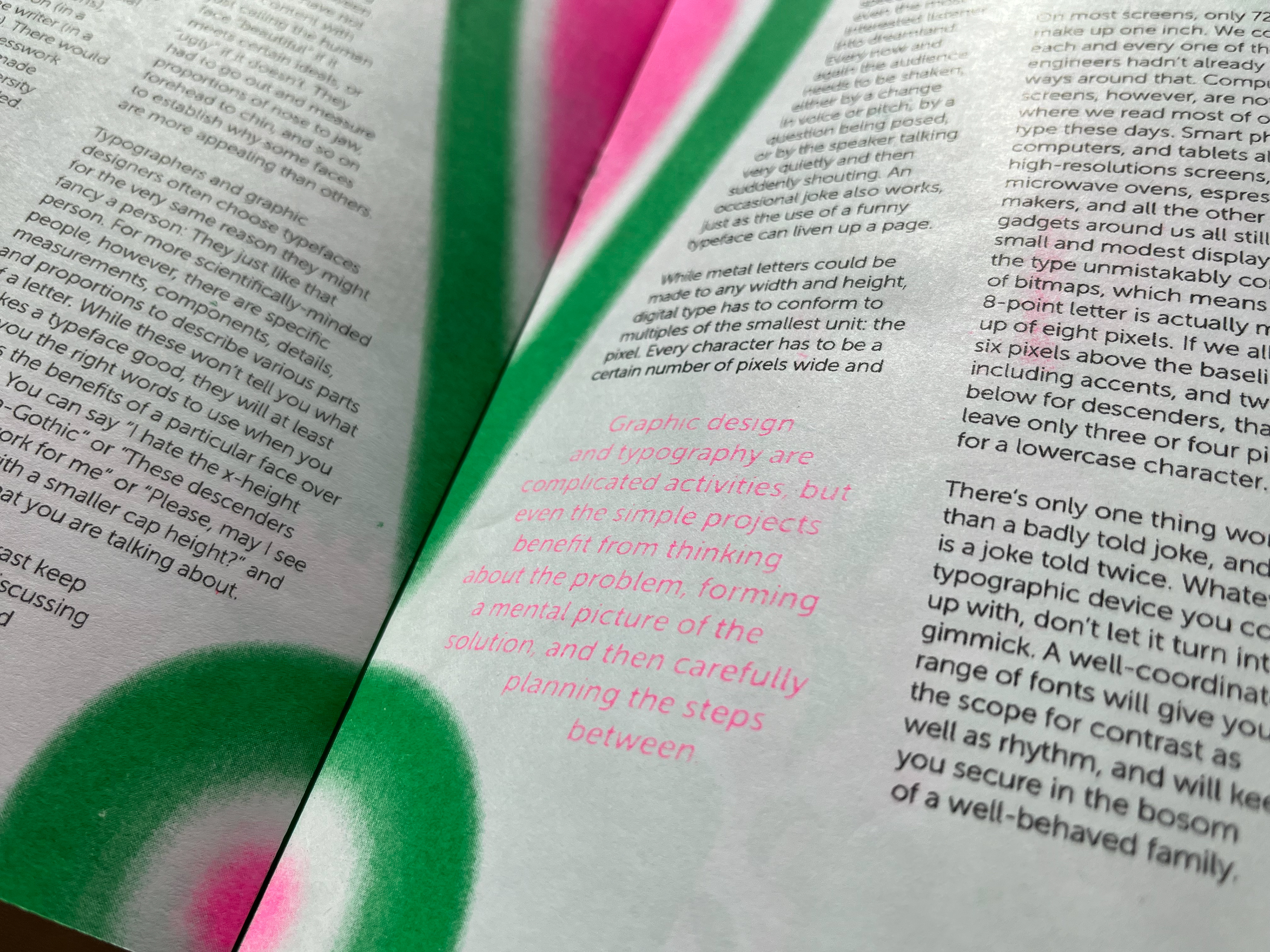
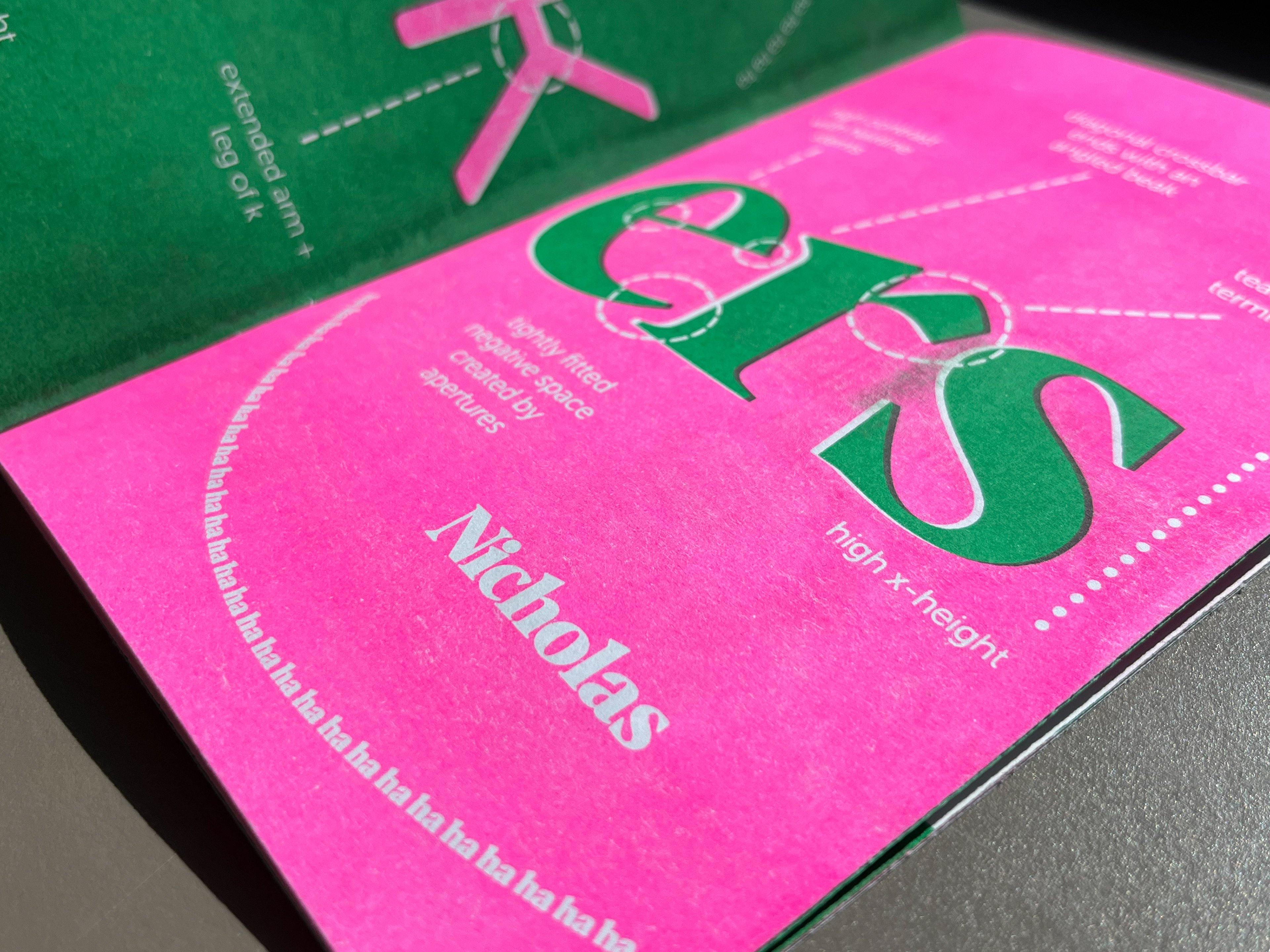
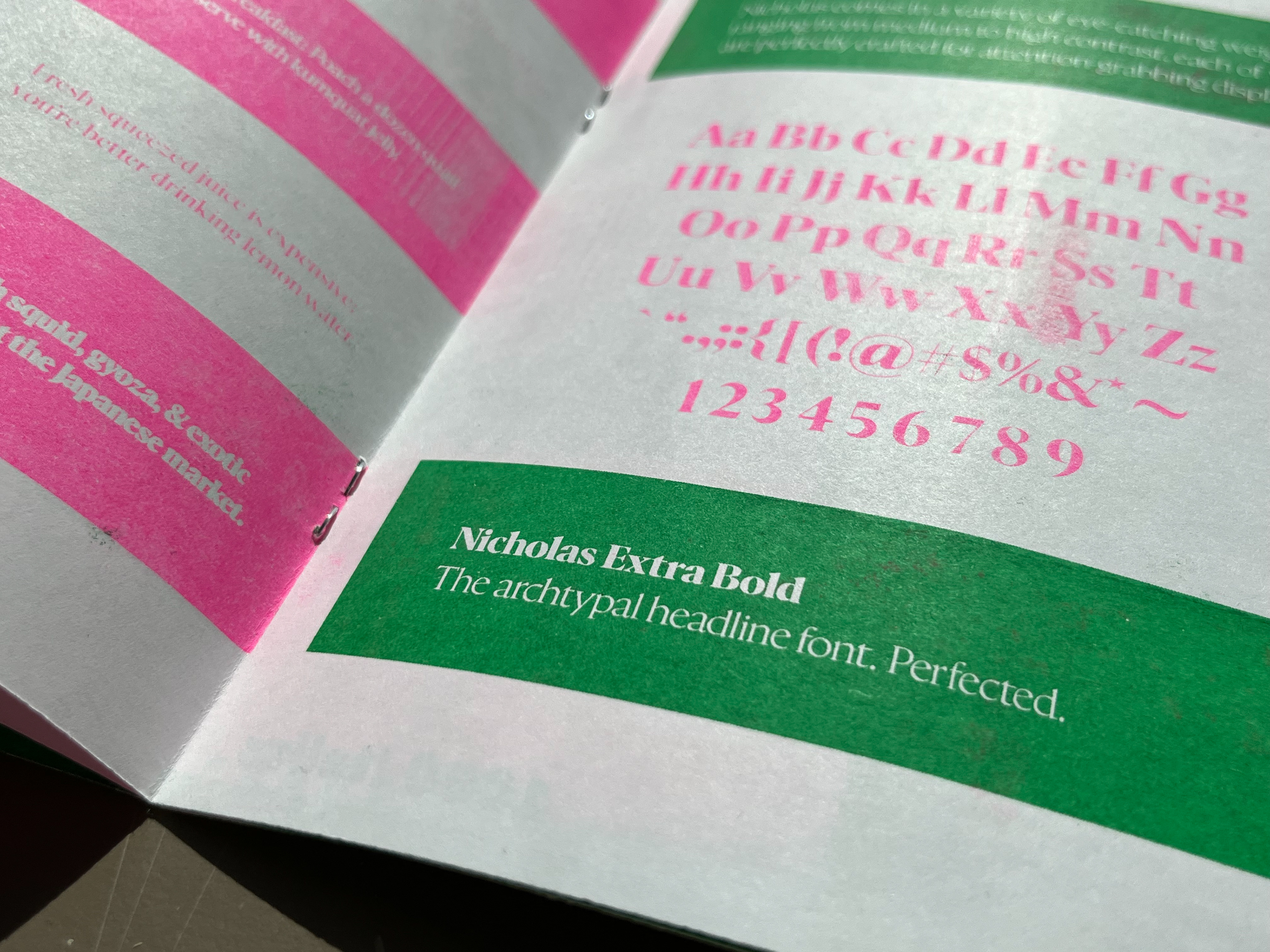
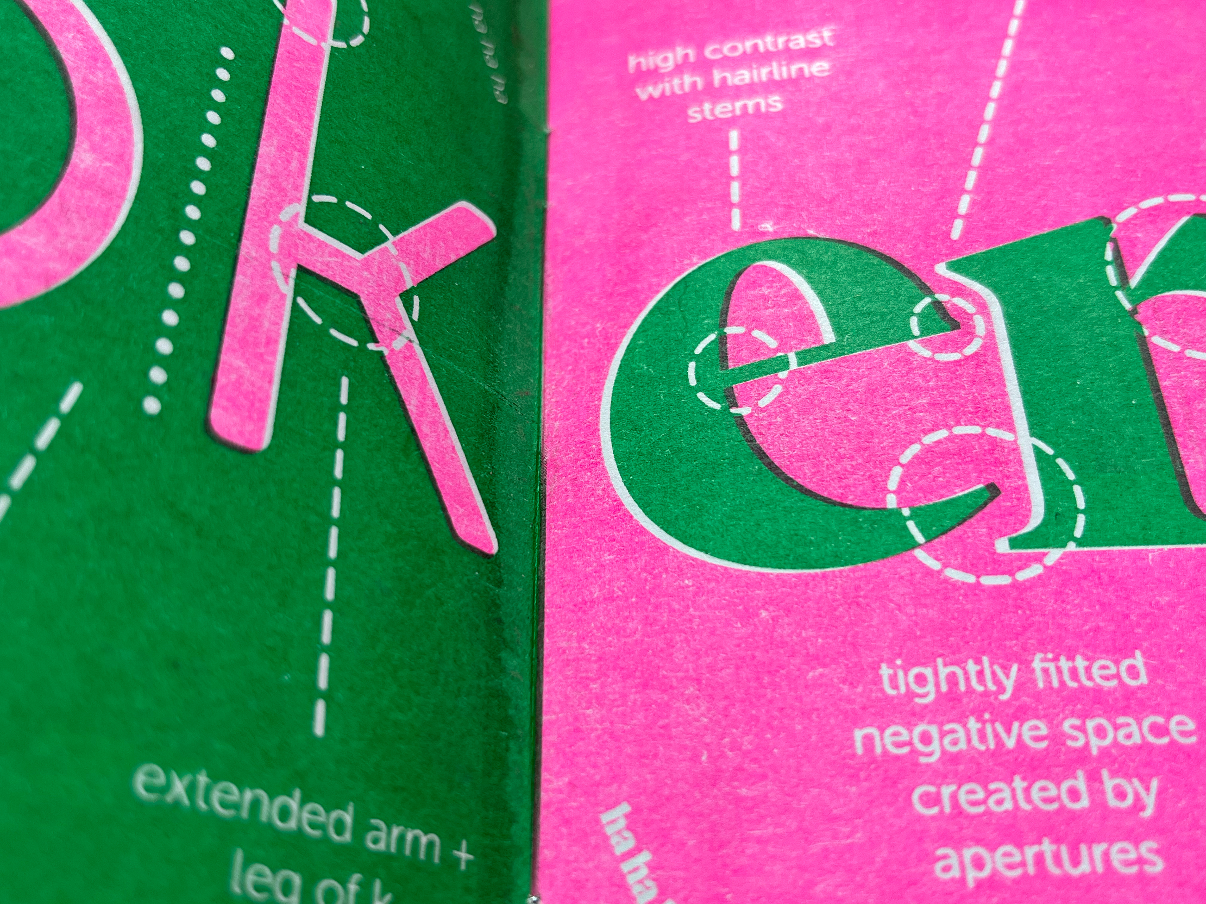
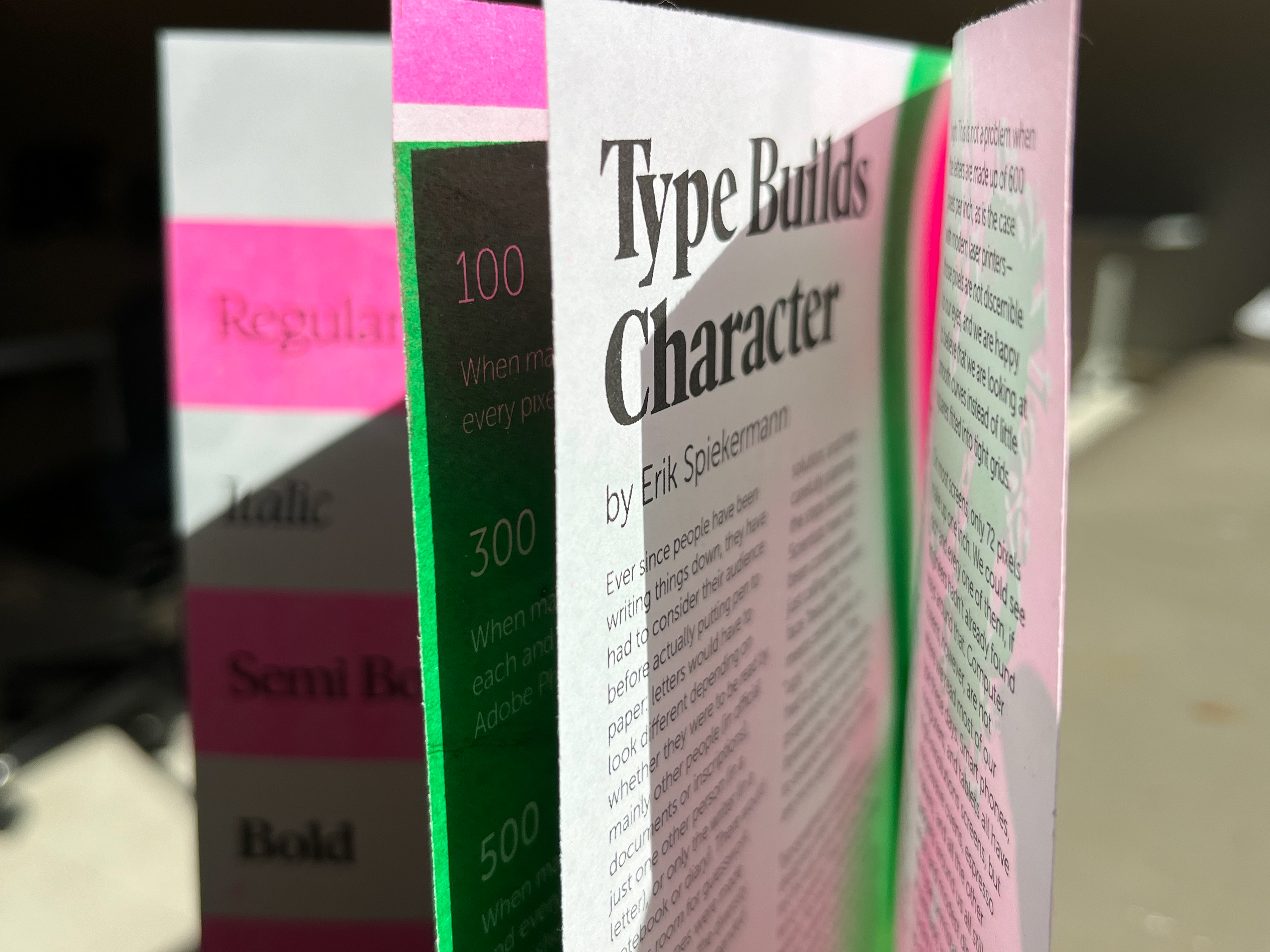
I then hand printed and bound my booklet using the risograph machine. The entire process took two weeks, as I had to let each layer of ink had to dry for at least 24 hours between prints. The final result adds a hand-crafted, human element to the design, displaying both typefaces in all their fluorescent glory.
