The Challenge
For this project, I designed a university campus café app to fill a need in the current market for busy students who aren't afraid to relax every once in a while.
User Interviews
I began the project by interviewing café-goers in campus cafes. In a series of short conversations, I asked members of my target user profile several questions related to their café habits, including:
1. What’s your usual routine at the cafés? What time do you usually come?
2. How do you usually order? Do you ever use the app?
3 . How do you feel when you come to the cafés? More rushed or relaxed?
4. What do you enjoy about the cafés?
5. Is there anything that frustrates you?
Results
Through this process, I came across several trends. Users tended to:
1. Avoid the rush, and dislike the long lines when it’s busy. There were not many issues outside of this time. Those who only go during the less busy times seemed unaware of lines.
2. Go to cafés in the afternoons after class, in between classes during the day, or when studying in the evenings or afternoons.
3. Go to cafés as a study break, and enjoy browsing and looking around. Users reported feeling pretty relaxed.
4. Enjoy the convenience of a quick snack, and dislike when they’re out of their go-to option. Rely on the cafés for snacks in between classes or when studying.
5. Either browse and look at the menu, or have a go-to option in mind. No users reported ever using an app to order or check options.
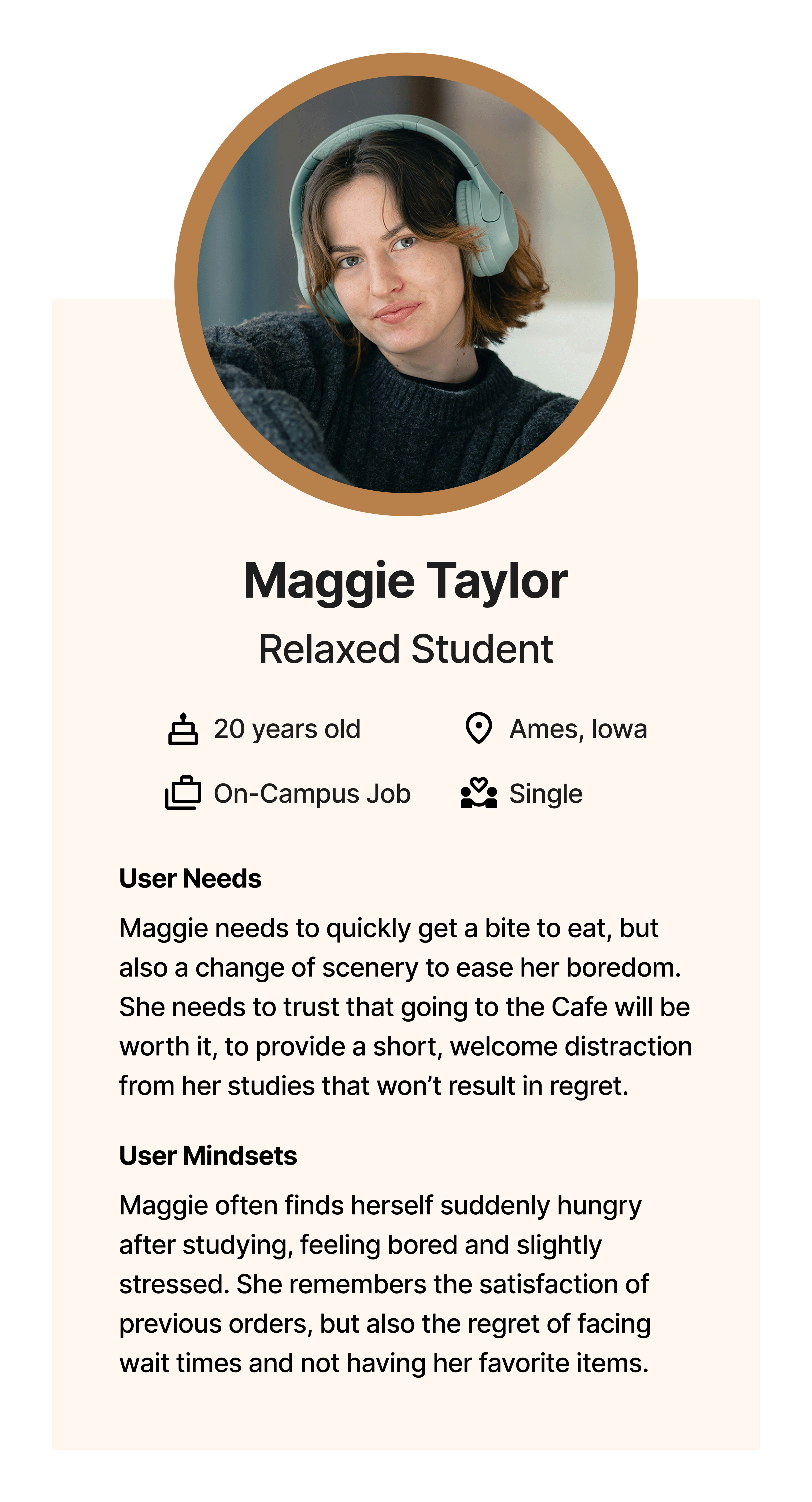
User Persona
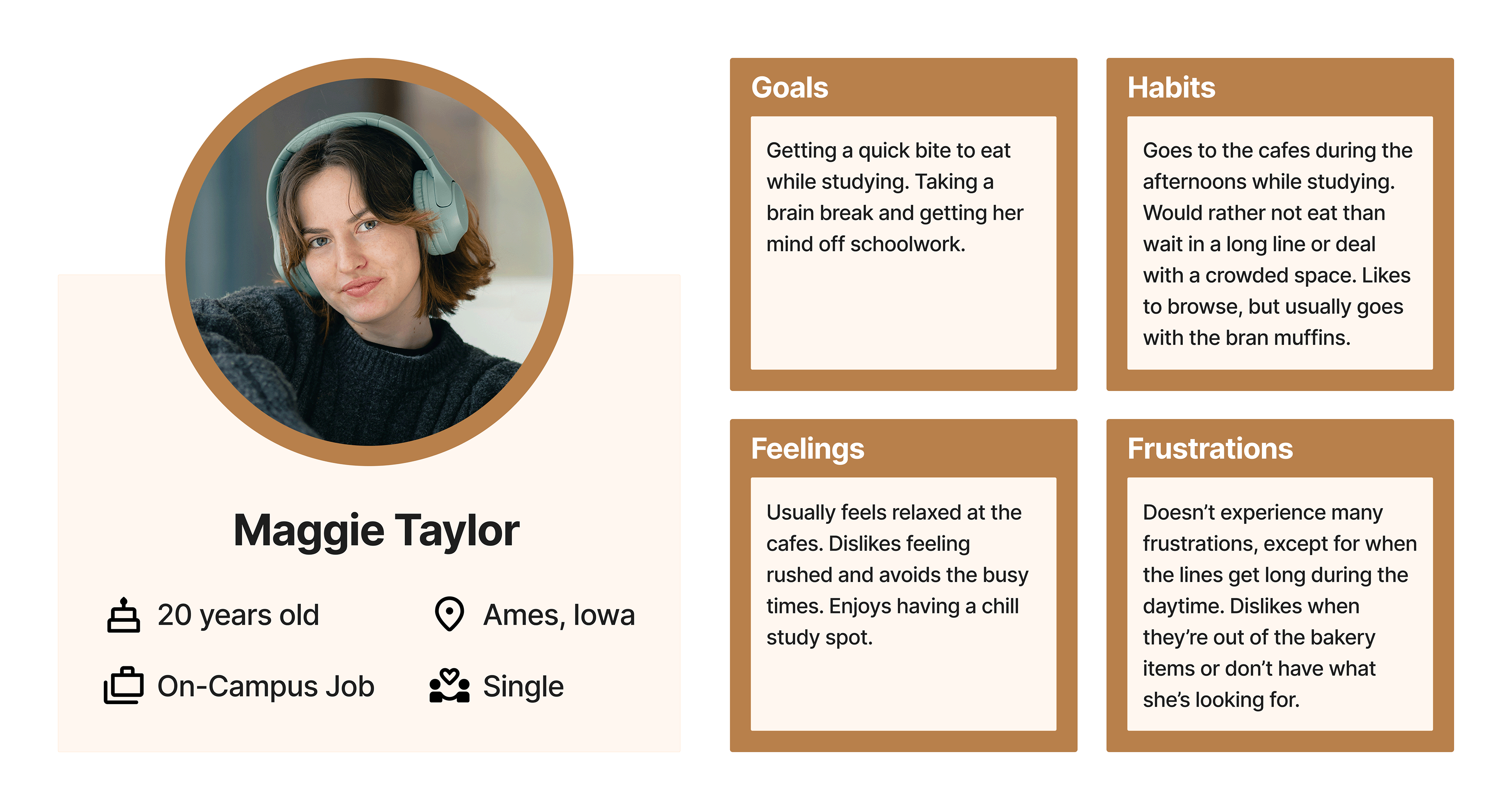
This research formed the basis for my user persona and informed my design decisions going forward. Keeping in mind my target user of a relaxed student, it was important that the app limit friction and create a laid-back experience for the user.
This research formed the basis for my user persona and informed my design decisions going forward. Keeping in mind my target user of a relaxed student, it was important that the app limit friction and create a laid-back experience for the user.
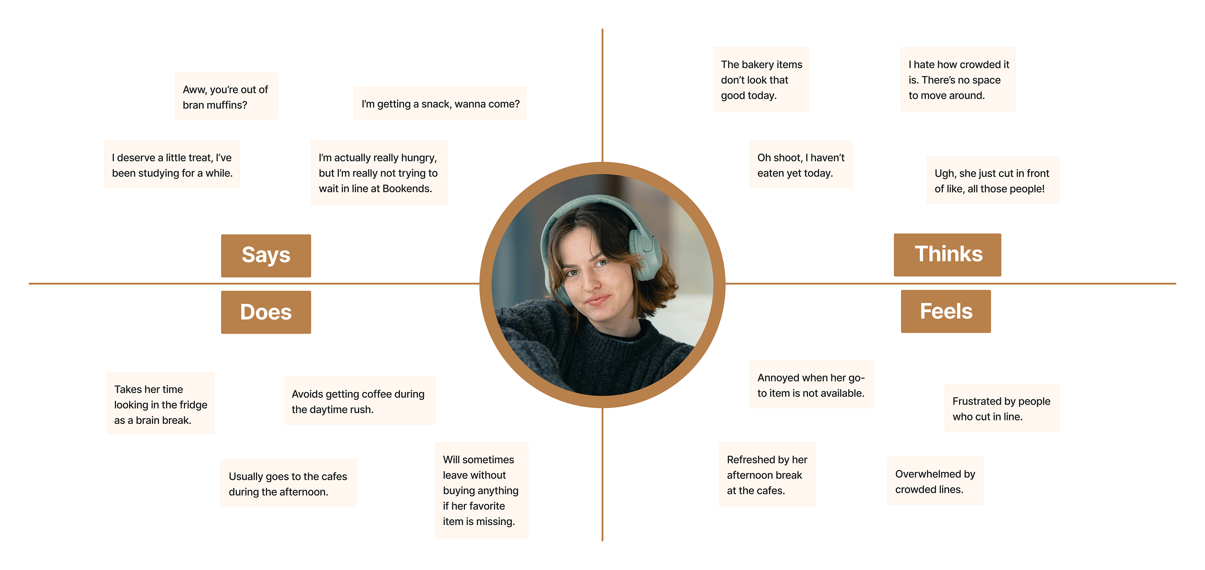
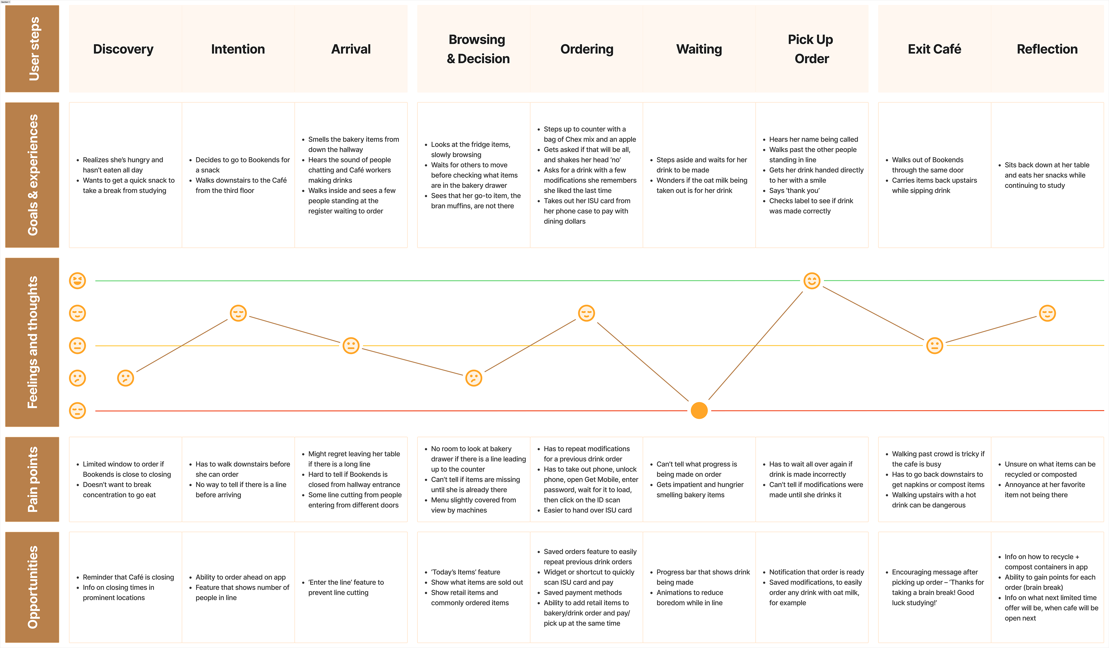
User Journey Map
Through this process, I identified pain points and opportunities for improving the user experience with the café app.
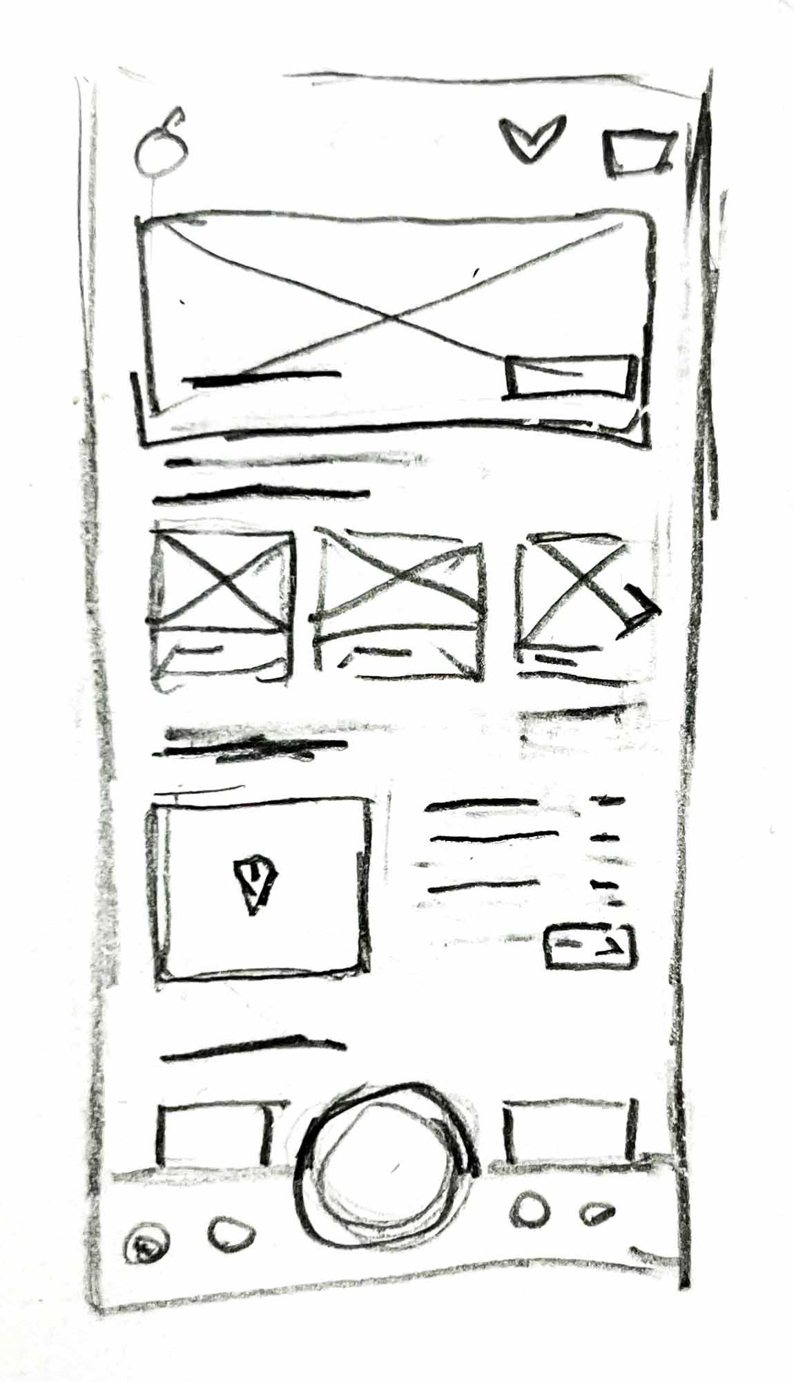
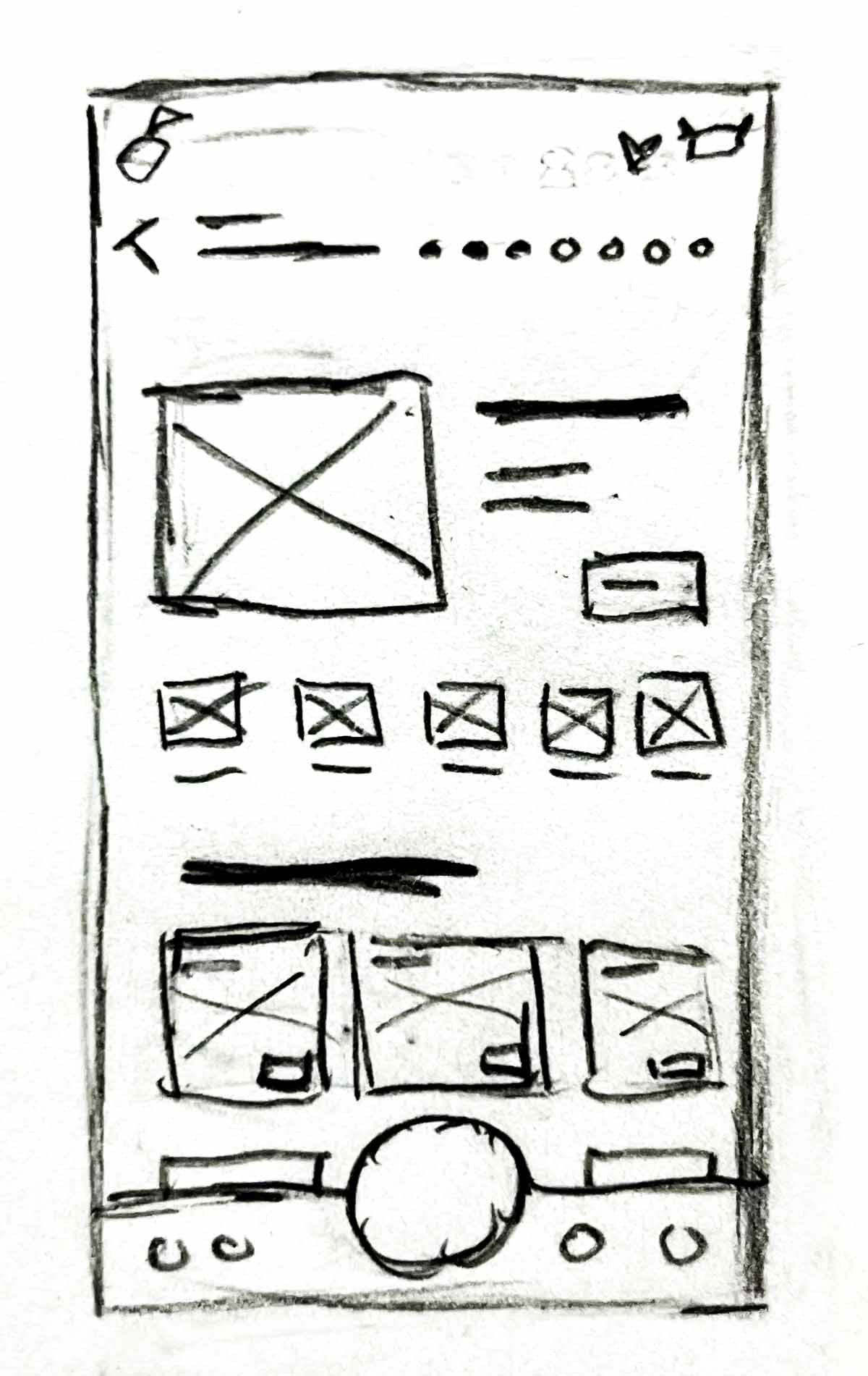
Sketches
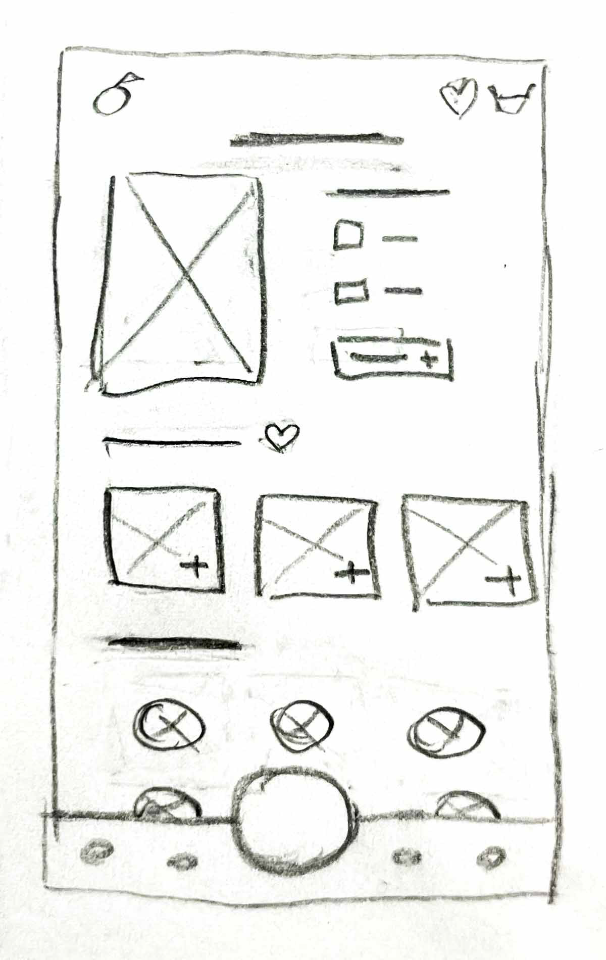
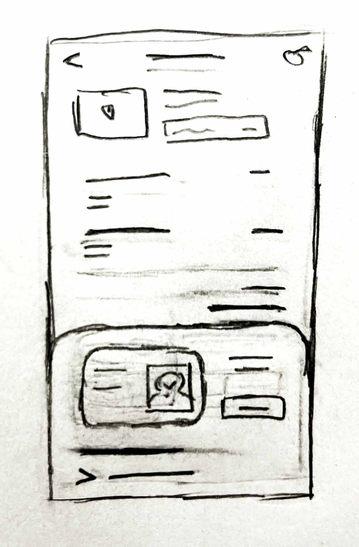
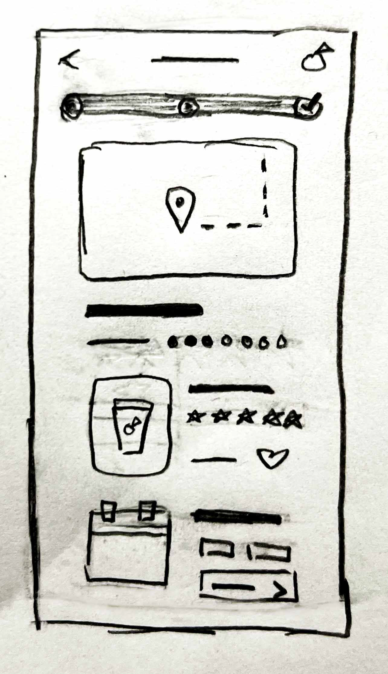
I began the visual design of the app by sketching 5 basic screens: Home, Meni, Order, Payment, and Confirmation.
Low-Fidelity Wireframes
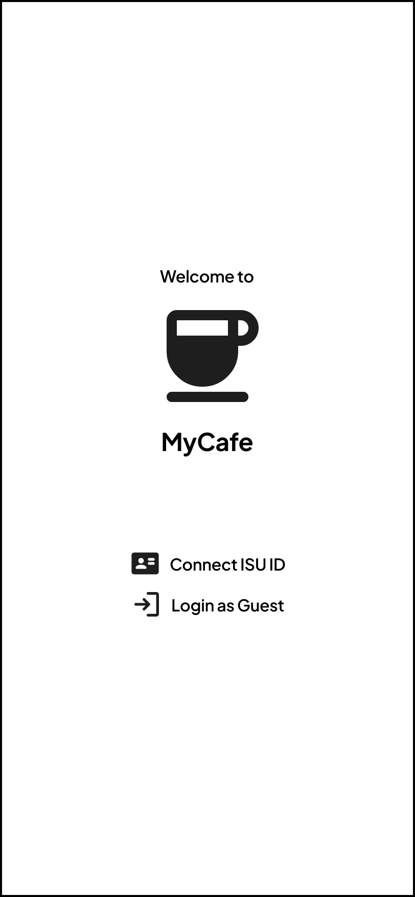
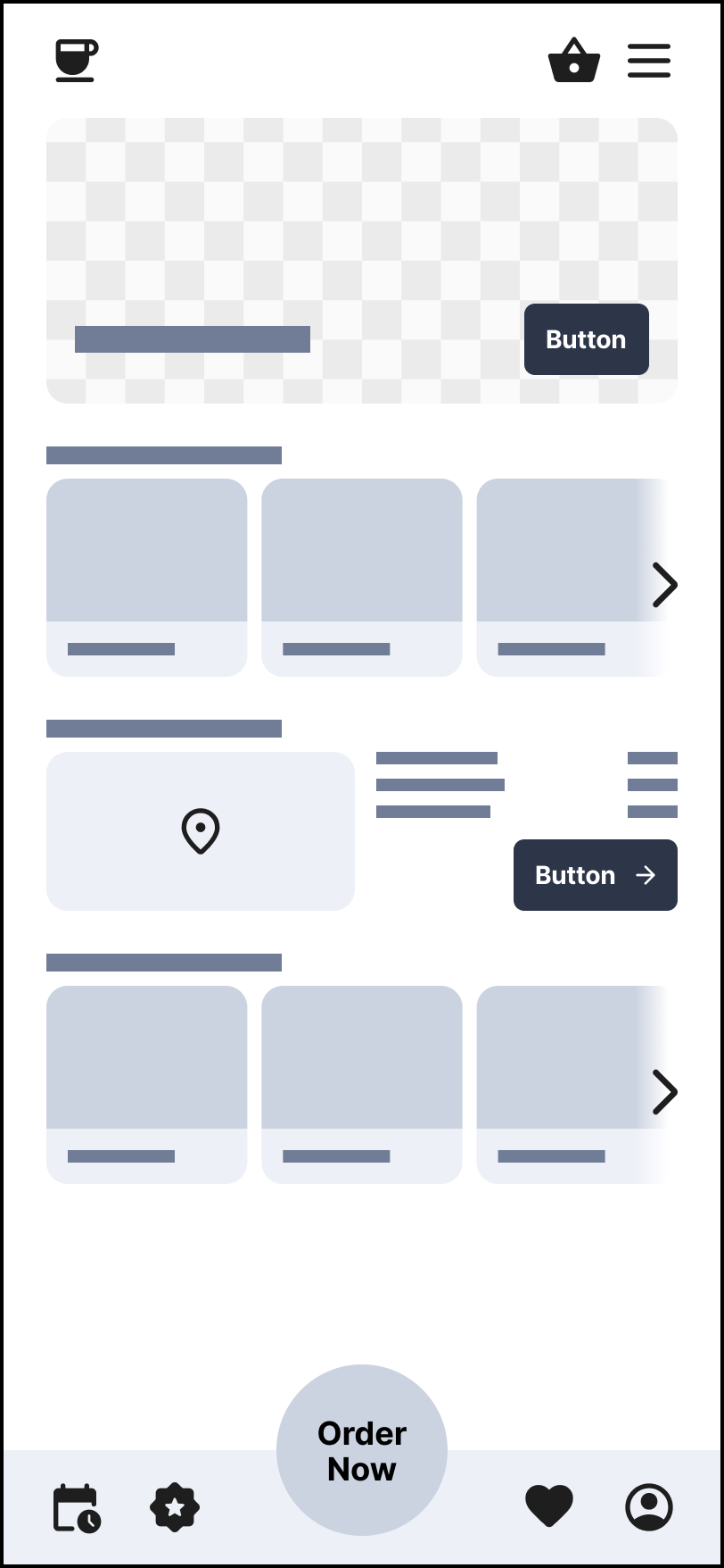
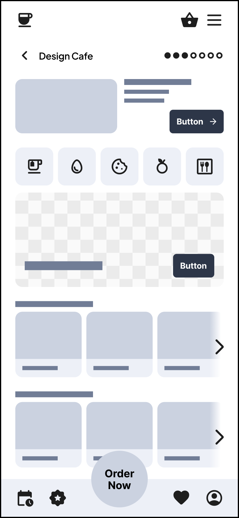
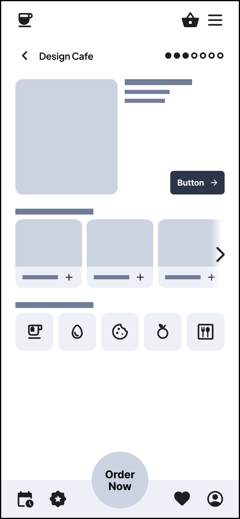
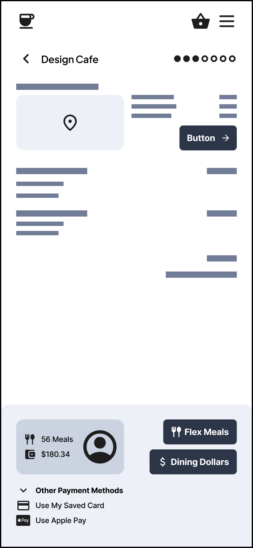
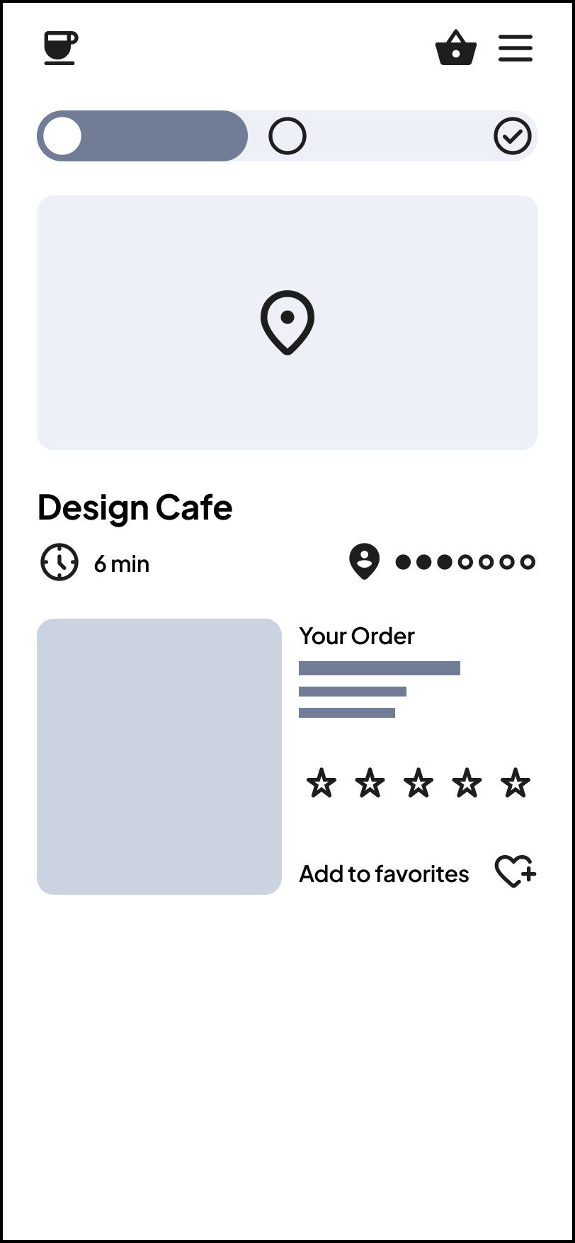
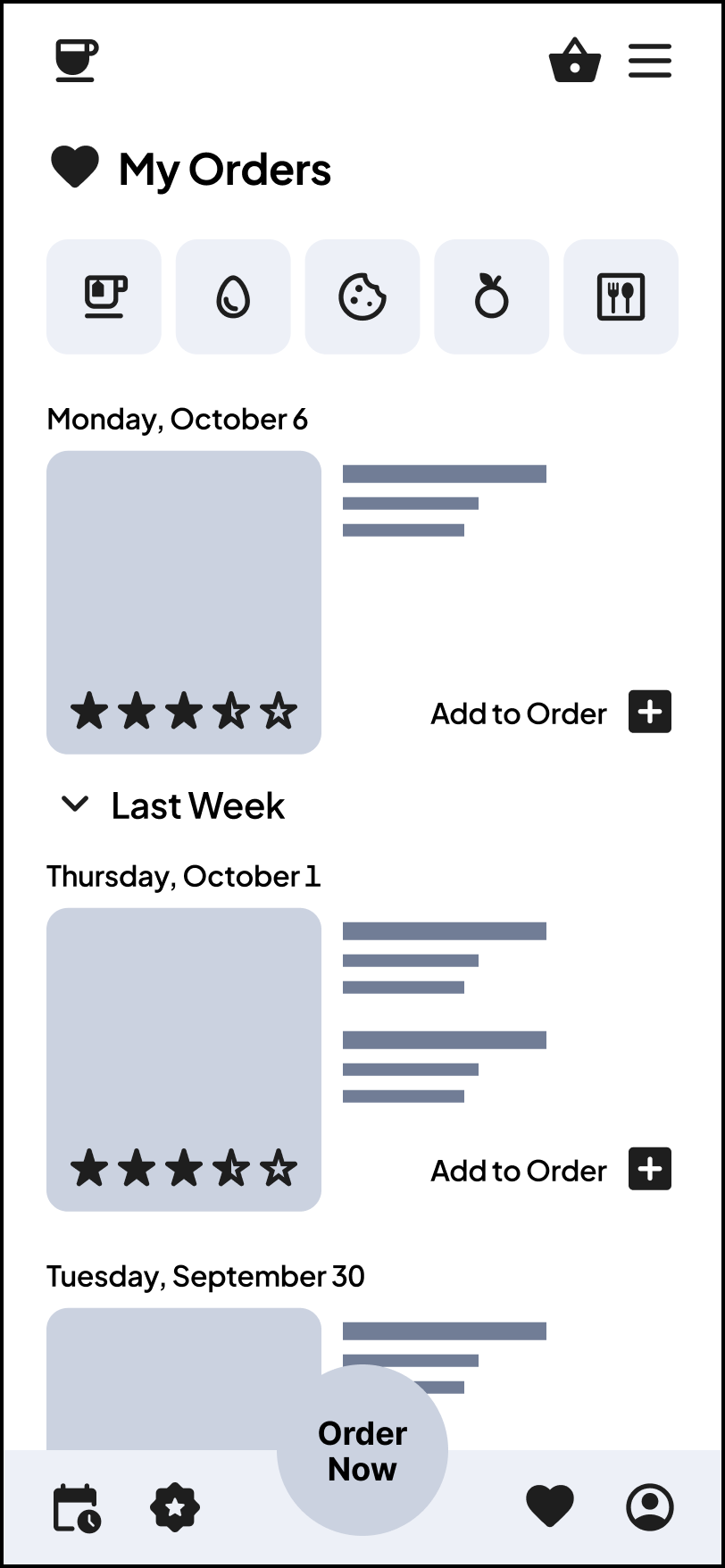
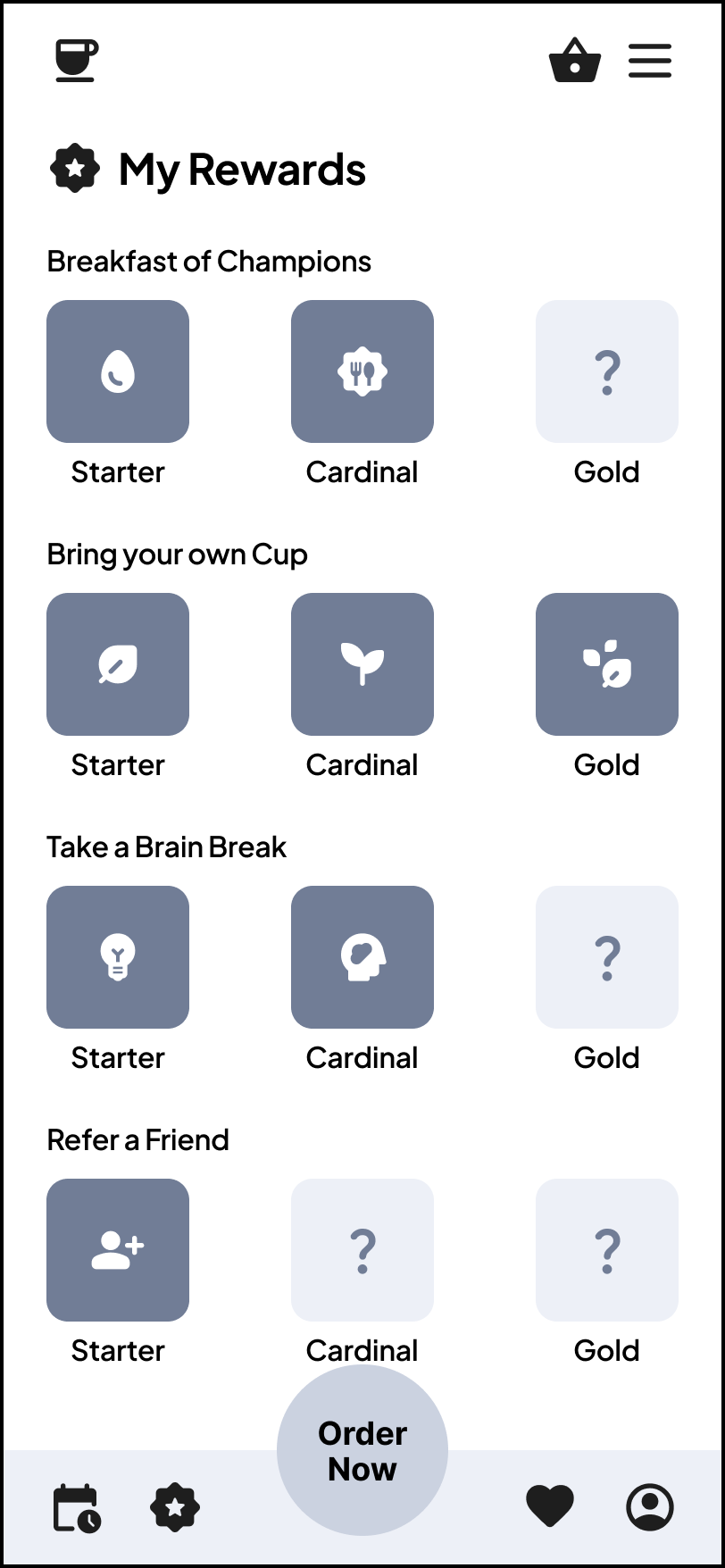
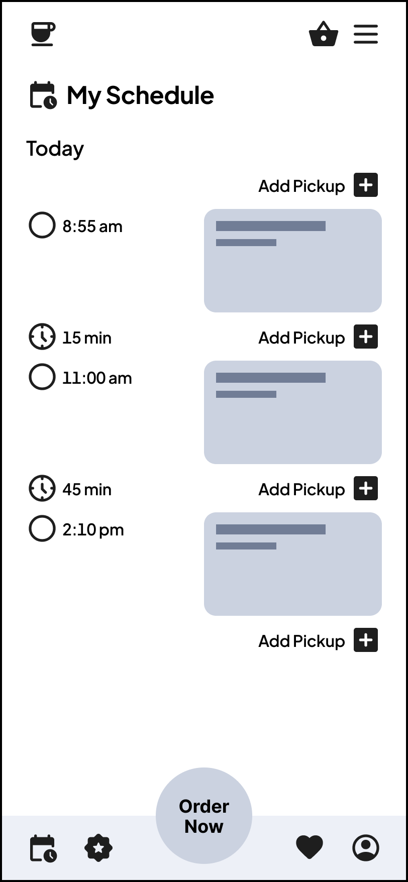
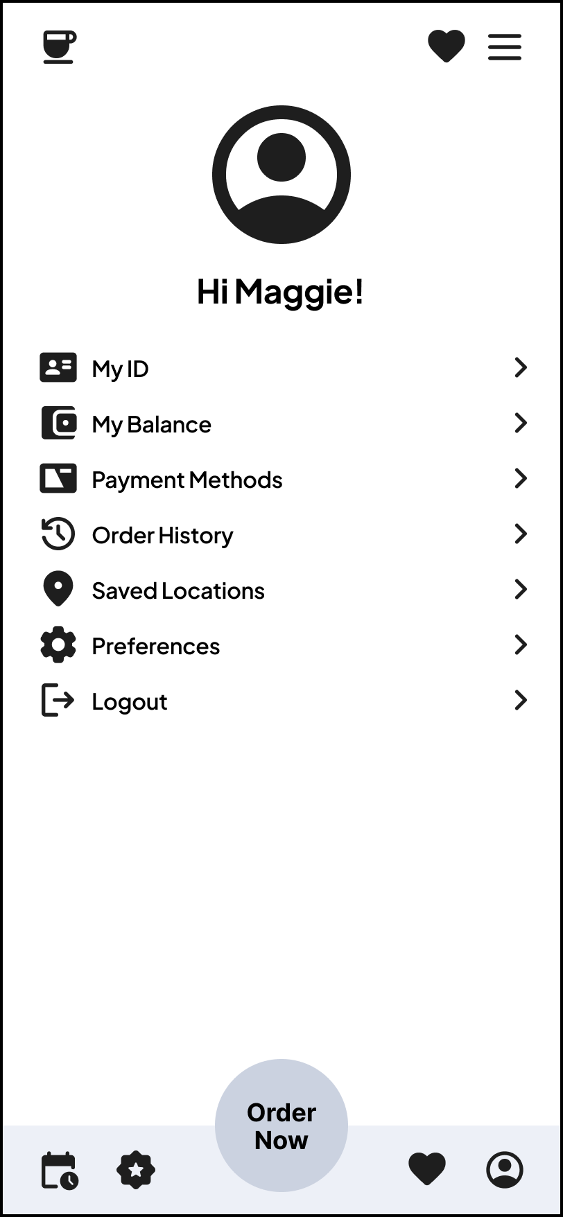
After creating the low-fidelity wireframes in Figma, I conducted user testing to reflect on the usability of the app. I received valuable feedback on features that were confusing, inaccessible, or awkward to use.
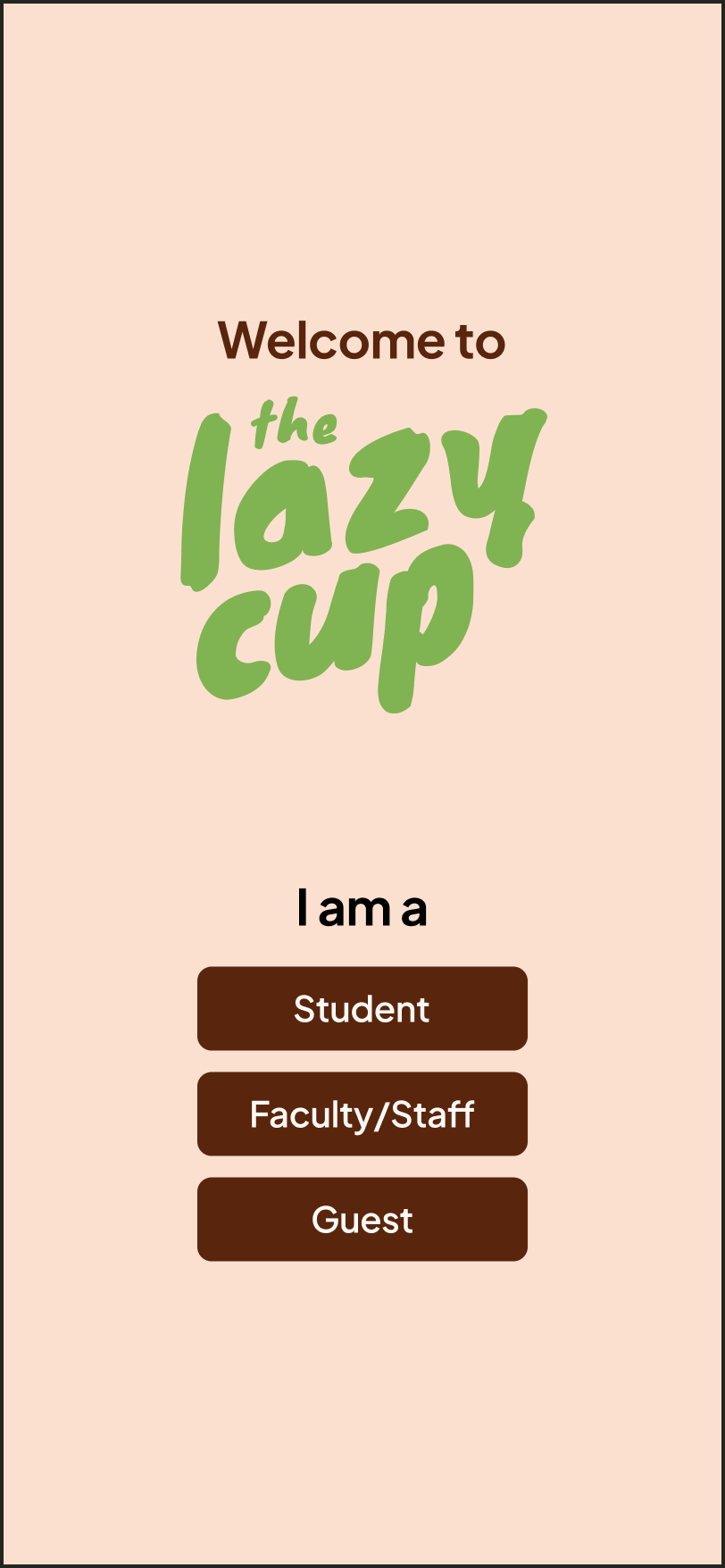
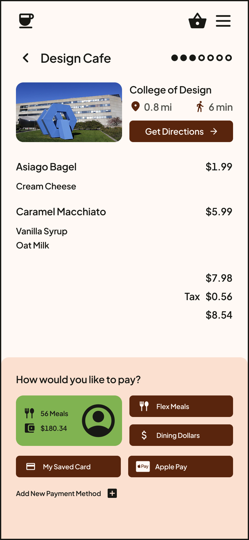
An important consideration was that some parts of the app were not helpful for users who were not students or don't have dining plans. As such, I adjusted the payment and onboarding screens to better allow for this wider range of users.
High-Fidelity Prototyping
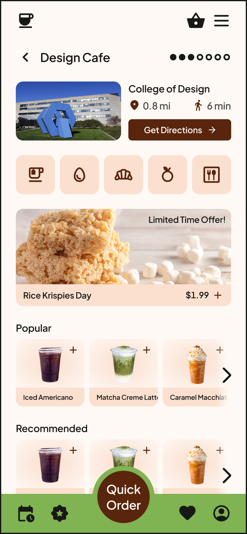
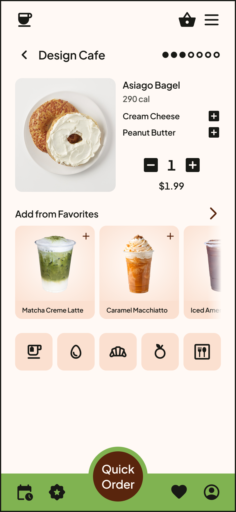
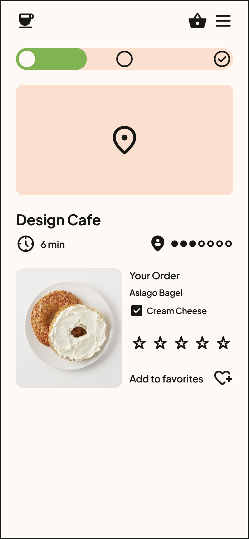
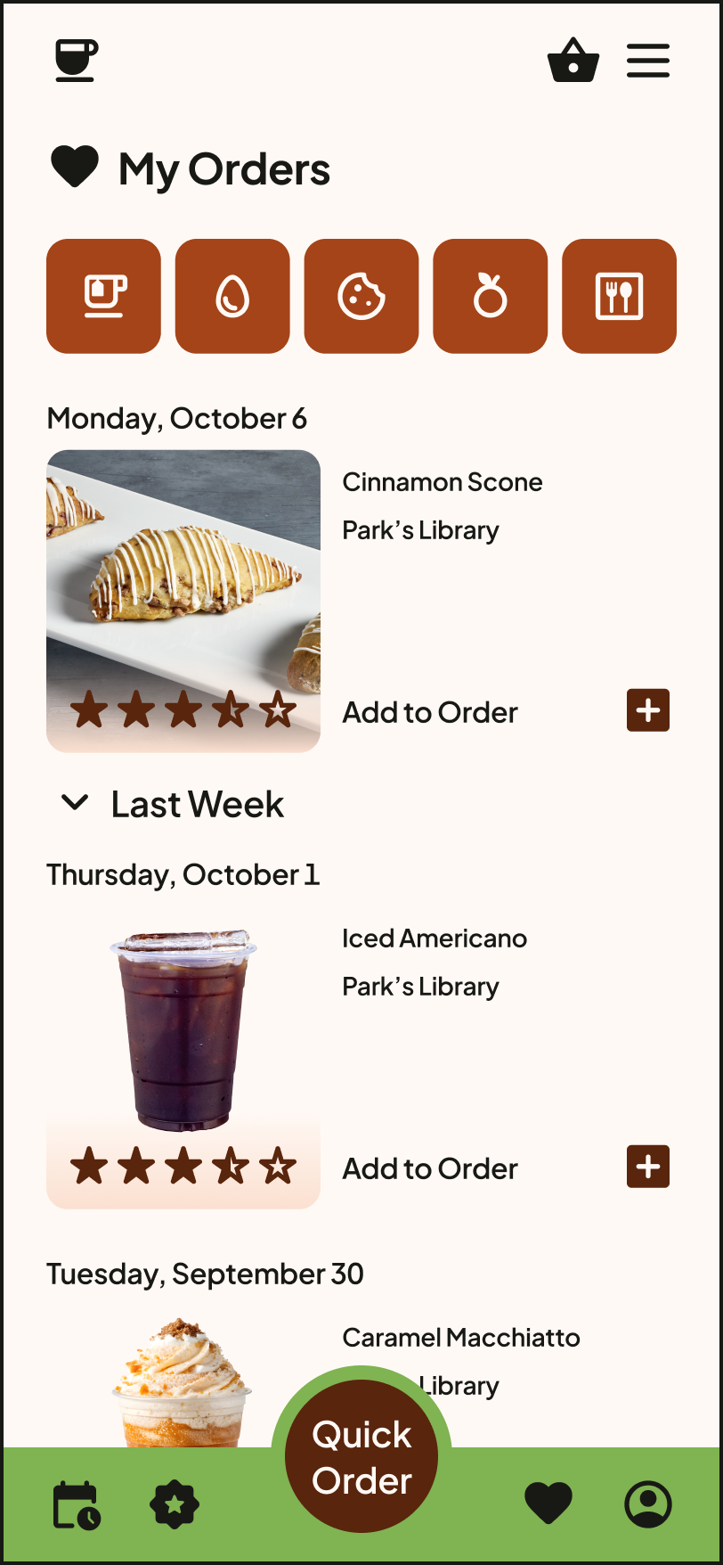
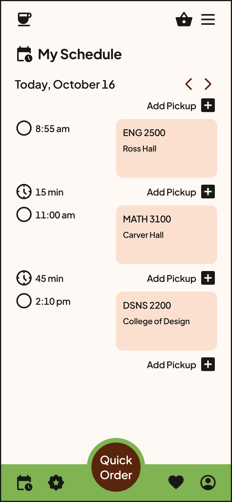
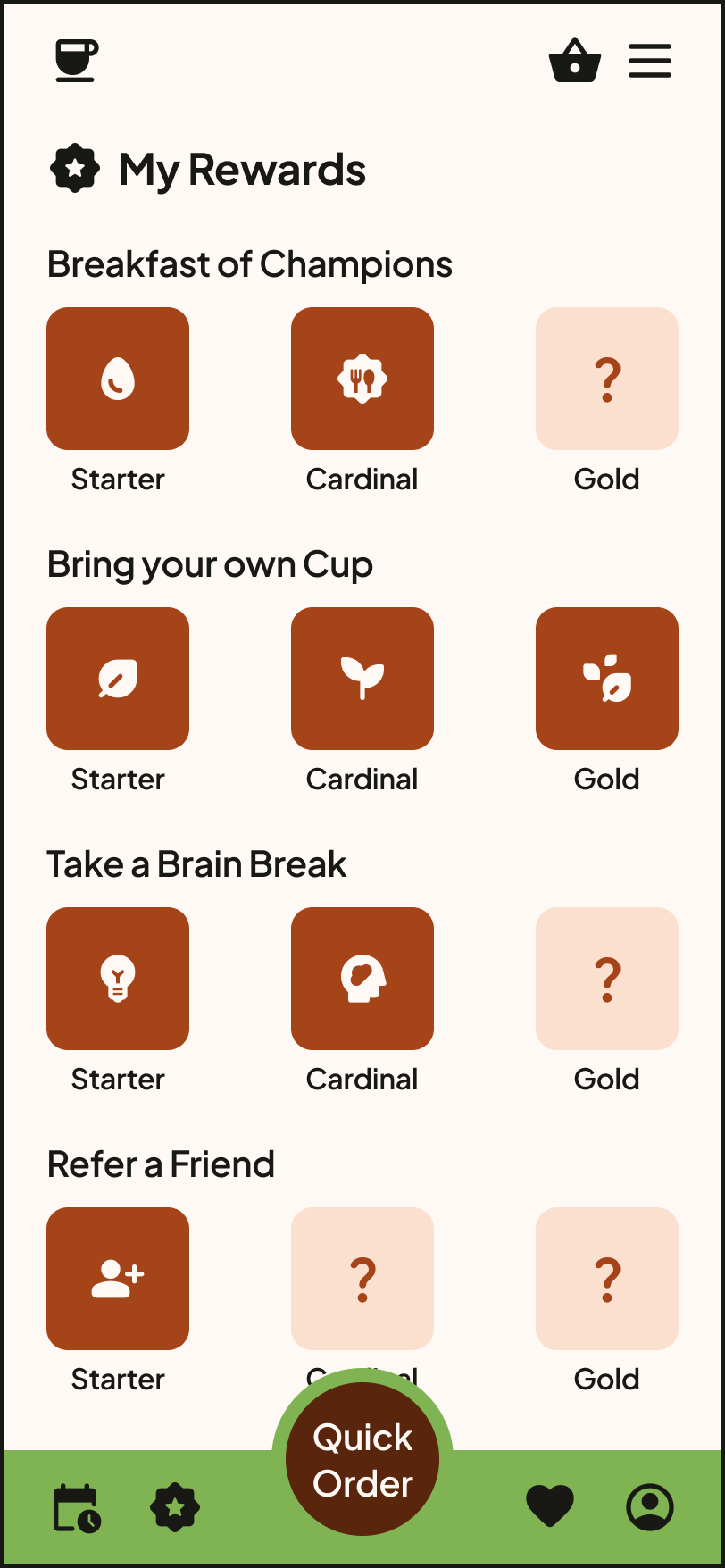
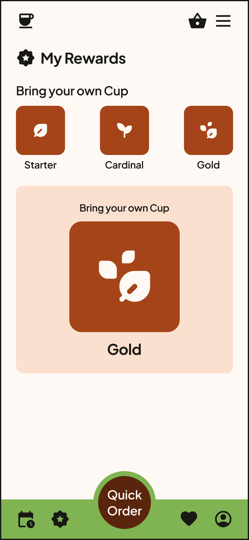
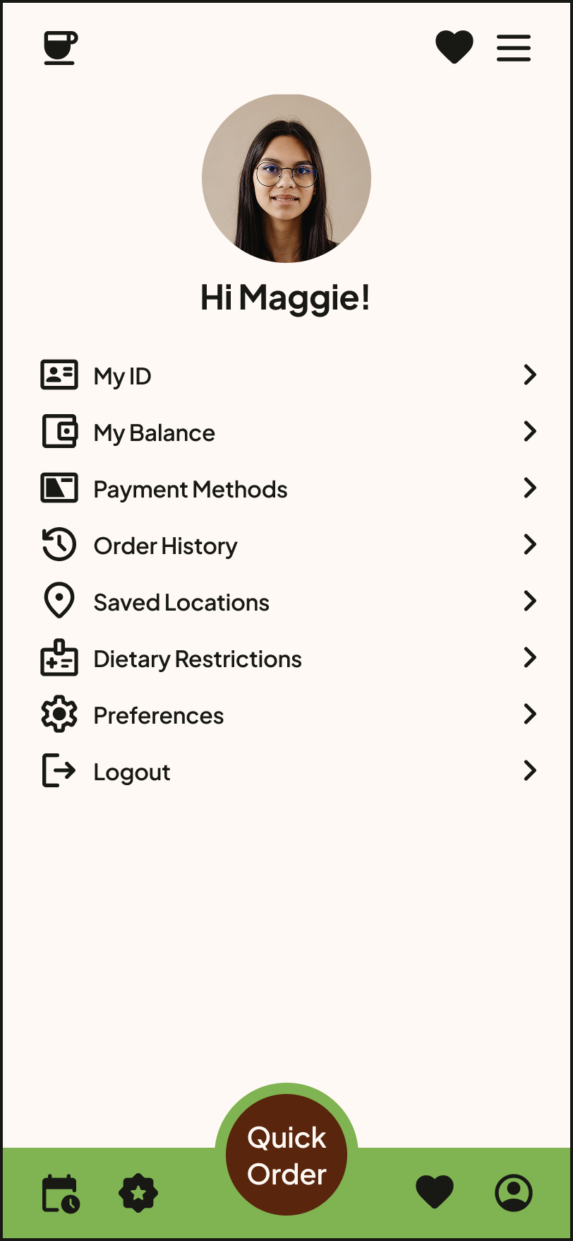
The visual design of the app features a warm color palette and clean interface, aiming to simplify and improve users' café experience.
